©The Author(s) 2025.
World J Gastrointest Oncol. Dec 15, 2025; 17(12): 114037
Published online Dec 15, 2025. doi: 10.4251/wjgo.v17.i12.114037
Published online Dec 15, 2025. doi: 10.4251/wjgo.v17.i12.114037
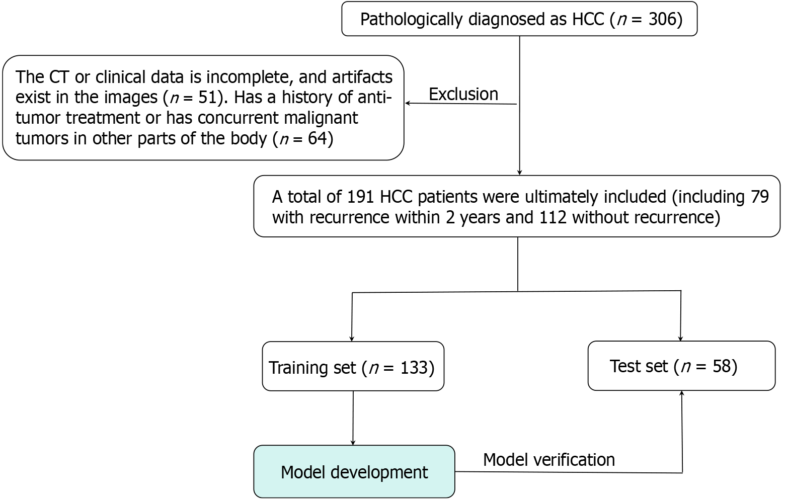
Figure 1 Study population and workflow.
HCC: Hepatocellular carcinoma; CT: Computed tomography.
Figure 2 Tumor segmentation of a typical case.
A: The original computed tomography arterial phase image; B: The tumor segmentation using ITK-SNAP software; C: Pseudo-color image of tumor habitat characteristics.
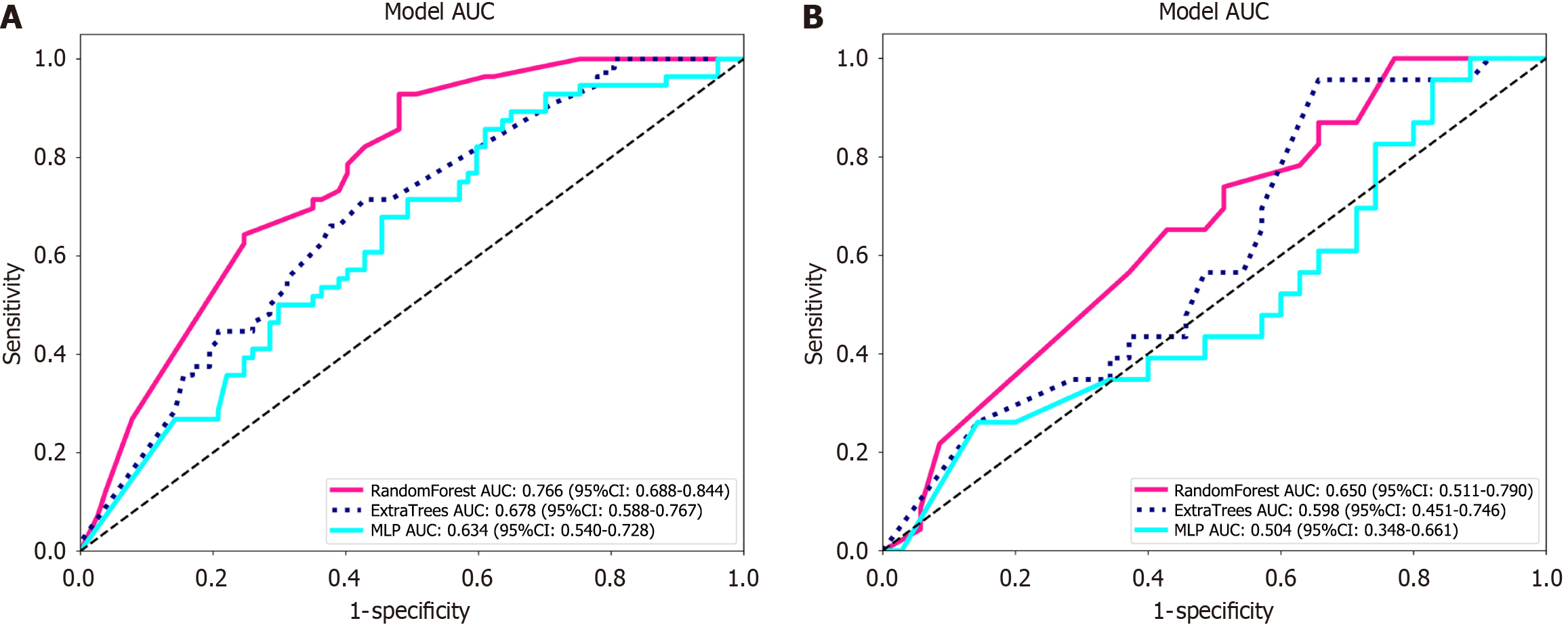
Figure 3 Receiver operating characteristic and decision curve analysis curves for clinical features.
A and B: The pink, dark blue, and cyan colors represent the RandomForest, ExtraTrees, and multi-layer perceptron models in the training and validation sets. AUC: Area under the curve; MLP: Multi-layer perceptron.
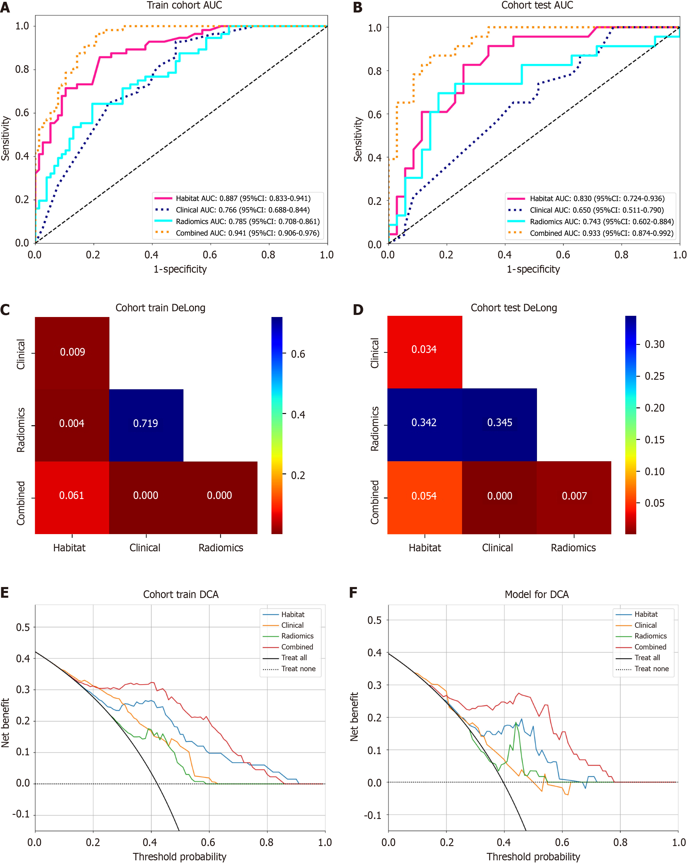
Figure 4 Receiver operating characteristic curves and decision curve analysis for subjects with different characteristics.
A and B: Receiver operating characteristic curves for the training and testing sets, where yellow, red, cyan, and dark blue represent fusion features, habitat features, radiomics features, and clinical features, respectively; C and D: Delong test analysis for the training and testing sets; E and F: Decision curve analysis for the training and testing sets. Red, blue, green, and yellow represent the integrated model, habitat model, traditional radiomics model, and clinical model, respectively. AUC: Area under the curve; DCA: Decision curve analysis.
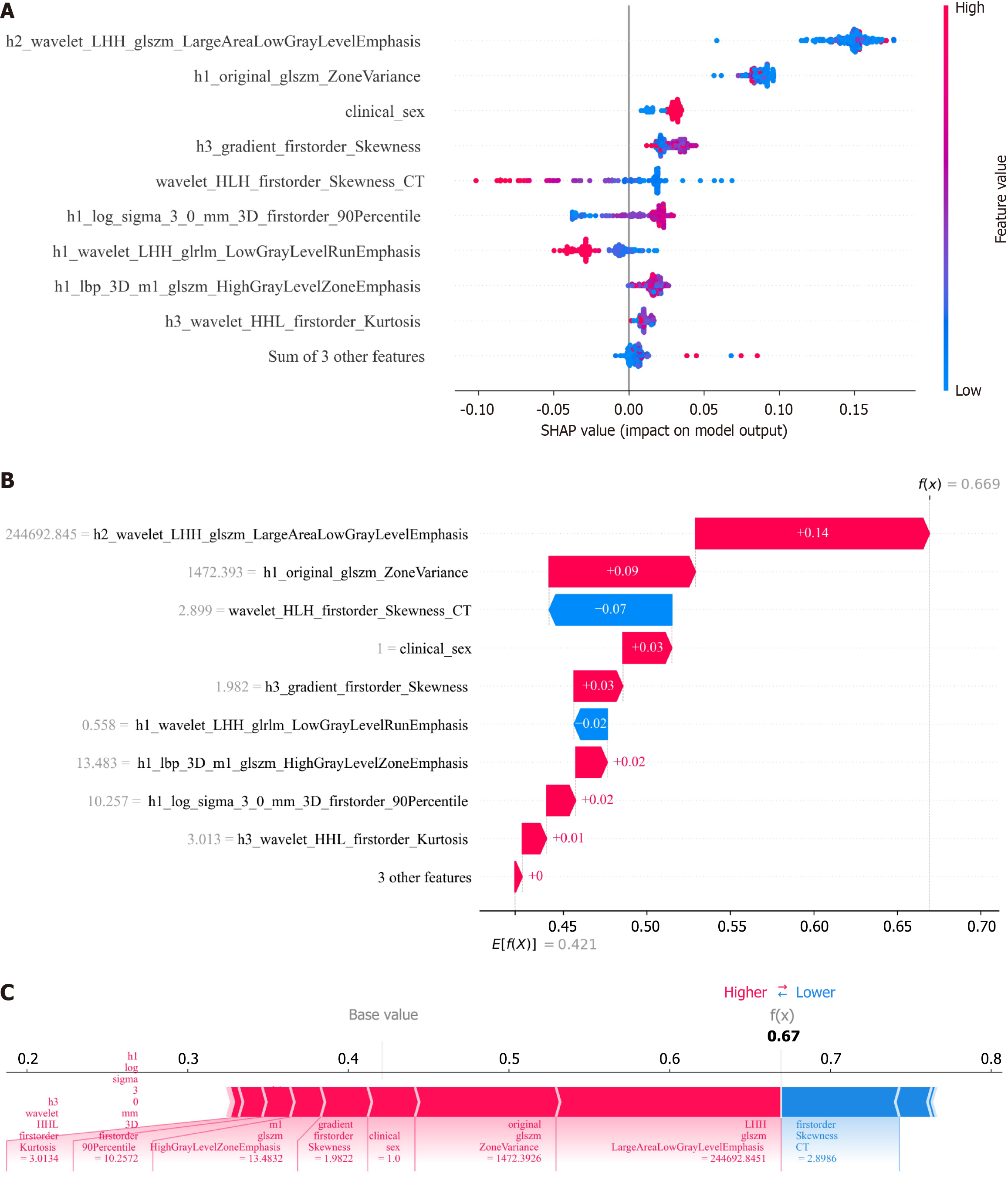
Figure 5 SHapley Additive exPlanations analysis plot.
A: SHapley Additive exPlanations adds feature importance explanations, represented by the average absolute shape value for each feature; B: The shape summary plot displays the distribution of shape values for each feature across patients. Each point corresponds to the shape value of a specific feature for each patient. The X-axis represents shape values, with colors ranging from red (high feature value) to blue (low feature value); C: Shape plots for patients with and without recurrence. Colors indicate each feature's contribution (red for positive, blue for negative), while bar length reflects contribution strength. SHAP: SHapley Additive exPlanations; CT: Computed tomography.
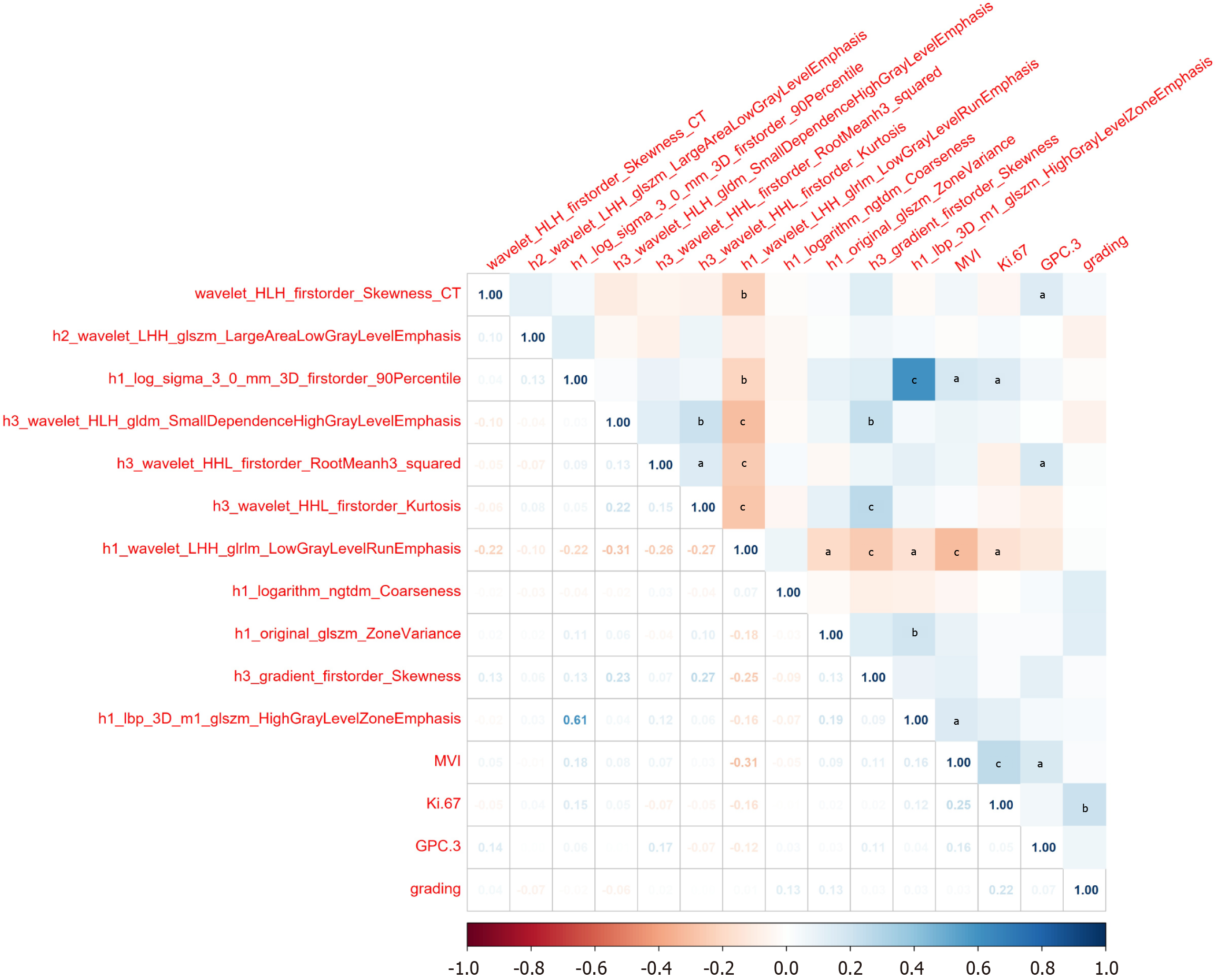
Figure 6 Correlation heatmap.
The numbers and colors within the squares indicate the correlation coefficients between variables, where warm colors (e.g., red) represent negative correlations and cool colors (e.g., blue) represent positive correlations. The deeper the color, the stronger the correlation. aP < 0.05; bP < 0.01; cP < 0.001. MVI: Microvascular invasion.
- Citation: Huang LH, Fang YJ, Zheng XJ, Huang C, Li CL, Yu B, Huang MJ, Qin SJ, Huang DY, Lu DW. Application of multimodal fusion technology in early recurrence prediction and pathological analysis of hepatocellular carcinoma. World J Gastrointest Oncol 2025; 17(12): 114037
- URL: https://www.wjgnet.com/1948-5204/full/v17/i12/114037.htm
- DOI: https://dx.doi.org/10.4251/wjgo.v17.i12.114037


