©The Author(s) 2025.
World J Gastrointest Oncol. Oct 15, 2025; 17(10): 111509
Published online Oct 15, 2025. doi: 10.4251/wjgo.v17.i10.111509
Published online Oct 15, 2025. doi: 10.4251/wjgo.v17.i10.111509
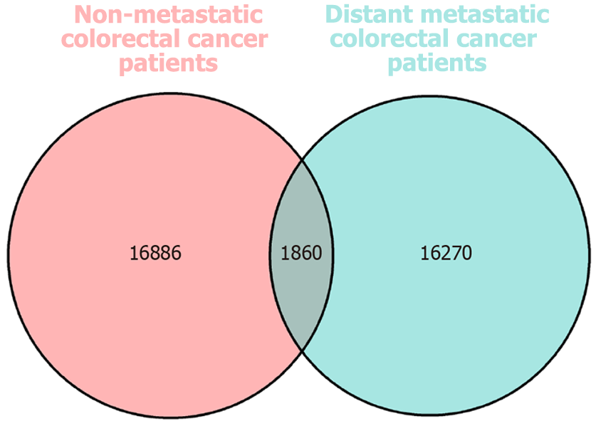
Figure 1 Venn diagram.
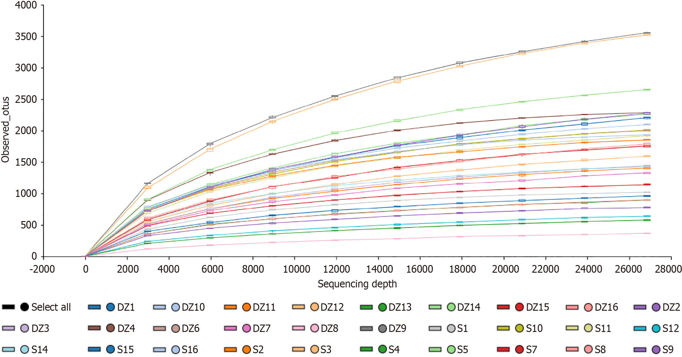
Figure 2 Rarefaction curves.
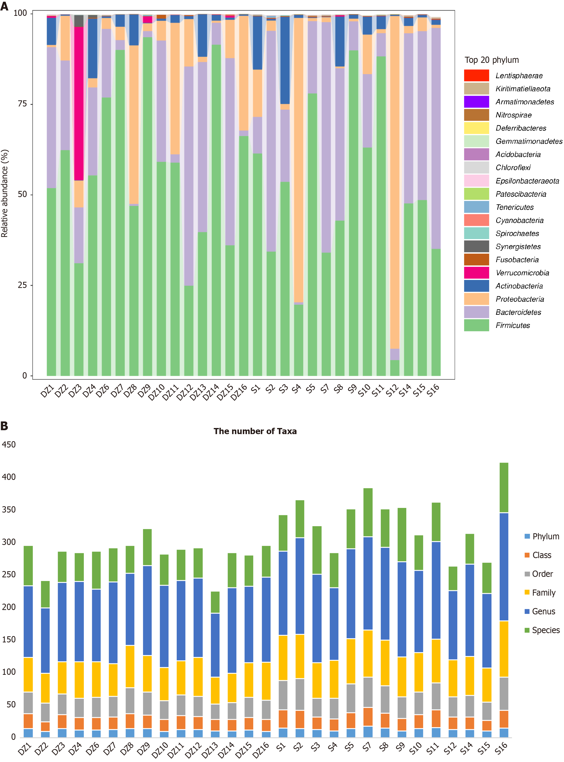
S: Non-metastatic colorectal cancer patients; DZ: Distant metastatic colorectal cancer patients.
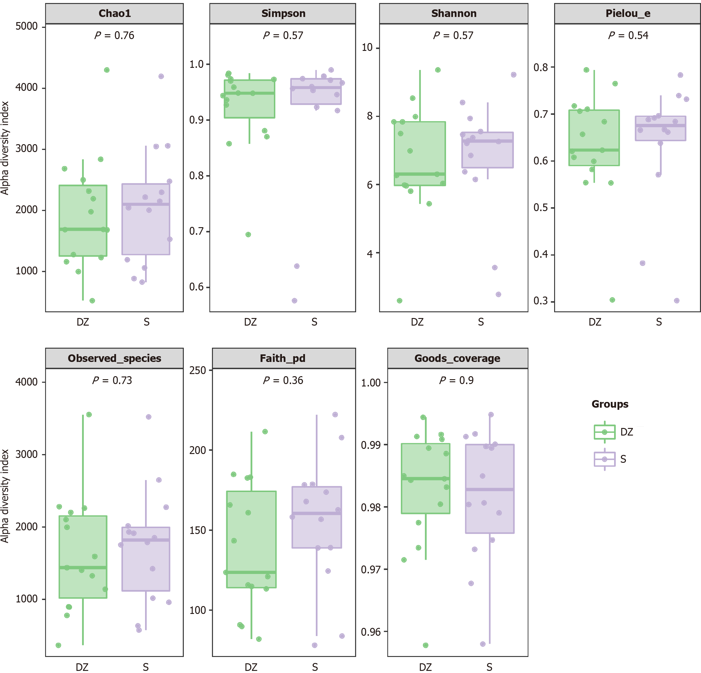
Figure 3 Boxplots of α-diversity indices by group.
S: Non-metastatic colorectal cancer patients; DZ: Distant metastatic colorectal cancer patients.
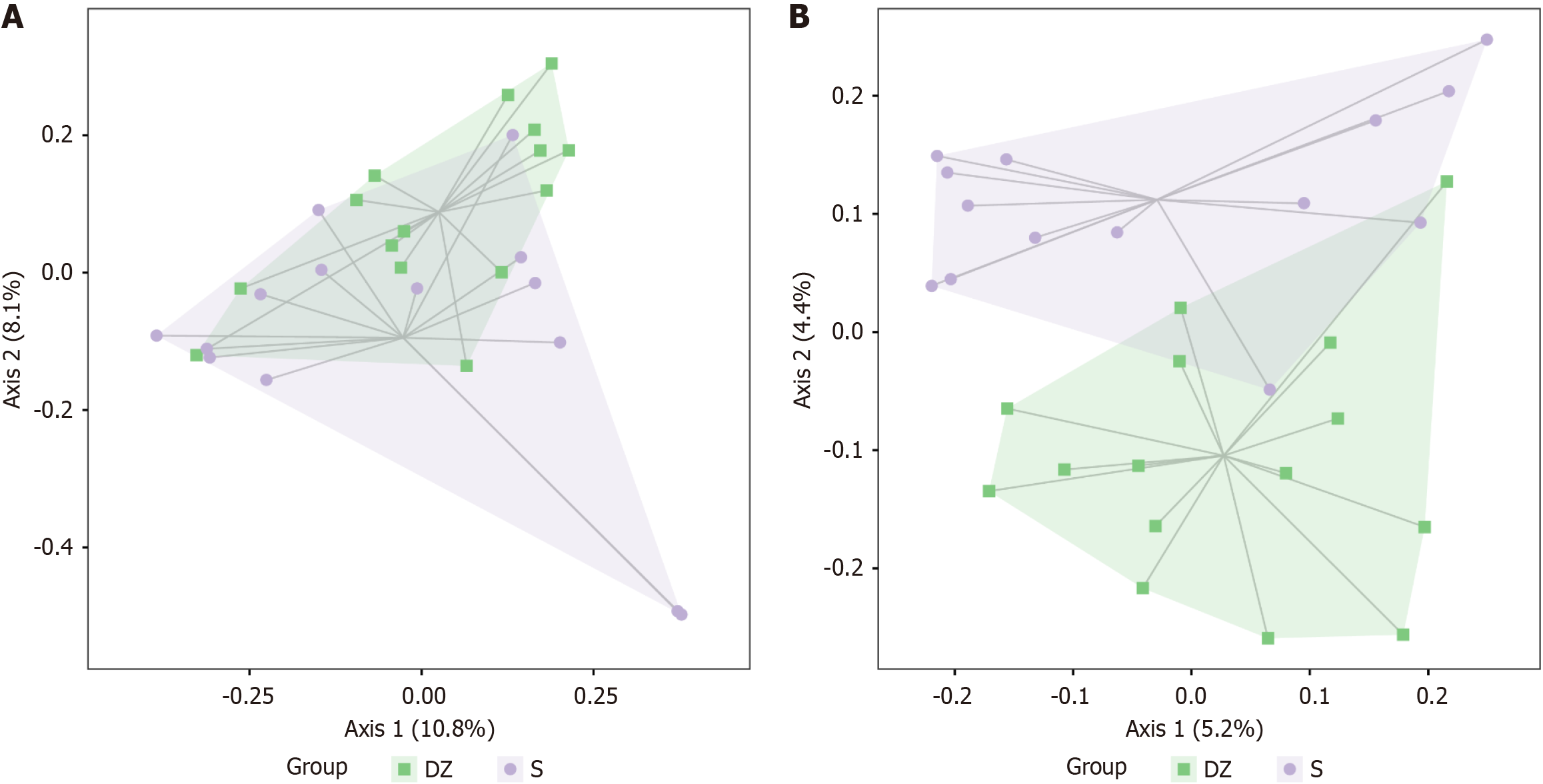
Figure 4 Principal co-ordinates analysis plot.
A: Based on Bray-Curtis distance; B: Based on Jaccard distance. S: Non-metastatic colorectal cancer patients; DZ: Distant metastatic colorectal cancer patients.
Figure 5 Gut microbiota analysis.
A: Compositional bar plot of gut microbiota at the phylum level between the two groups; B: Taxonomic unit counts of gut microbiota in the two groups. The X-axis displays sample names, while the Y-axis represents the number of taxonomic units at six levels: Phylum, class, order, family, genus, and species. S: Non-metastatic colorectal cancer patients; DZ: Distant metastatic colorectal cancer patients.
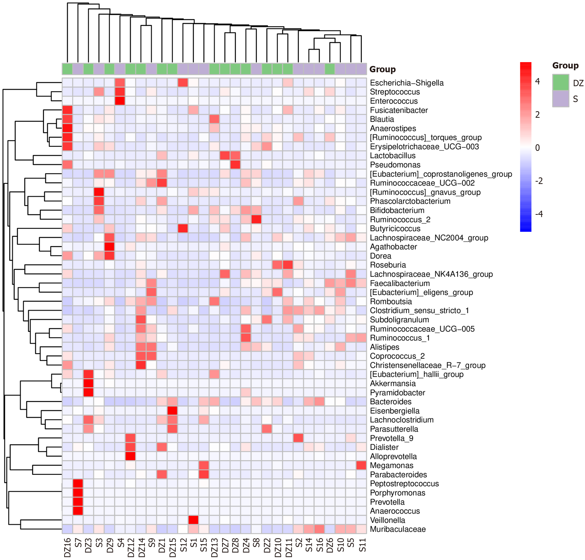
Figure 6 Genus-level heatmap of species composition with hierarchical clustering based on the Pearson correlation coefficient matrix (unweighted pair-group method with arithmetic means method).
Red blocks indicate higher relative abundance of the genus in the corresponding sample compared to others. Blue blocks indicate lower relative abundance. S: Non-metastatic colorectal cancer patients; DZ: Distant metastatic colorectal cancer patients.
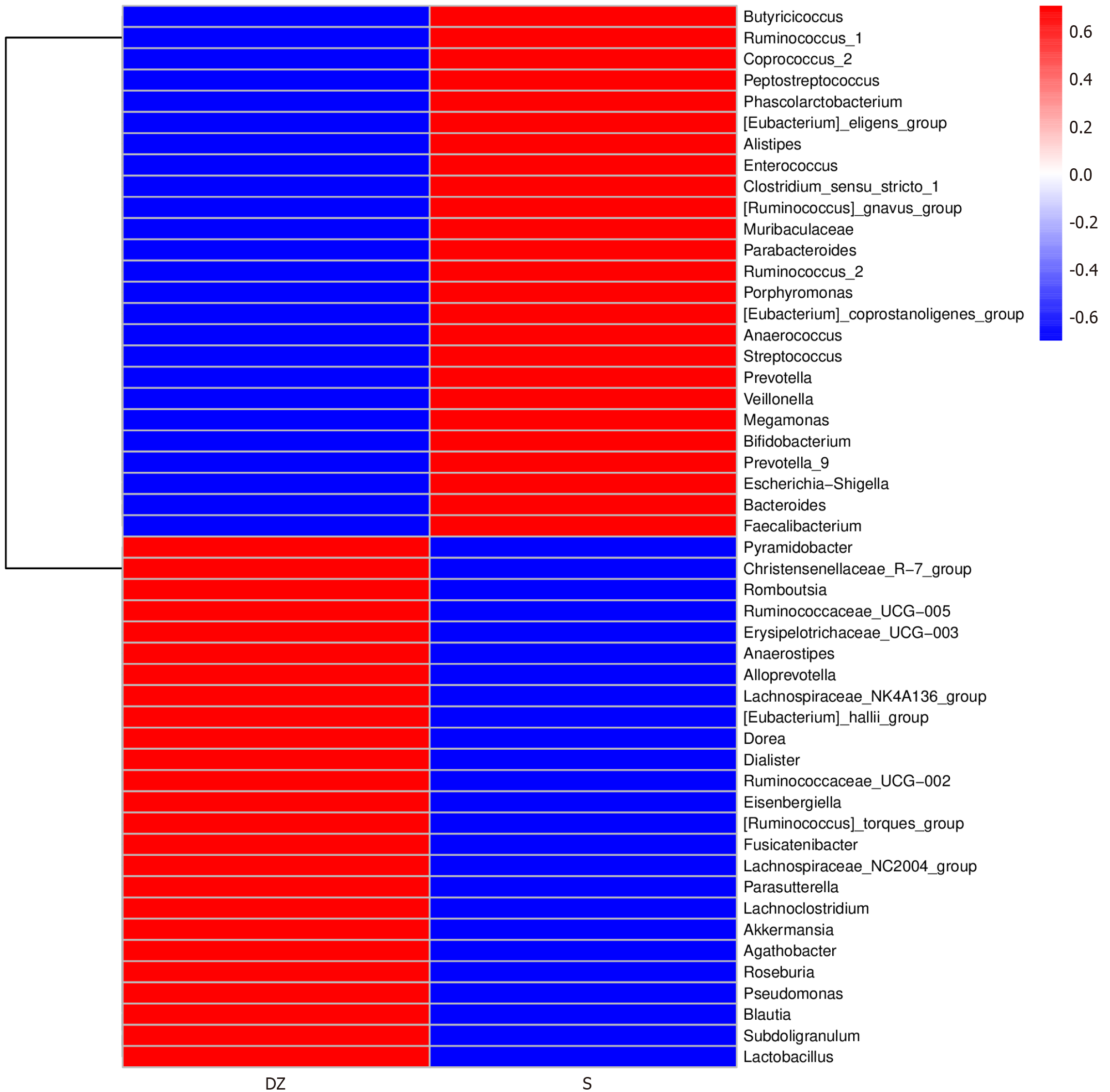
Figure 7 Genus-level heatmap of species composition sorted by mean abundance across samples.
Red blocks represent higher relative abundance of the genus in the sample. Blue blocks represent lower relative abundance. S: Non-metastatic colorectal cancer patients; DZ: Distant metastatic colorectal cancer patients.
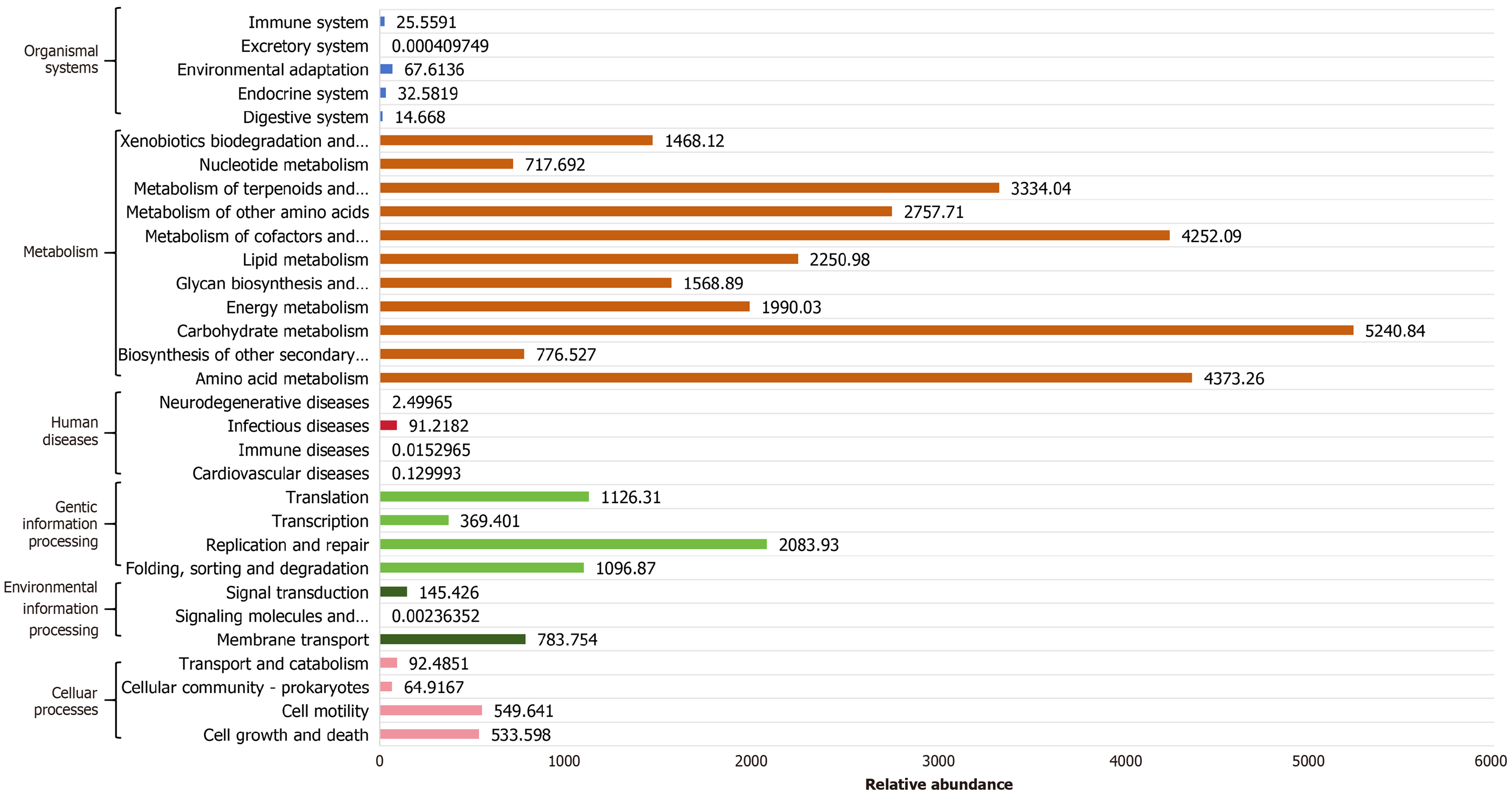
Figure 8 The X-axis represents the abundance of functional pathways (in units of Kyoto Encyclopedia of Genes and Genomes Orthology per million), while the Y-axis displays the Kyoto Encyclopedia of Genes and Genomes secondary classification of functional pathways.
The far-right column indicates the primary classification to which each pathway belongs. The figure presents the average abundance across all samples.
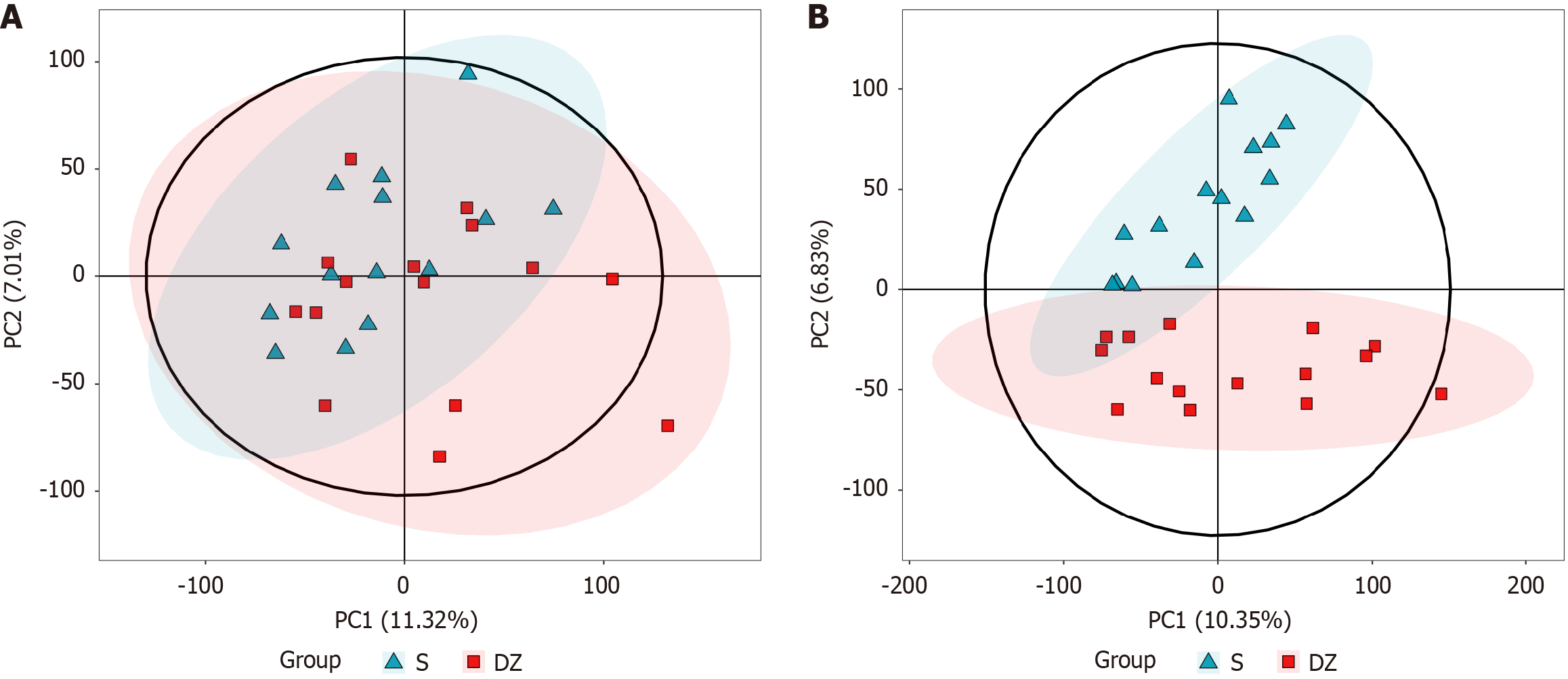
Figure 9 Principal component analysis score plot.
A: In positive ionization mode; B: In negative ionization mode. PC: Principal component; S: Non-metastatic colorectal cancer patients; DZ: Distant metastatic colorectal cancer patients.
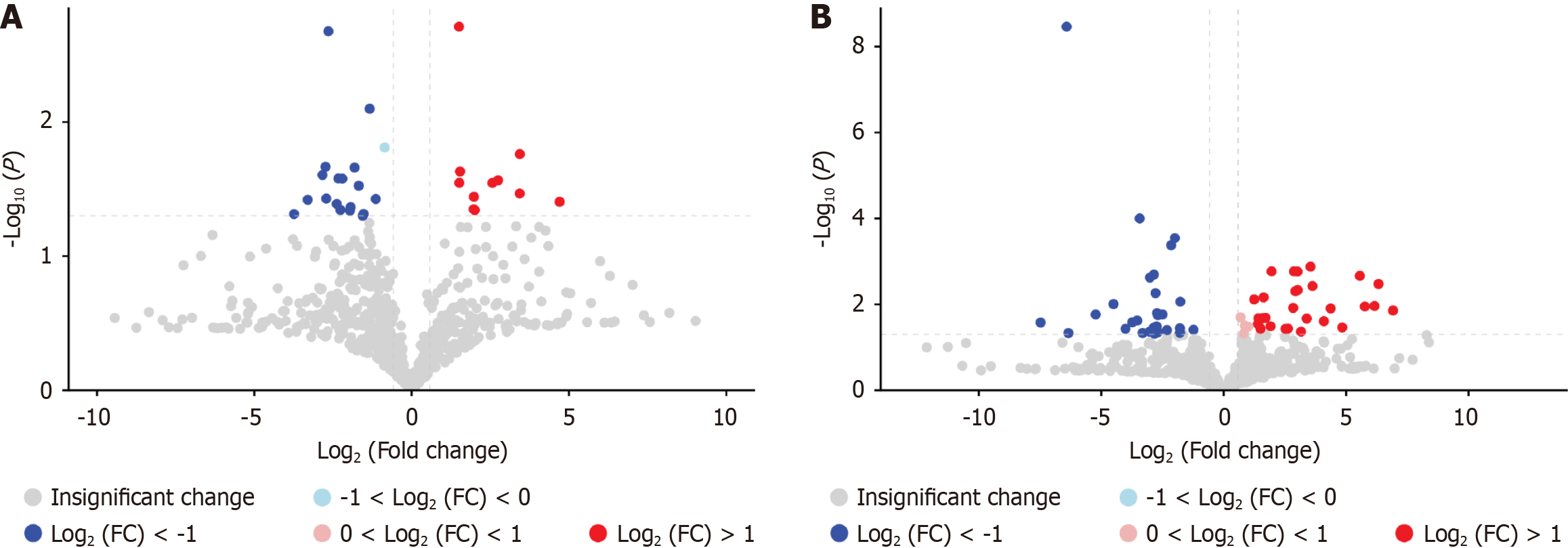
Figure 10 Volcano plot of differential metabolites.
A: In positive ionization mode; B: In negative ionization mode. The screening criteria were set as fold change (FC) > 1.5 or FC < 0.667 with a significance threshold of P < 0.05. Vertical dashed lines indicate log2 (1/1.5) and log2 (1.5). Red dots represent upregulated metabolites, while blue dots denote downregulated metabolites. FC: Fold change.
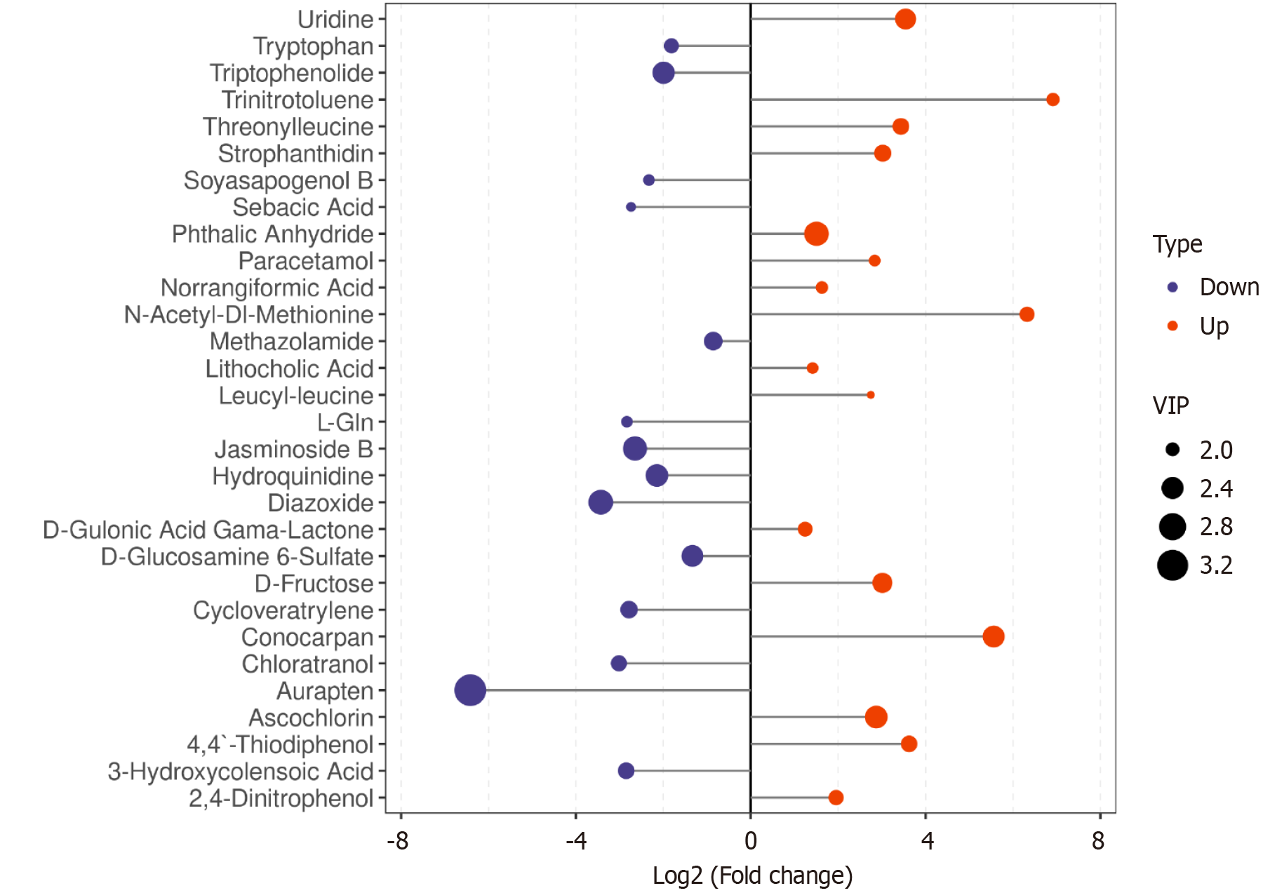
Figure 11 Bar plot of significant differential metabolites between groups in mixed ion mode.
The X-axis represents log2-transformed fold change values, while the Y-axis displays metabolite names. Blue and red data points on the left and right sides indicate downregulated and upregulated metabolites, respectively. The point size corresponds to the variable importance in projection (VIP) score, with larger dots denoting higher VIP values and thus greater metabolic significance. VIP: Variable importance in projection.
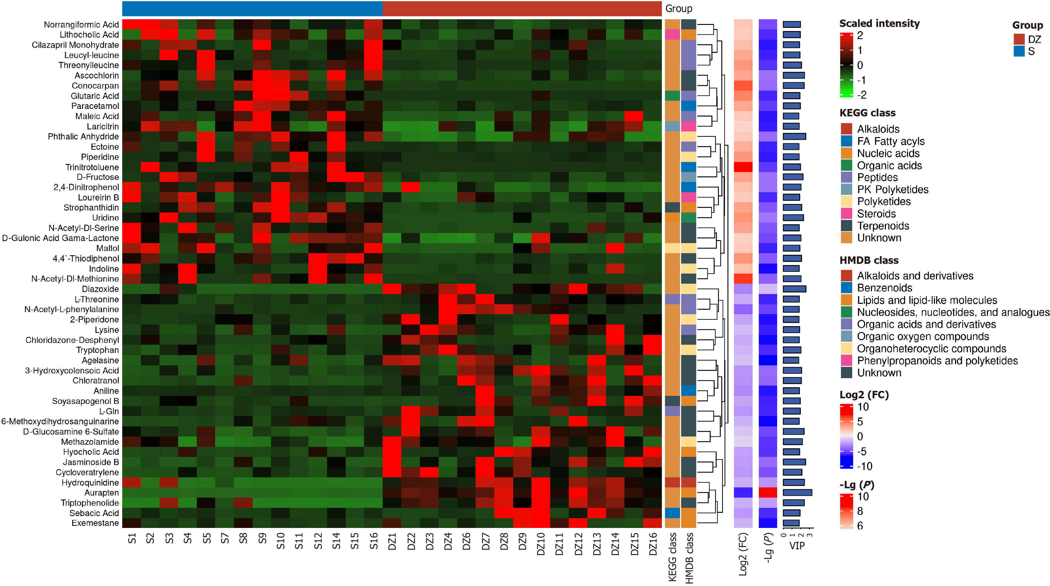
Figure 12 Composite heatmap displaying multiple analytical dimensions of the differential metabolites.
Including relative expression levels, fold change values, P values, variable importance in projection scores, and metabolite classification information. S: Non-metastatic colorectal cancer patients; DZ: Distant metastatic colorectal cancer patients; KEGG: Kyoto Encyclopedia of Genes and Genomes; HMDB: Human Metabolome Database; VIP: Variable importance in projection; FC: Fold change.
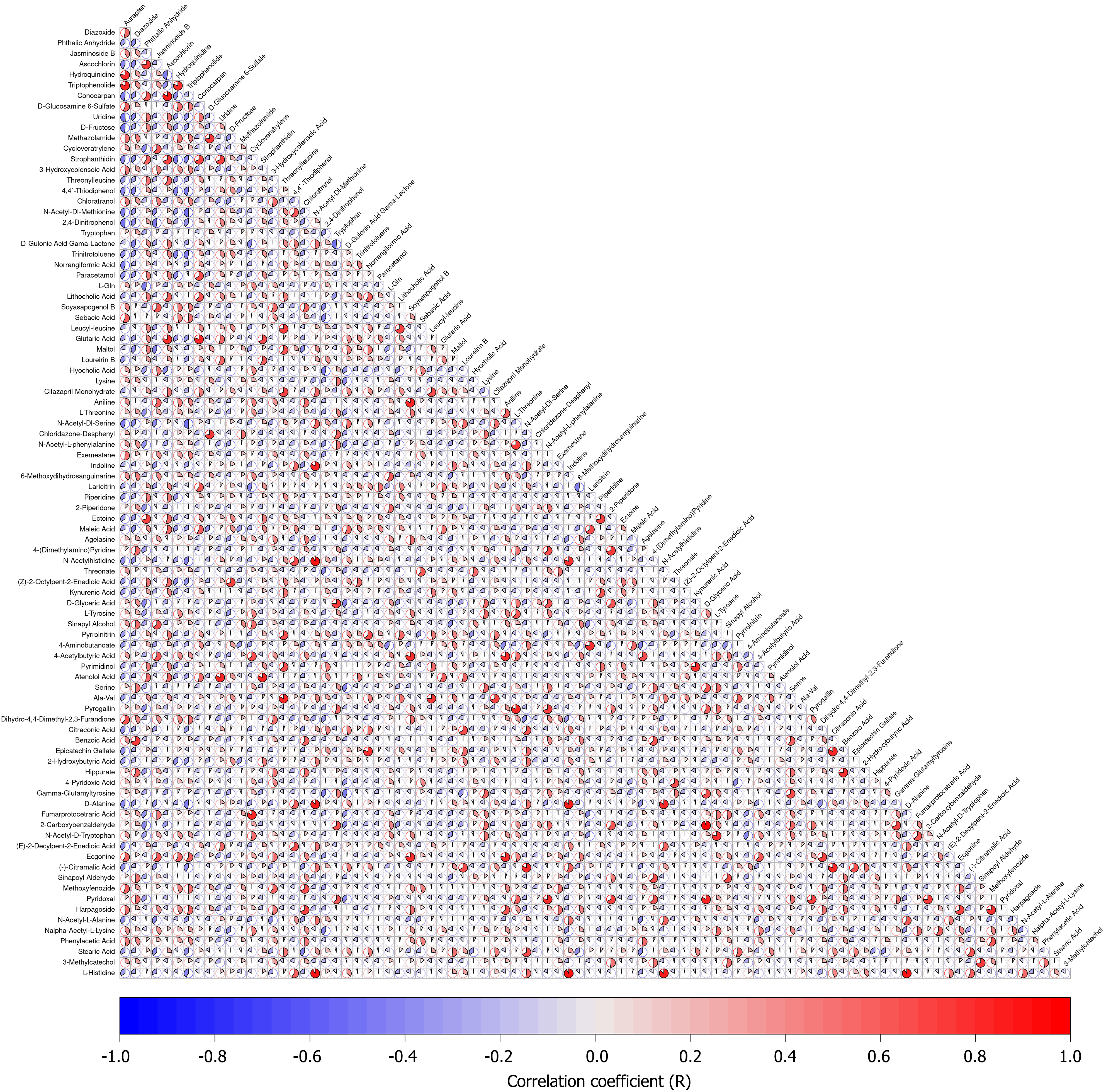
Figure 13 Correlation matrix of differential metabolites.
The X-axis in the figure represents the correlation coefficient (R) between the differential metabolites, which ranges from -1 to +1. r > 0 indicates a positive correlation, represented in red; r < 0 indicates a negative correlation, represented in blue. A larger proportion of the colored area indicates a stronger positive or negative correlation.
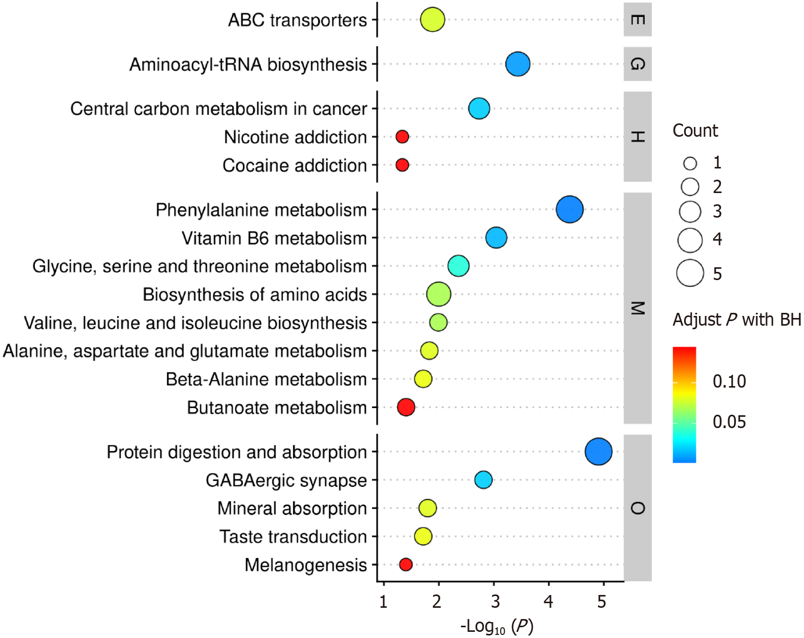
Figure 14 Top 30 significantly enriched pathways of differential metabolites.
The X-axis represents the negative logarithmic transformation of the P value, and the Y-axis displays the pathway names. The pathways are categorized into level 1 classifications, with pathways in each category arranged from top to bottom in descending order of significance [i.e., -log10 (P value) decreases, meaning the P value increases and significance declines]. The size of the circles corresponds to the count (number of differential metabolites annotated to the pathway); the color gradient (red to blue) reflects the adjusted P value, with red indicating higher significance. ABC: Adenosine triphosphate-binding cassette; BH: Benjamini-Hochberg method; E: Environmental information processing; G: Genetic information processing; H: Human diseases; M: Metabolism; O: Organismal systems.
- Citation: Deng P, Lin H, Zeng H, Guo F. Gut microbiota and metabolite changes in metastatic colorectal cancer via 16S rRNA and metabolomics. World J Gastrointest Oncol 2025; 17(10): 111509
- URL: https://www.wjgnet.com/1948-5204/full/v17/i10/111509.htm
- DOI: https://dx.doi.org/10.4251/wjgo.v17.i10.111509


