©The Author(s) 2024.
World J Gastrointest Oncol. Aug 15, 2024; 16(8): 3705-3715
Published online Aug 15, 2024. doi: 10.4251/wjgo.v16.i8.3705
Published online Aug 15, 2024. doi: 10.4251/wjgo.v16.i8.3705
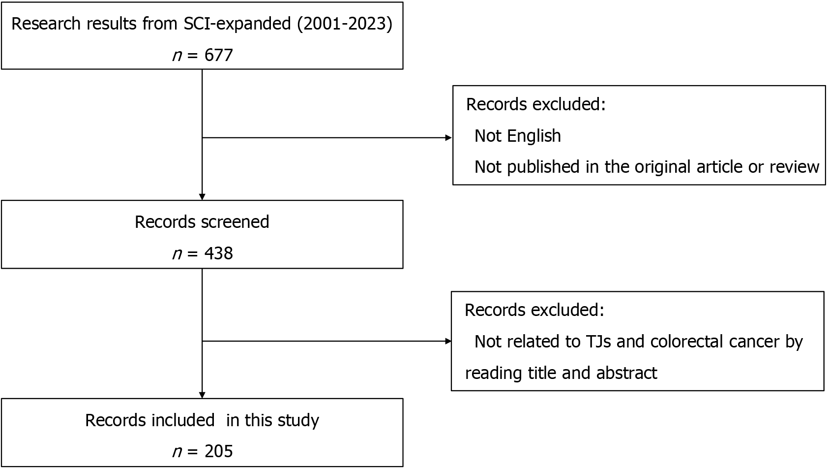
Figure 1 The flowchart of the literature screening process.
SCI: Science Citation Index; TJ: Tight junction.
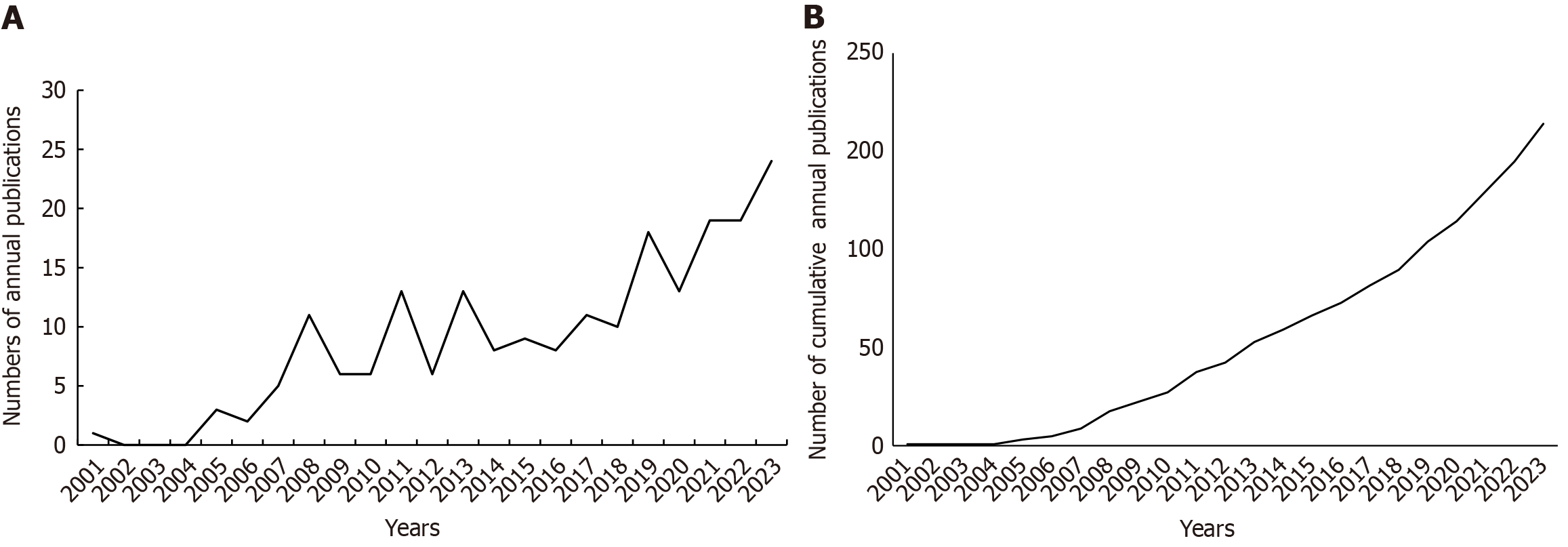
Figure 2 Global number of publications in the field of tight junctions and colorectal cancer from 2001 to 2023.
A: The global annual number of published articles; B: The global number of annual cumulative published articles.
Figure 3 The cooperation network of countries/regions in the field.
A: Dots represent countries, with larger dots indicating a greater number of publications. Clusters are marked using different colors, and links represent cooperation between countries; B: The cooperation network of countries/regions in the field. The colors represent the average years.
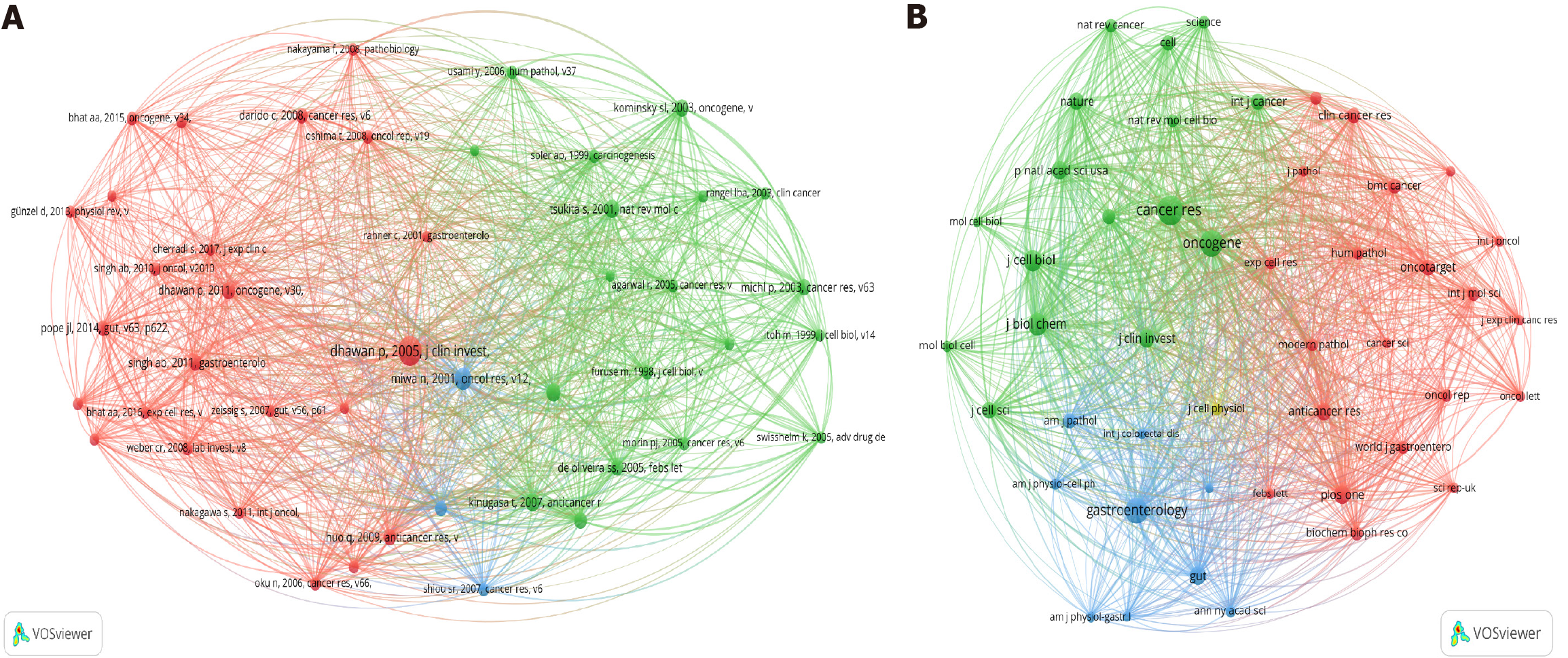
Figure 4 Reference co-citation analysis by VOSviewer.
A: Dots represent references, with larger dots indicating a greater number of references. Clusters are marked using different colors, and the connecting lines represent a paper citing two different references separately; B: Co-citation relationships between journals. The circles represent the number of articles cited in a journal, and the connecting lines represent a paper citing two different journals separately.
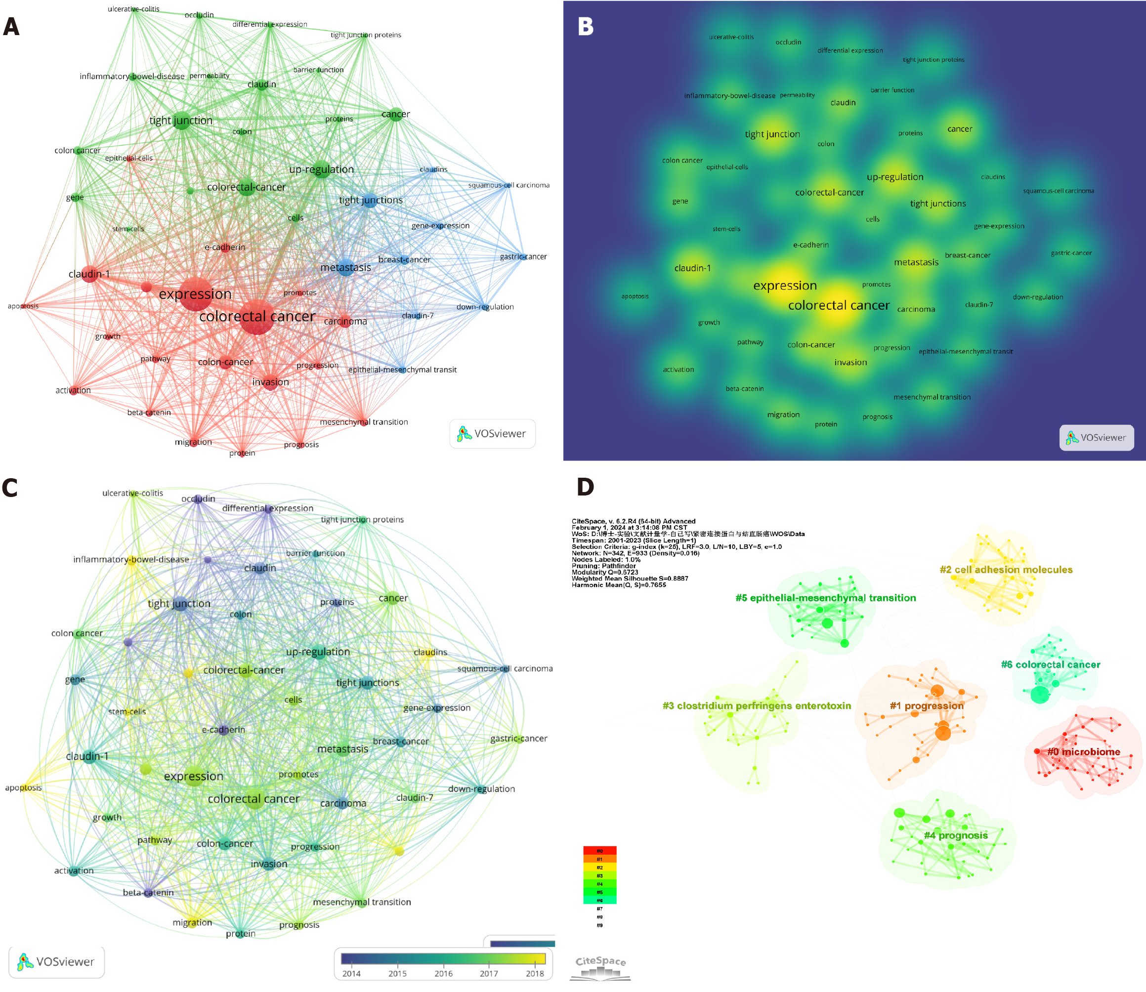
Figure 5 Visualization of keywords related to tight junctions and colorectal cancer research from 2001 to 2023.
A: The cooperation network of keywords in the field. Dots represent keywords, with larger dots indicating a greater frequency of keywords. Clusters are marked using different colors, and links represent co-occurrence between keywords; B: The density of keywords in the field; C: Temporal view of keyword co-occurrence analysis (the node color represents the average year of keyword occurrence); D: Keyword clustering analysis in this field. Different colors represent different clusters. Each point represents a keyword, and the number on the node represents the cluster to which the keyword belongs. The different patterns represented a cluster. Tag# was allocated to clusters; the smaller the count was, the greater the number of keywords in the cluster.
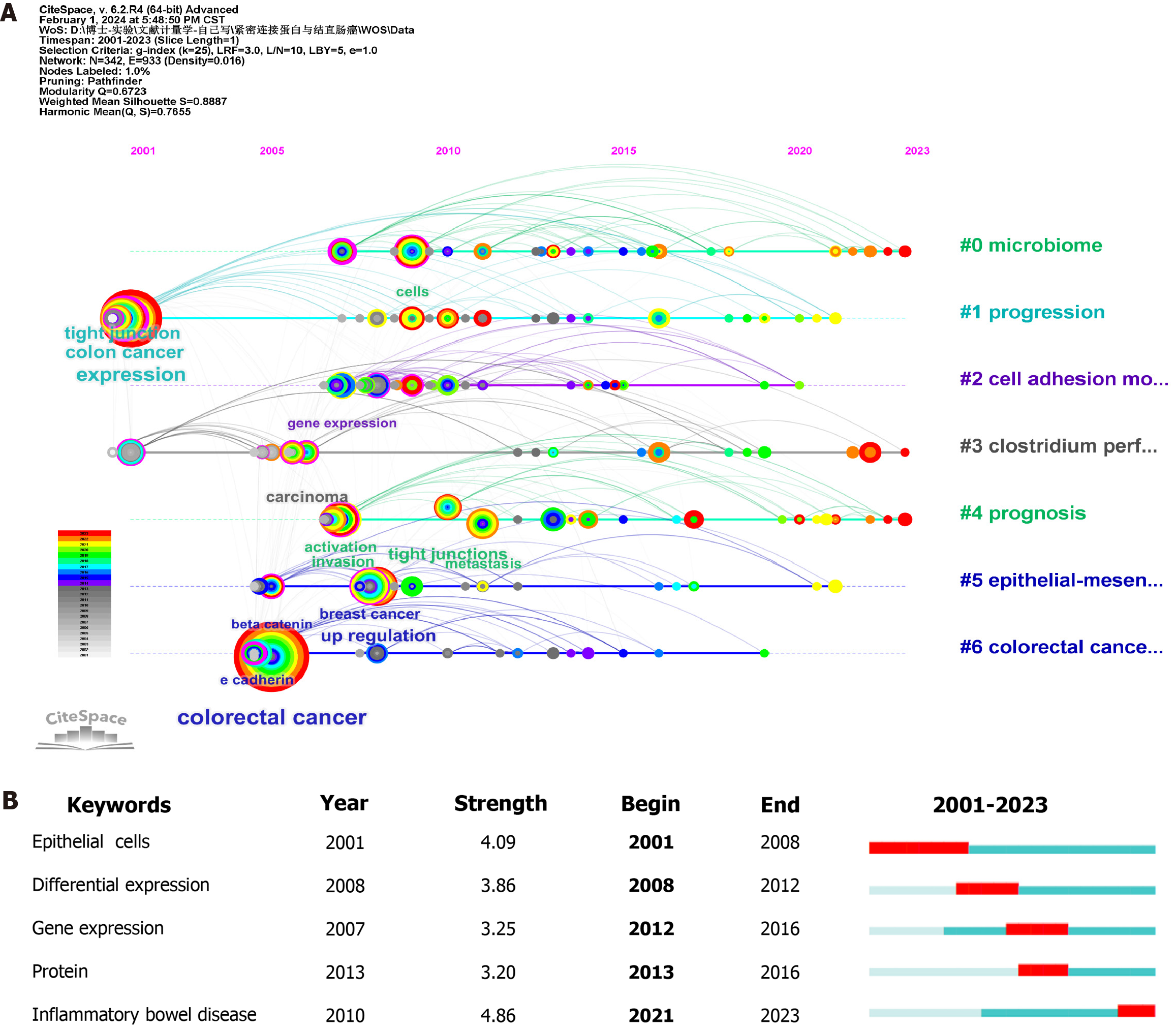
Figure 6 A timeline for keywords.
A: The node’s position on the horizontal axis represents the time when the keyword first appeared, and the node’s size is positively correlated with the number of keywords. The lines between the nodes represent the correlation between two keywords. A redder color indicates that the keyword first appeared closer to 2023. The clusters with redder colors and larger nodes included more keywords, demonstrating that the issue of this cluster was a hot topic in the field; B: The top 5 keywords with the strongest citation bursts. The blue bar represents the period in which the keyword appeared; the red bar represents the interval in which the keyword was found to burst, indicating the start year, the end year and the duration of the burst.
- Citation: Li HM, Liu Y, Hao MD, Liang XQ, Yuan DJ, Huang WB, Li WJ, Ding L. Research status and hotspots of tight junctions and colorectal cancer: A bibliometric and visualization analysis. World J Gastrointest Oncol 2024; 16(8): 3705-3715
- URL: https://www.wjgnet.com/1948-5204/full/v16/i8/3705.htm
- DOI: https://dx.doi.org/10.4251/wjgo.v16.i8.3705


