
















Copyright: ©Author(s) 2026.
World J Psychiatry. Jul 19, 2026; 16(7): 117803
Published online Jul 19, 2026. doi: 10.5498/wjp.117803
Published online Jul 19, 2026. doi: 10.5498/wjp.117803
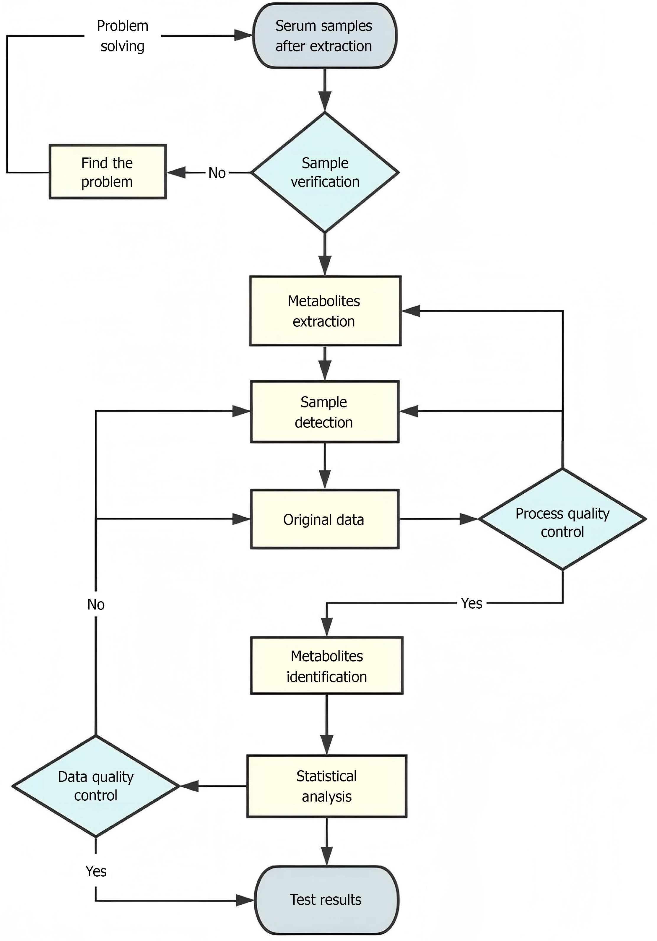
Figure 1
Metabolomics test flow chart.
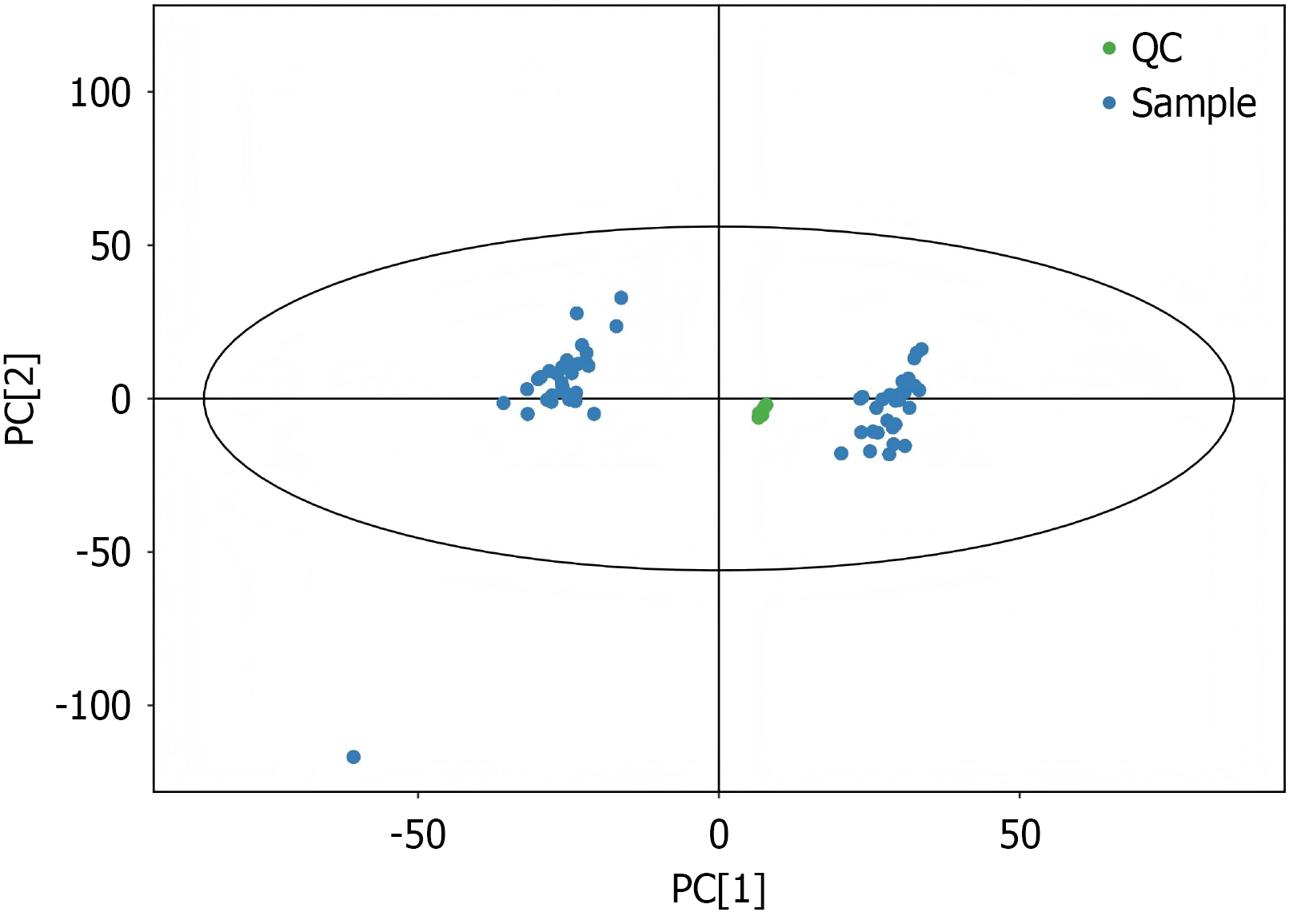
Figure 2 Metabolic spectrum characterization detection process.
QC: Quality control; PC: Principal component.

Figure 3 Principal component analysis score plot.
Green dots are designated as quality control samples, while blue dots represent analytical samples. The clustering degree of quality control samples is positively correlated with methodological stability and reflects the quality of the experimental data.

Figure 4 Orthogonal partial least squares-discriminant analysis results.
A and B: The orthogonal partial least squares-discriminant model scatter plot. In Figure 4A, orange circles represent the samples from the generalized anxiety disorder (GAD) group, while purple diamonds represent the samples from the control group. In Figure 4B, orange circles denote the samples from the pre-intervention GAD group, and blue diamonds denote the samples from the post-intervention GAD group. The samples in each group are roughly distributed within the same interval, and the sample sets between the two groups are completely separated, indicating that the serum metabolic spectrograms of the two groups are significantly different; C and D: The orthogonal partial least squares-discriminant model permutation result dot plot. GAD: Generalized anxiety disorder; ZC: Control group; GYH: Congqi Shoushen Tuina Method group.
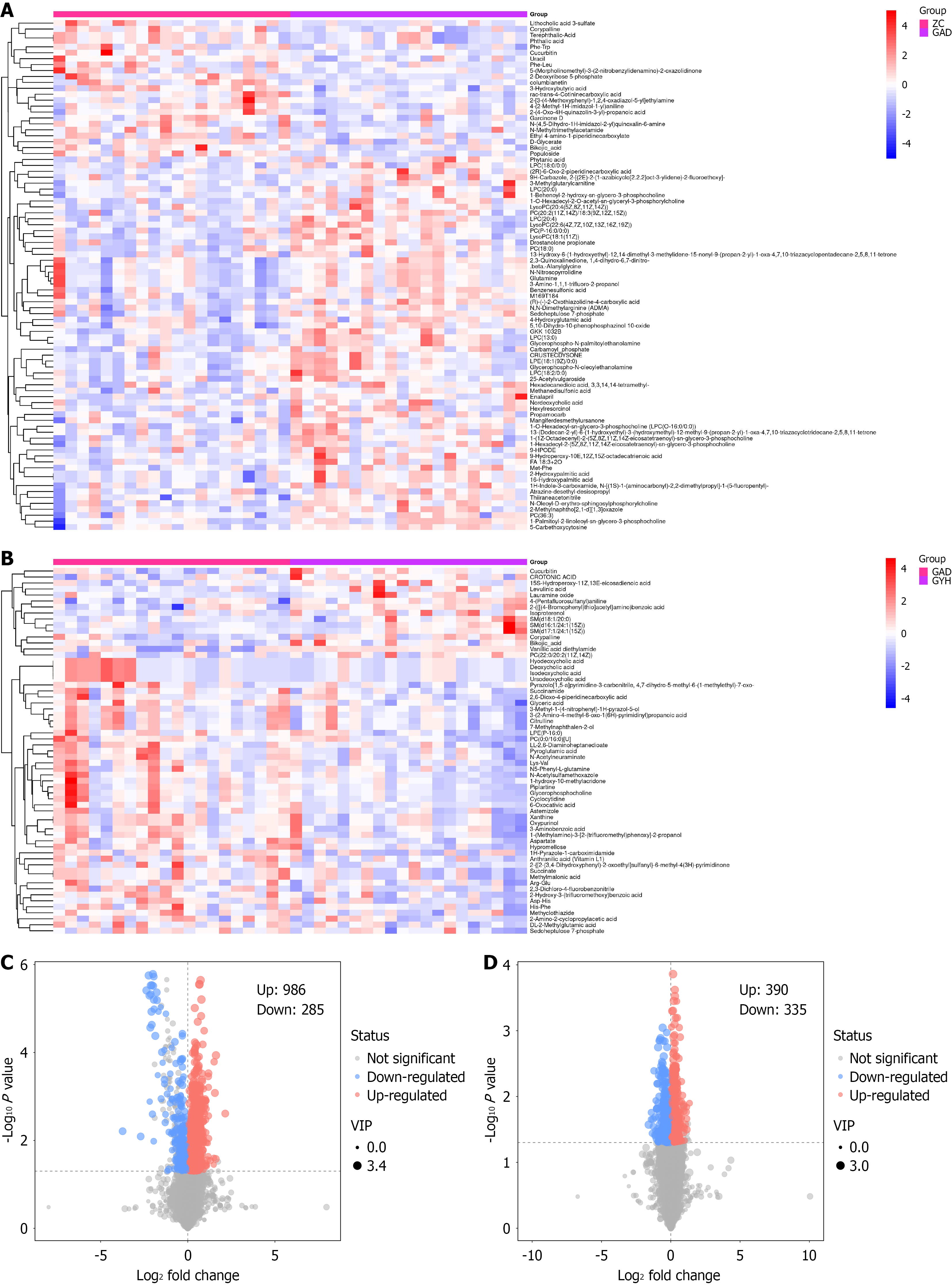
Figure 5 Heatmaps and volcano plots.
A and B: Heatmaps, where the horizontal coordinates represent different groupings of samples, the vertical coordinates represent all metabolites, and the color blocks at different positions represent the relative expression of metabolites at the corresponding positions; red indicates high expression of the substance content, and blue indicates low expression of the substance content. Figure A shows the comparison between the control group and the generalized anxiety disorder group before intervention, and Figure B shows the comparison between the generalized anxiety disorder group before intervention and after intervention; C and D: Volcano plots. Each point in the plots represents a detected metabolite: The horizontal axis denotes the fold change of each metabolite between groups, while the vertical axis denotes the P value derived from Student’s t-test. The color of each scatter point indicates the expression change trend of metabolites: Red represents upregulated metabolites, blue represents downregulated ones, and gray represents metabolites with no significant differences in expression. VIP: Variable importance in the projection.
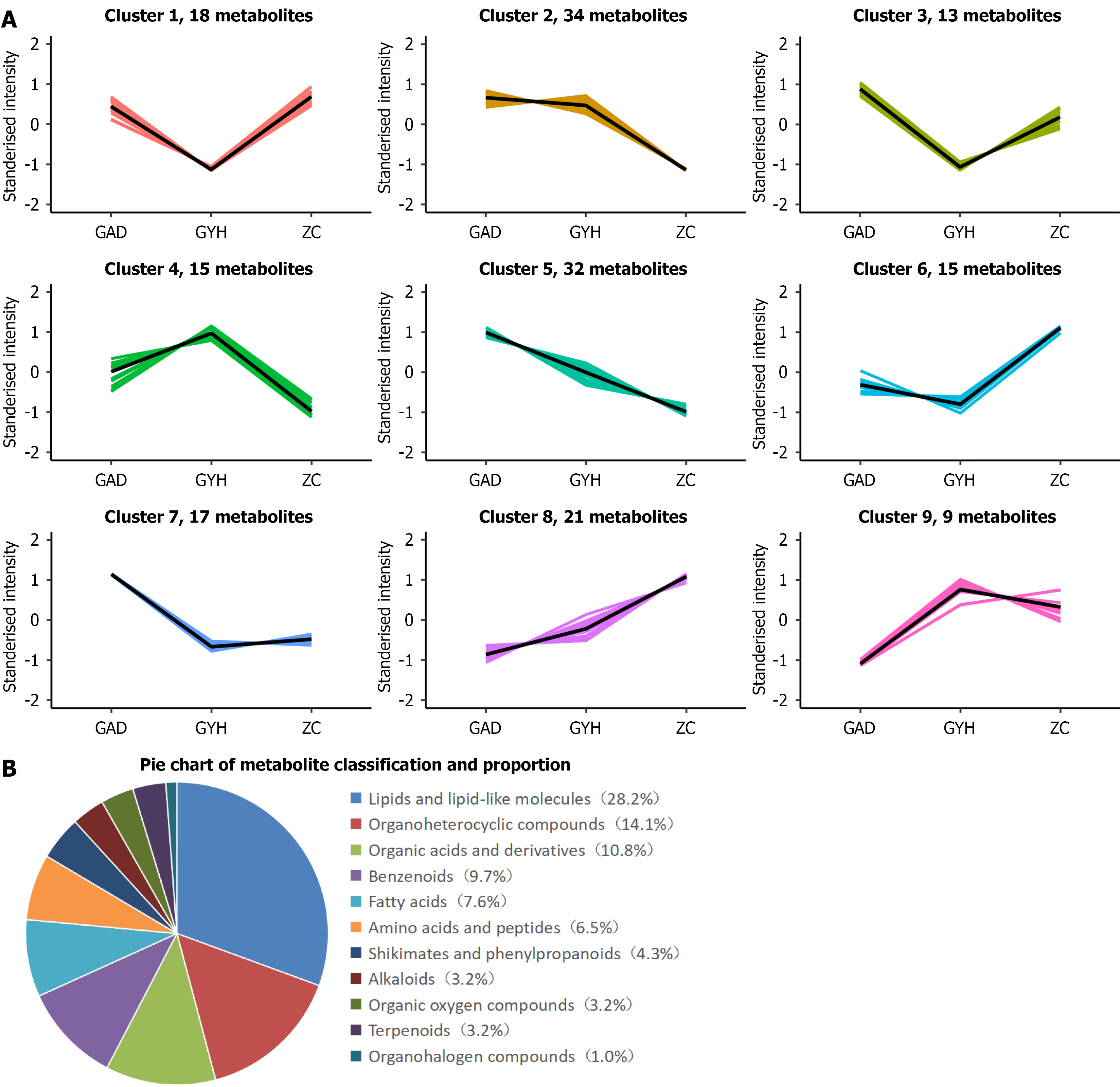
Figure 6 K-means plot and differential metabolites proportion.
A: K-means plot, the horizontal coordinate in the figure represents the sample group name, the vertical coordinate indicates the relative content of metabolites after normalization, and the cluster represents the same change trend as a cluster; B: The classification and proportion of differential metabolites.
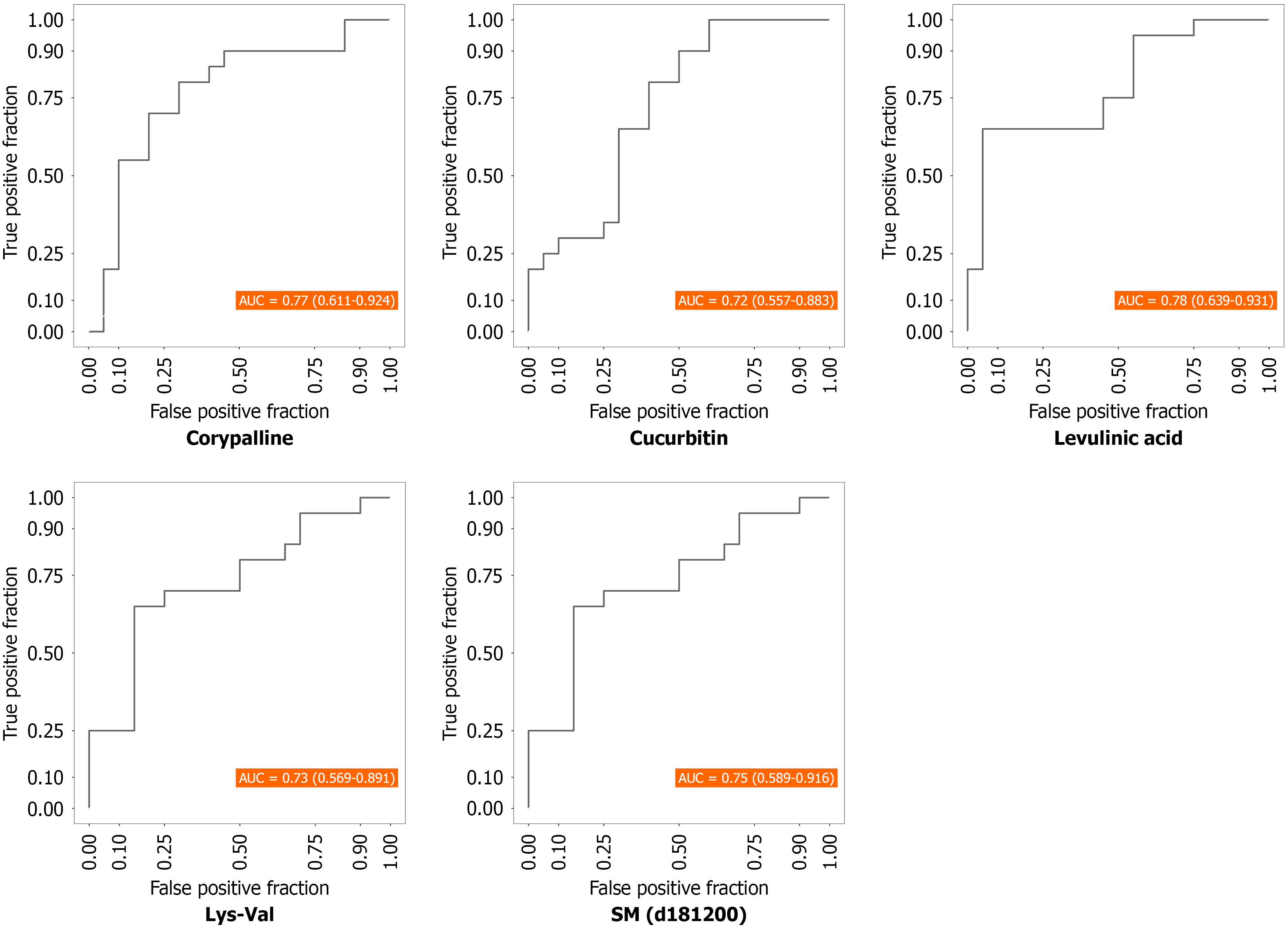
Figure 7 Receiver operating characteristic curve.
The results of different differential metabolites: Levulinic acid, Corypalline, sphingomyeli (d18:1/20:0), lysine-valine, and cucurbitin. SM: Sphingomyelin; Lys-Val: Lysine-valine.
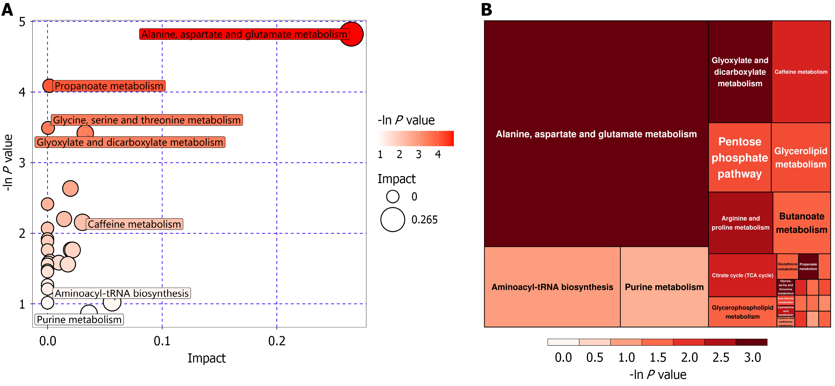
Figure 8 Bubble diagram for metabolic pathway analysis and rectangular treemap for metabolic pathway analysis.
A: Bubble diagram for metabolic pathway analysis. Each bubble in the bubble chart represents a metabolic pathway. The horizontal coordinates of the bubble and bubble size represent the influence factors of the pathway in topological analysis, the larger the bubble size, the larger the influence factor; the vertical coordinate of the bubble and bubble color represent the P value of the enrichment analysis [take the negative natural logarithm, i.e. -ln(P)]. The darker the bubble color, the smaller the P value and the more significant the enrichment degree; B: Rectangular treemap for metabolic pathway analysis. Each block in the figure represents a metabolic pathway. The size of the block indicates the influence factor of the pathway in topological analysis, the larger the block size, the larger the influence factor; the color of the block represents the P value of the enrichment analysis [take the negative natural logarithm, i.e. -ln(P)], the darker the block color, the smaller the P value, and the more significant the degree of enrichment.
- Citation: Zhang J, Li WB, Wang XX, Han TT, Dong S, Sang YN, Lu M, Guo XH. Congqi Shoushen Tuina Method for generalized anxiety disorder: Clinical outcomes and serum metabolomic profiles. World J Psychiatry 2026; 16(7): 117803
- URL: https://www.wjgnet.com/2220-3206/full/v16/i7/117803.htm
- DOI: https://dx.doi.org/10.5498/wjp.117803