
















Copyright: ©Author(s) 2026.
World J Psychiatry. Oct 19, 2026; 16(10): 122517
Published online Oct 19, 2026. doi: 10.5498/wjp.122517
Published online Oct 19, 2026. doi: 10.5498/wjp.122517
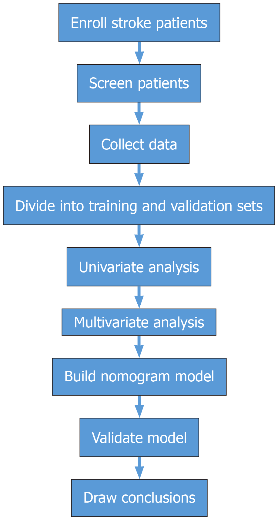
Figure 1
Flow chart of the study.
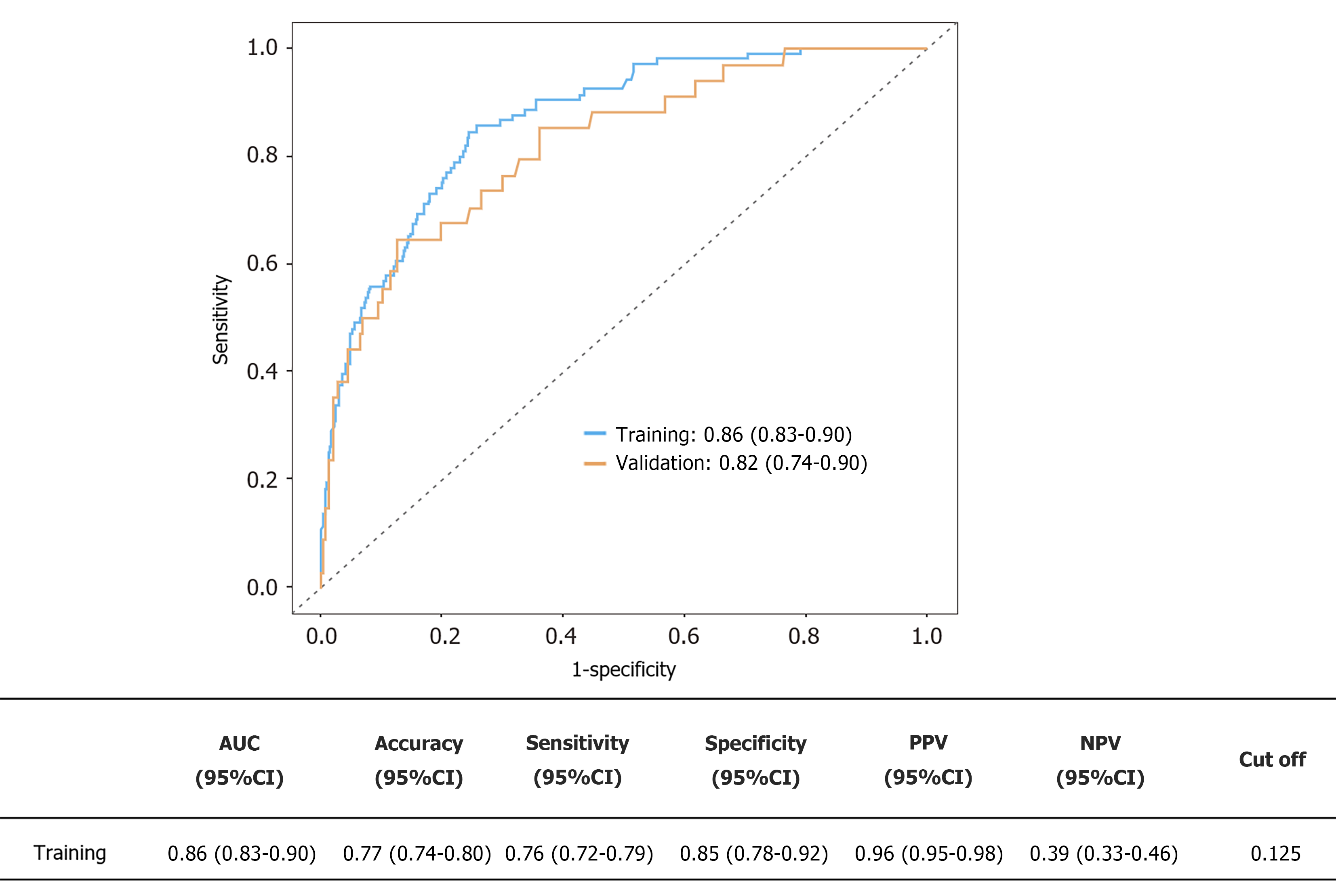
Figure 2 Receiver operating characteristic curves for assessing discriminative ability of the nomogram.
AUC: Area under the curve; CI: Confidence interval; PPV: Positive predictive value; NPV: Negative predictive value.
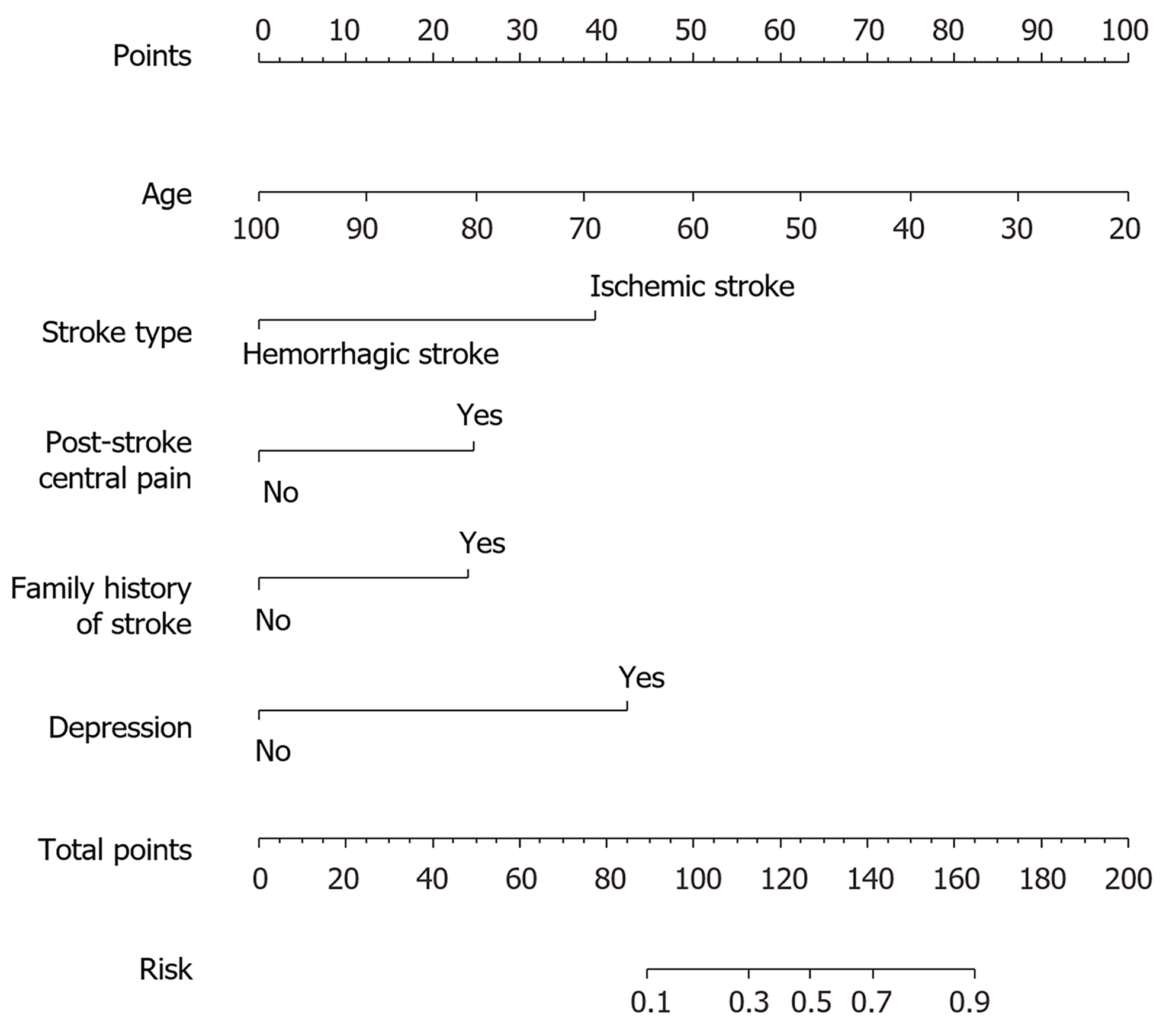
Figure 3 Nomograph for identifying post-stroke anxiety symptoms.
The nomogram incorporates five independent associated factors: Age, stroke type (ischemic vs hemorrhagic), central post-stroke pain (yes vs no), family history of stroke (yes vs no), and depression (Patient Health Questionnaire-9 ≥ 5). To utilize the nomogram, the points corresponding to each factor are summed to derive the total score, which is then mapped onto the bottom scale to estimate the probability of current anxiety symptoms (Generalized Anxiety Disorder-7 ≥ 5).
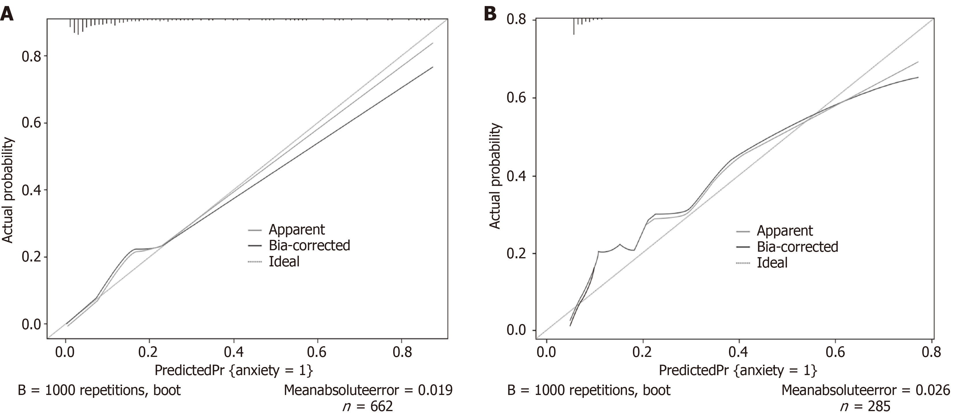
Figure 4 Calibration curve evaluating the consistency between predicted and observed post-stroke anxiety symptoms probabilities.
The dashed diagonal line denotes the ideal reference line, indicating perfect concordance between predicted and observed probabilities. In contrast, the solid line illustrates the bias-corrected calibration curve, which is obtained through bootstrap resampling with 1000 iterations. A closer alignment with the dashed line signifies superior calibration. A: Training set; B: Validation set.
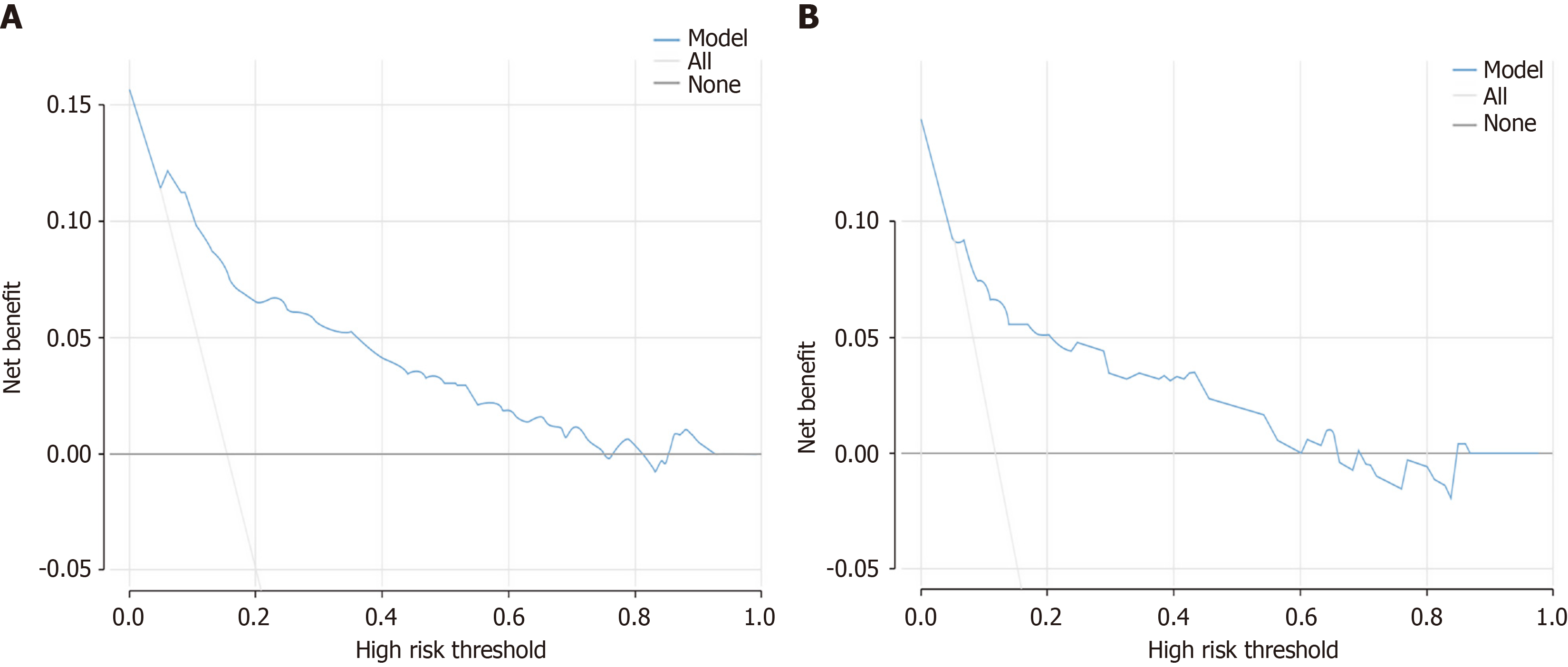
Figure 5 Decision curve analysis of the nomogram.
A: Training set; B: Validation set. The Y-axis depicts net benefit, while the X-axis denotes threshold probability. The blue curve represents the nomogram, whereas the gray descending line illustrates the “treat all” strategy. The gray horizontal line at a net benefit of zero symbolizes the “treat none” strategy.
- Citation: Luo SY, Feng L, Hong YJ, Liang J, Peng Y, Shao LH, Zhang XB. Development and validation of a nomogram model for identifying post-stroke anxiety symptoms. World J Psychiatry 2026; 16(10): 122517
- URL: https://www.wjgnet.com/2220-3206/full/v16/i10/122517.htm
- DOI: https://dx.doi.org/10.5498/wjp.122517