©The Author(s) 2025.
World J Diabetes. Aug 15, 2025; 16(8): 104879
Published online Aug 15, 2025. doi: 10.4239/wjd.v16.i8.104879
Published online Aug 15, 2025. doi: 10.4239/wjd.v16.i8.104879
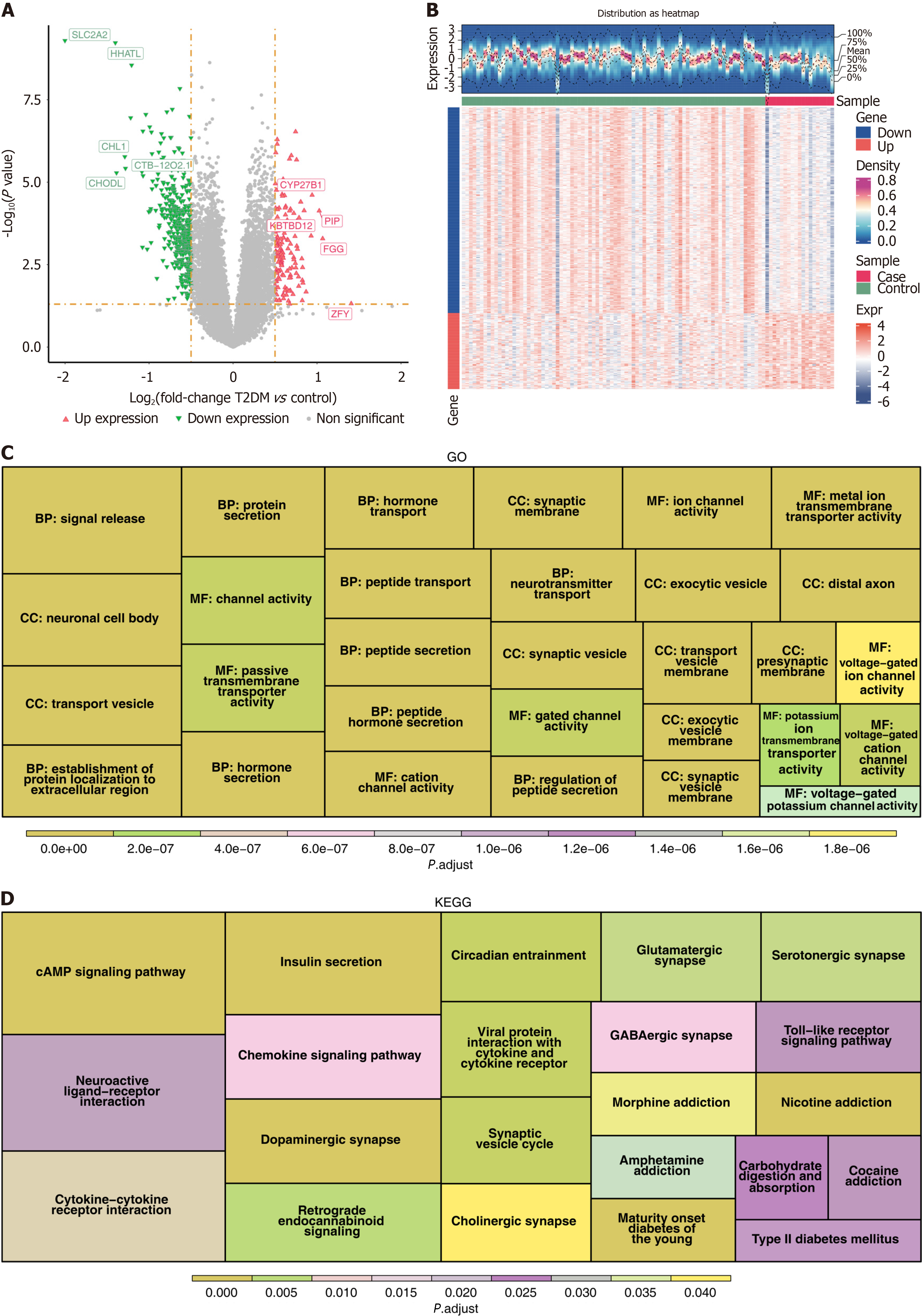
Figure 1 Differential expression analysis and functional enrichment analysis in the GSE76894 dataset.
A: Volcano plot of differentially expressed genes (DEGs) between type 2 diabetes mellitus (T2DM) and normal control (NC) samples. The horizontal axis, log2 (fold change), represented the logarithm to the base 2 of the fold change in gene expression between T2DM samples and NC samples. The vertical axis, -log10 (P value), was used to measure the significance of the differences. The smaller the P value, the larger the -log10 (P value), and the more significant the differential gene expression was. Red represented genes with up-egulated expression, while green represented genes with downregulated expression; B: Heatmap of the distribution of DEGs between T2DM and NC samples. In the upper area, the horizontal axis represented different samples, the vertical axis represented gene expression levels, the waveform plot showed the distribution density of gene expression, and the black dashed lines corresponded, from bottom to top, to the gene expression levels of the 0%, 25%, 50% (mean), 75%, and 100% quantiles; C: G of Gene Ontology (GO) terms enriched in DEGs. The regions of different colors respectively represented GO entries related to biological process, cellular component, and molecular function. Each rectangular block represented a specific GO term, and generally, the size of its area was associated with the number of genes enriched in that term; D: Graph of Kyoto Encyclopedia of Genes and Genomes (KEGG) pathways enriched by DEGs. Regions in different colors represented different KEGG pathways. Each rectangular block represented a specific KEGG pathway, and the size of its area was usually related to the number of genes enriched in that pathway.
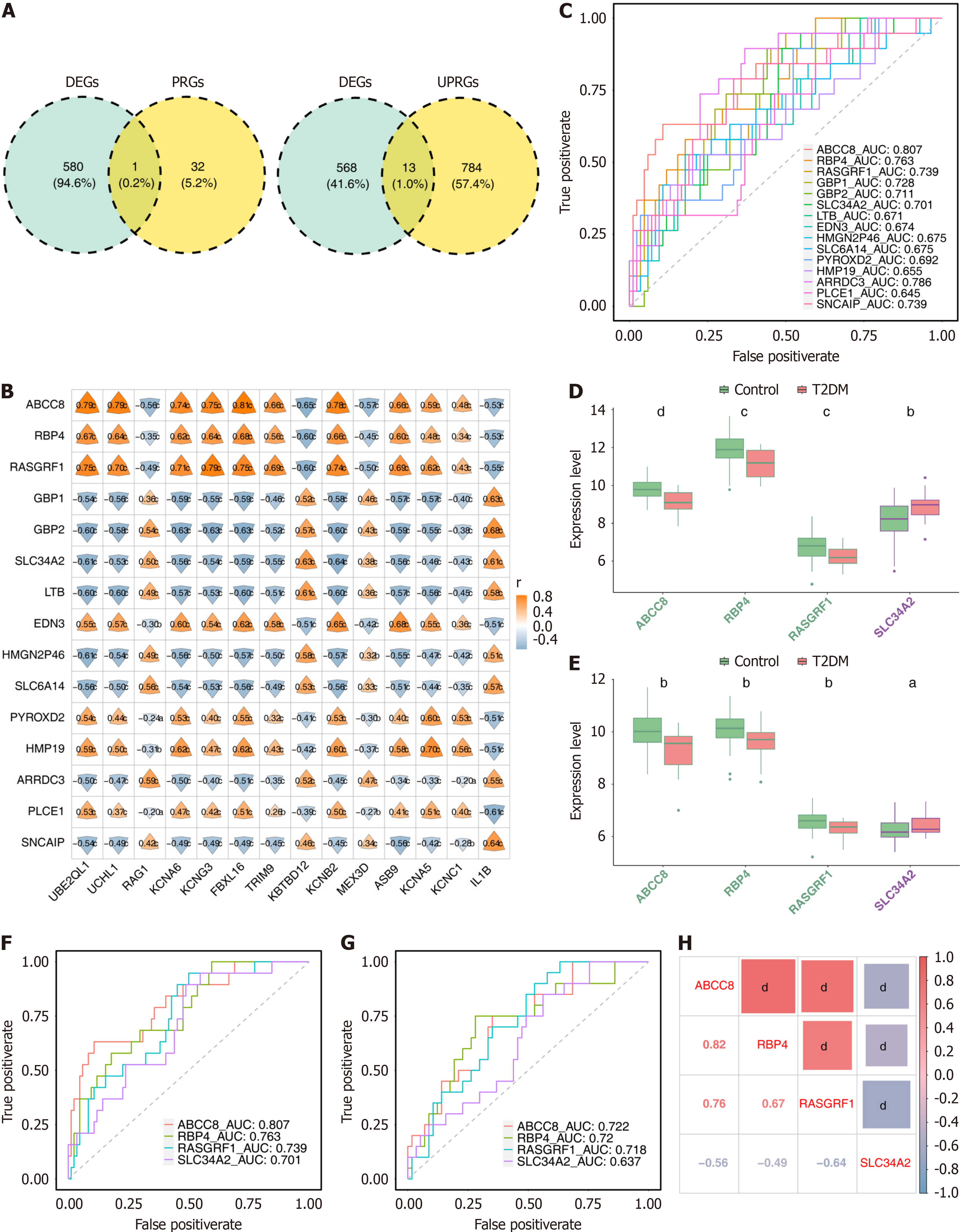
Figure 2 Identification and validation of four biomarkers.
A: Differentially expressed genes (DEGs) were intersected with ubiquitin-proteasome system related genes (UPSGs) and pyroptosis-related genes (PRGs) to recognize differentially expressed UPSGs (DEUPSGs) and differentially expressed PRGs (DEPRGs), respectively; B: Correlation analysis of DEGs to DEPRGs and DEUPSGs; C: Receiver operating characteristic (ROC) curves of candidate genes obtained by correlation analysis; D and E: Expression analysis of biomarkers in the type 2 diabetes mellitus and normal control samples in the GSE76894 and GSE41762 datasets; F and G: ROC curves of four biomarkers in the GSE76894 and GSE41762 datasets; H: Correlation analysis of biomarkers. aP < 0.05; bP < 0.01; cP < 0.001; dP < 0.0001. AUC: Area under the curve.
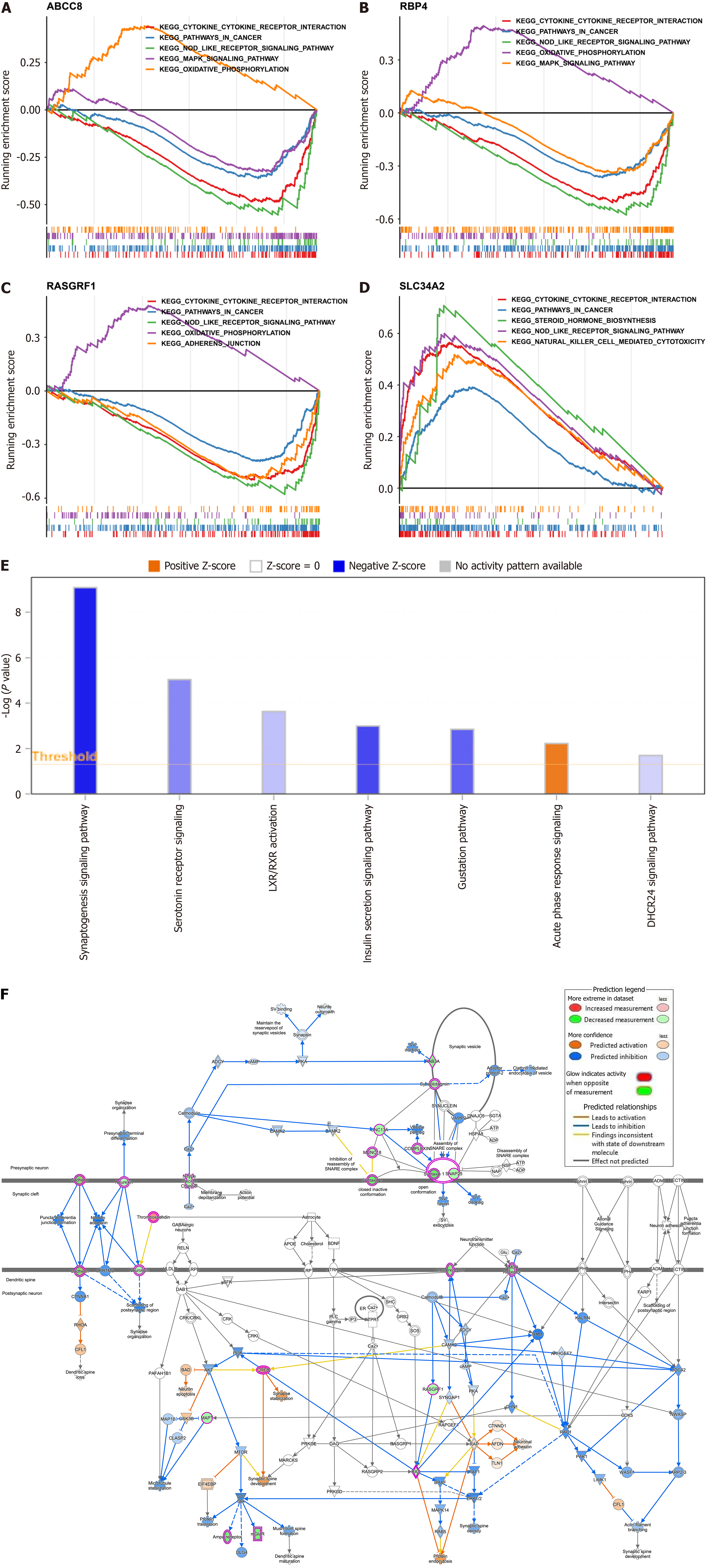
Figure 3 Investigation of potential function for biomarkers.
A-D: Gene set enrichment analysis of biomarkers (A: ATP binding cassette subfamily C member 8 [ABCC8]; B: Retinol binding protein 4 [RBP4]; C: Ras protein-specific guanine nucleotide-releasing factor 1 [RASGRF1]; D: Solute carrier family 34 member 2 [SLC34A2]); E: Results of ingenuity pathway analysis for biomarkers; F: Regulatory relationship of biomarkers and their enrichment pathways. aP < 0.05; bP < 0.01; cP < 0.001.
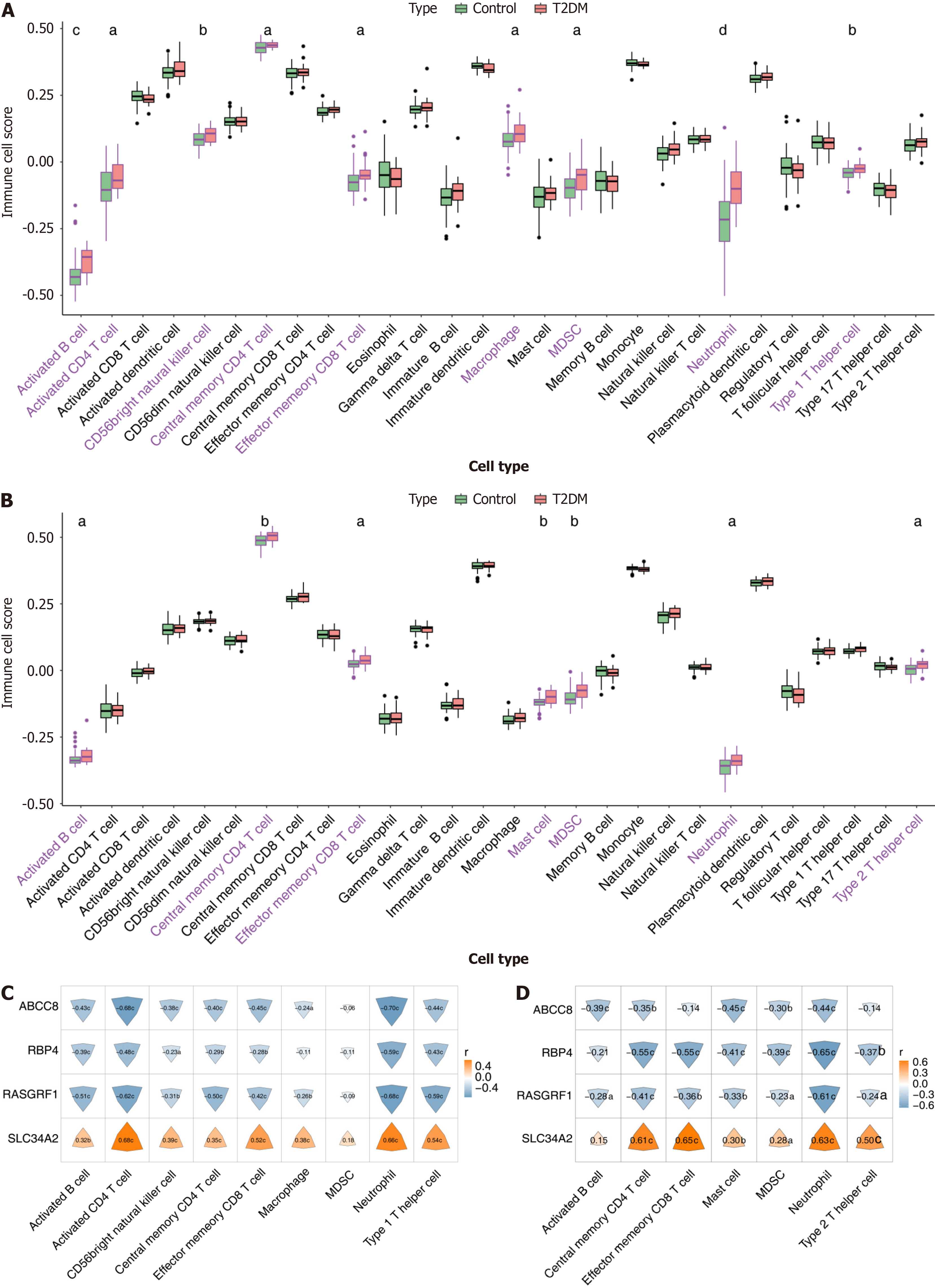
Figure 4 Immune infiltration analysis.
A and B: Comparison of immune cell scores between type 2 diabetes mellitus (T2DM) and normal control groups in training set and validation set; C and D: Correlation of biomarkers to differential immune cells in training set and validation set. The color and size of the irregular shapes in the figure represent the size of the correlation. aP < 0.05; bP < 0.01; cP < 0.001; dP < 0.0001. MDSC: Myeloid-derived suppressor cell.
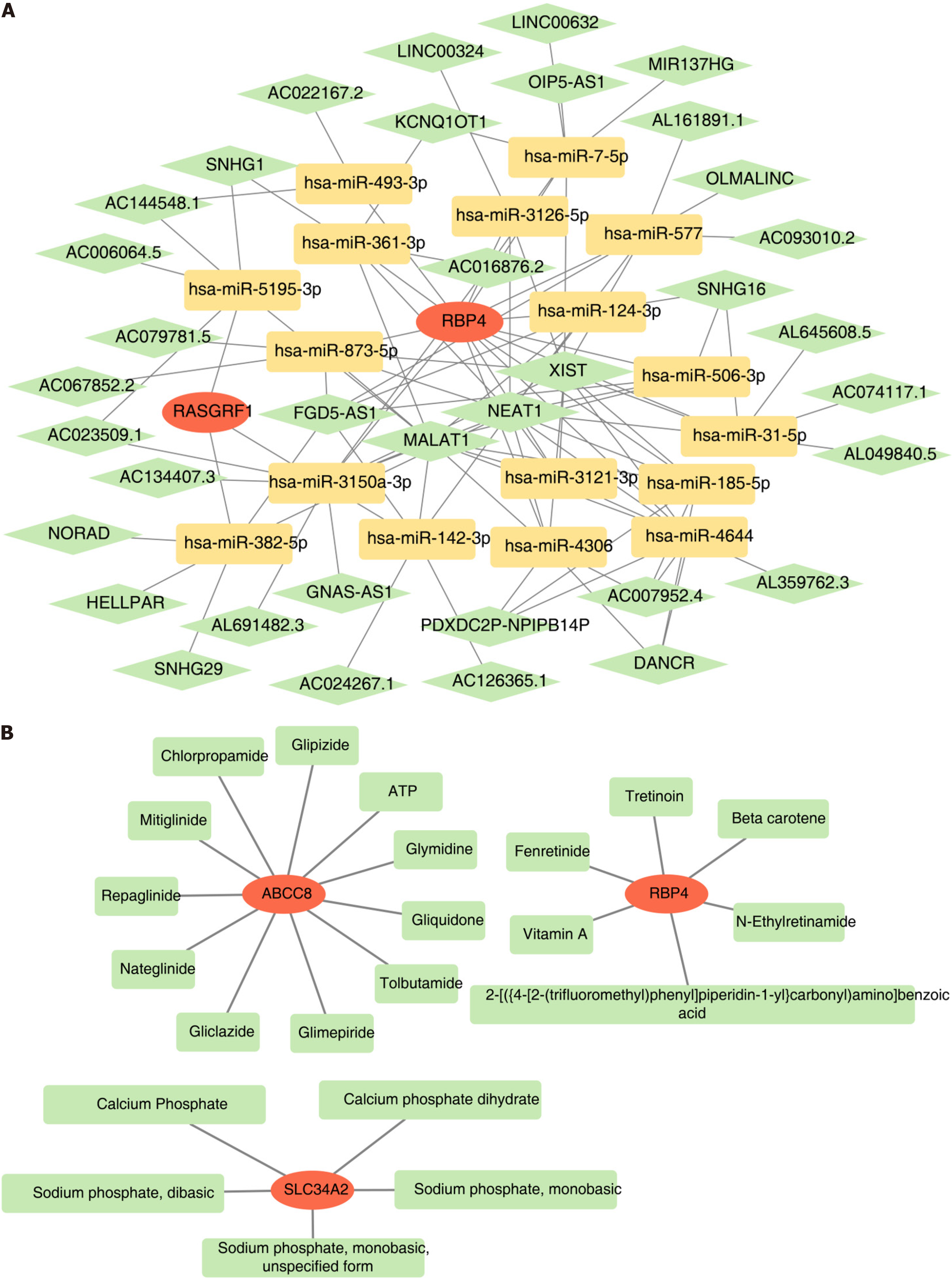
Figure 5 Exploration of biomarker regulatory mechanisms and drug prediction.
A: Construction of mRNA-microRNA (miRNA)-long non-coding RNA (lncRNA) network for biomarkers. The red graphics represent biomarkers, yellow represent miRNAs, and green represent lncRNAs; B: Regulatory network of biomarkers and targeted drugs. The red graphics represent biomarkers and green represent drugs.
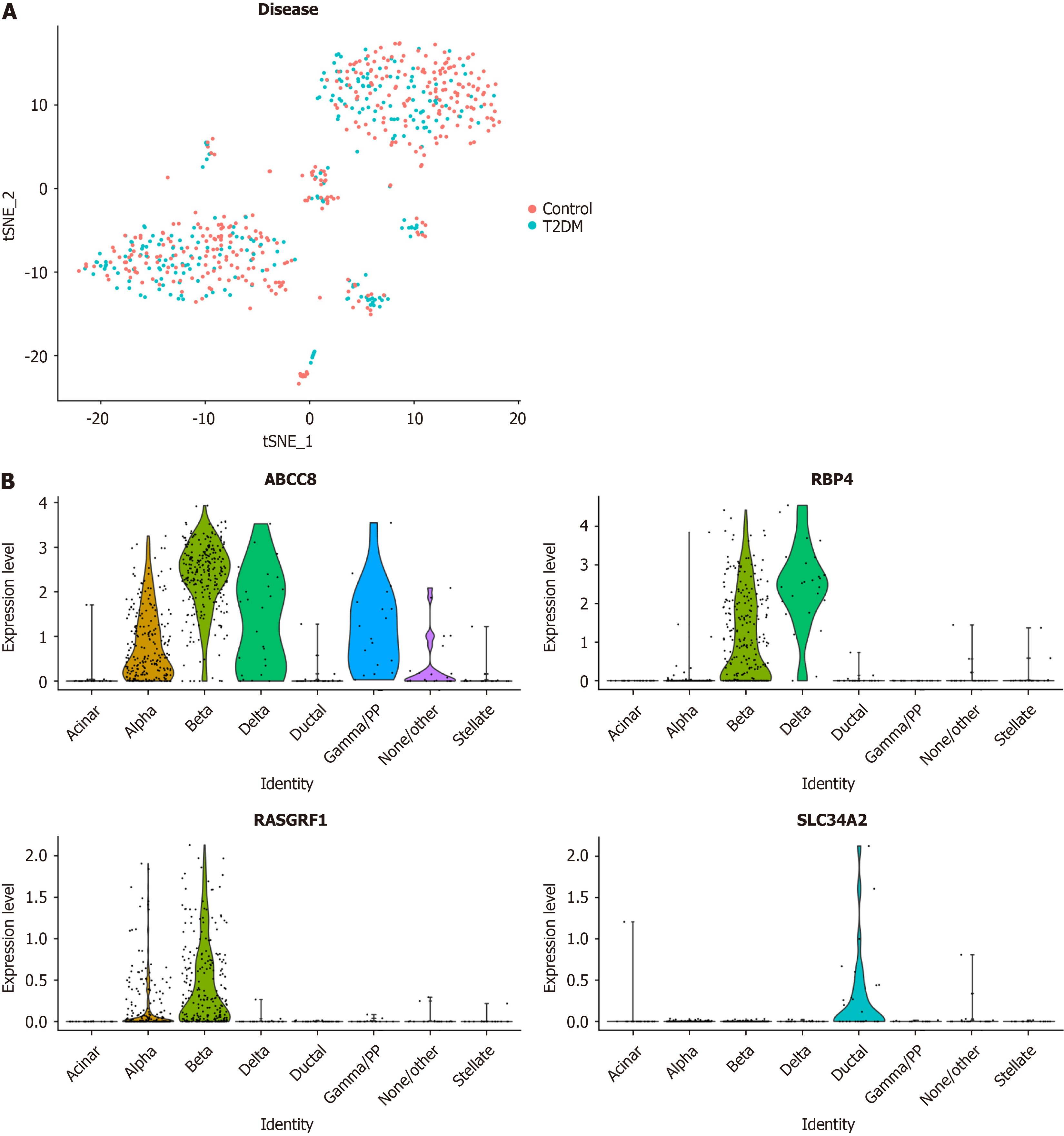
Figure 6 Expression levels of biomarkers in cells based on the single-cell RNA sequencing data.
A: Results of t-distributed Stochastic Neighbor Embedding (t-SNE) clustering results of t-SNE clustering of cells from type 2 diabetes mellitus and normal control samples; B: Expression levels of four biomarkers in eight cell types.
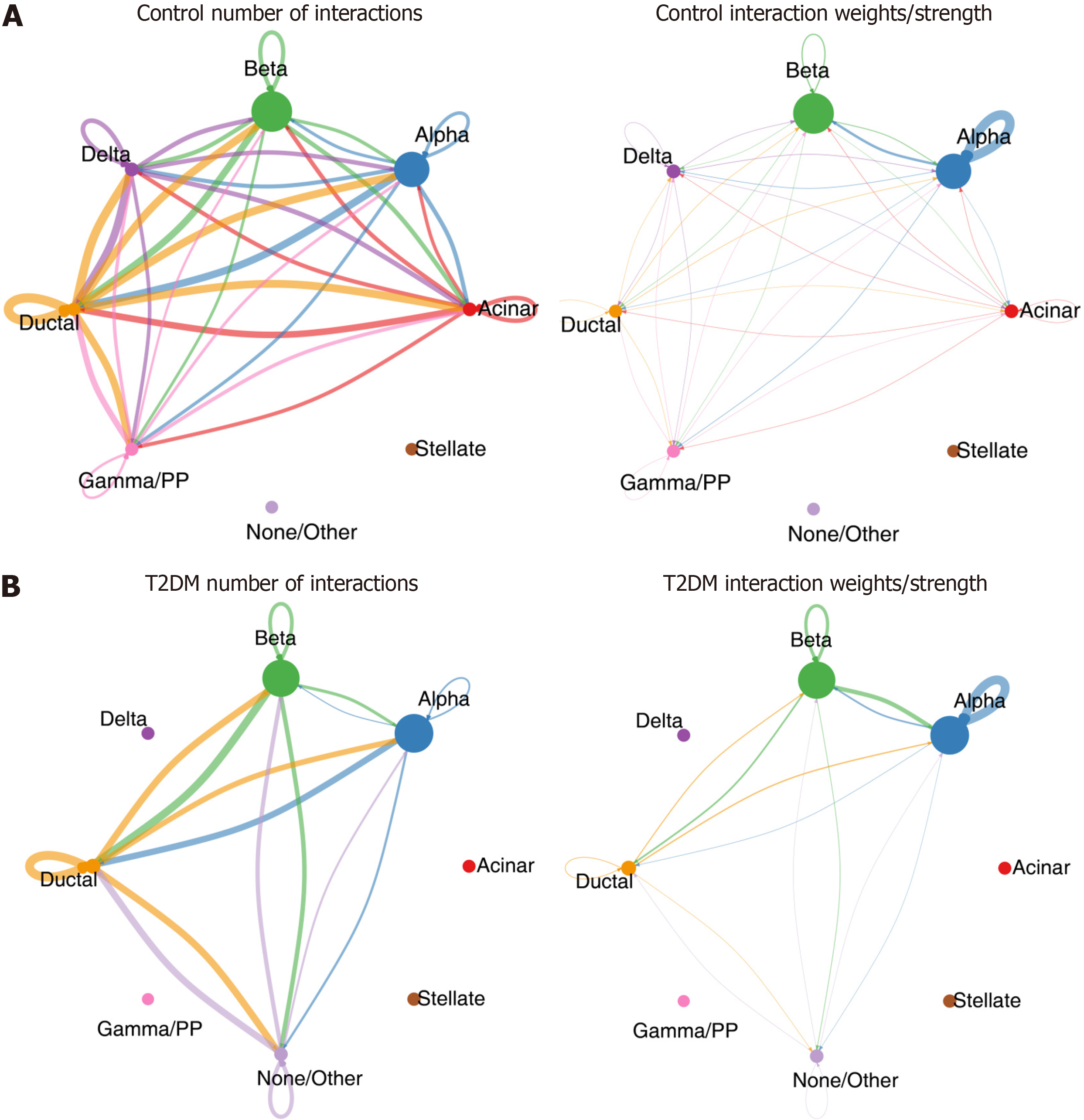
Figure 7 Results of cell-to-cell communication containing number of interactions and interaction weights/strength in type 2 diabetes mellitus and normal control samples.
A: Normal control; B: Type 2 diabetes mellitus.
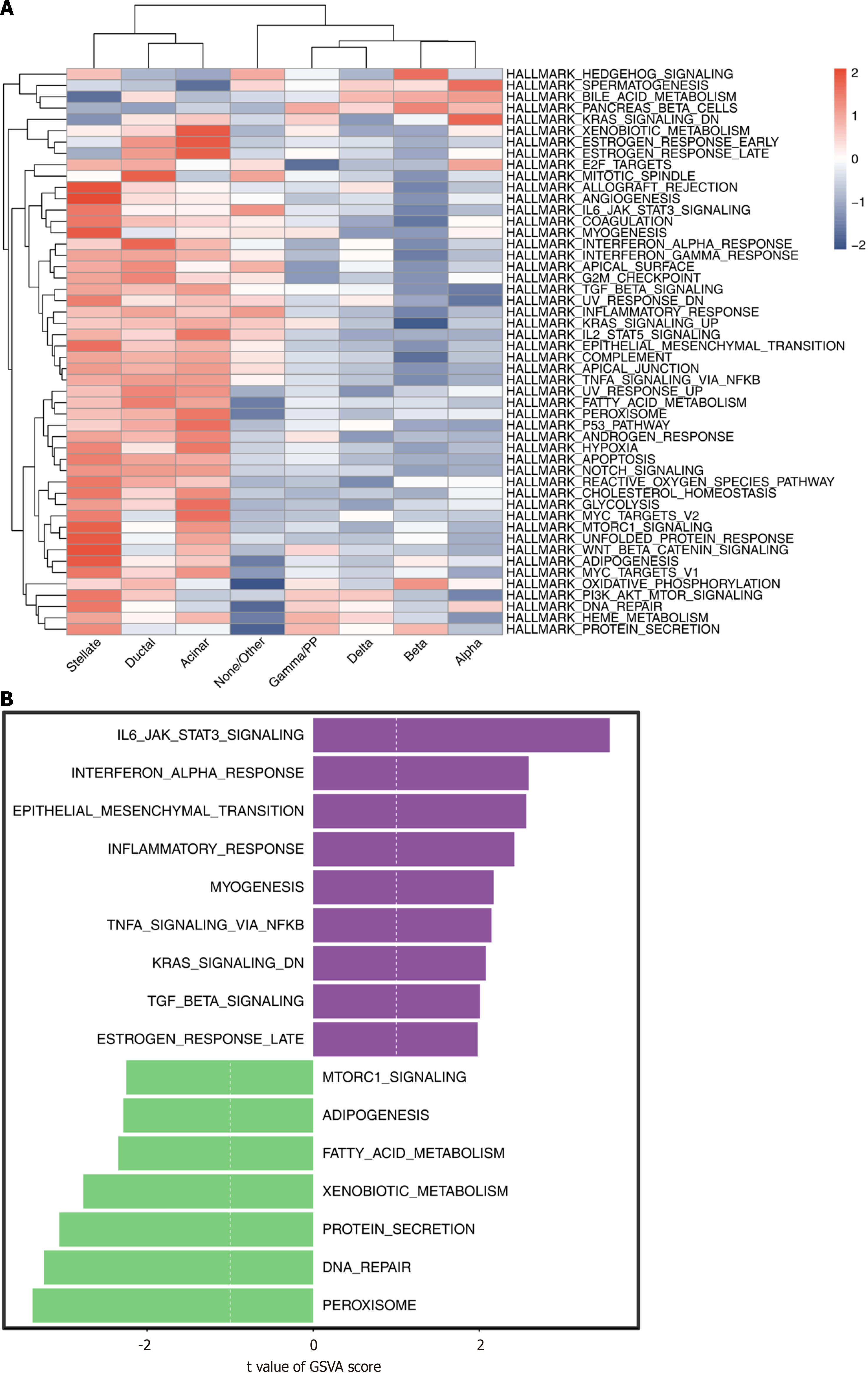
Figure 8 Gene set variation analysis.
A: Heatmap of pathways obtained by gene set variation analysis in eight cell types; B: Score of pathways enriched in type 2 diabetes mellitus and normal control groups.
Figure 9 Expression level of biomarkers in the type 2 diabetes mellitus and normal control samples by quantitative PCR.
aP < 0.05. NC: Normal control; T2DM: Type 2 diabetes mellitus.
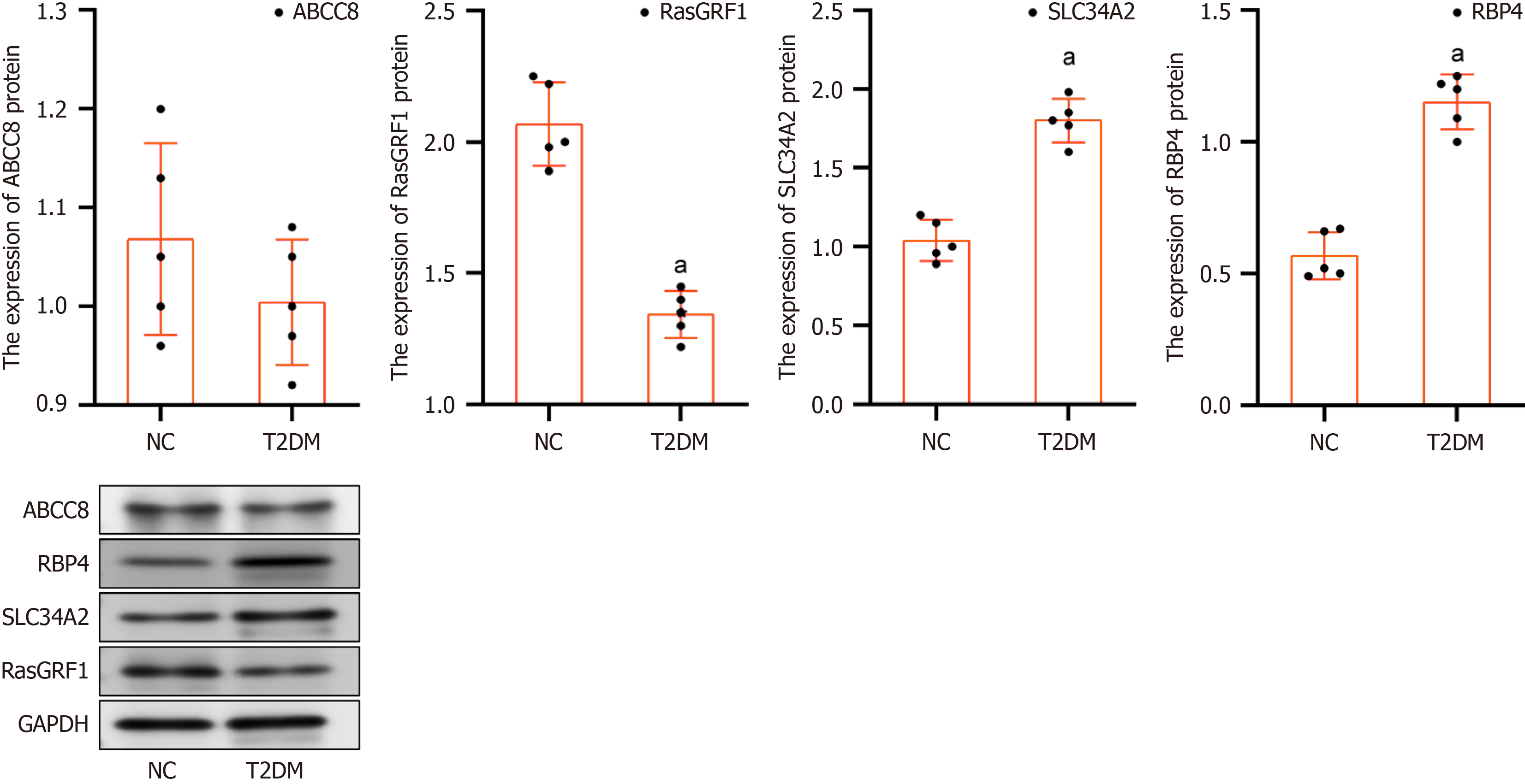
Figure 10 Expression level of biomarkers in the type 2 diabetes mellitus and normal control samples by western blot analysis.
aP < 0.05. T2DM: NC: Normal control; Type 2 diabetes mellitus.
- Citation: Yuan XJ, Zhang ZC, Li J, Ye SD, Zhou W. Identification and mechanistic insights of ubiquitin-proteasome system and pyroptosis-related biomarkers in type 2 diabetes mellitus. World J Diabetes 2025; 16(8): 104879
- URL: https://www.wjgnet.com/1948-9358/full/v16/i8/104879.htm
- DOI: https://dx.doi.org/10.4239/wjd.v16.i8.104879


