©The Author(s) 2025.
World J Diabetes. Jul 15, 2025; 16(7): 104789
Published online Jul 15, 2025. doi: 10.4239/wjd.v16.i7.104789
Published online Jul 15, 2025. doi: 10.4239/wjd.v16.i7.104789
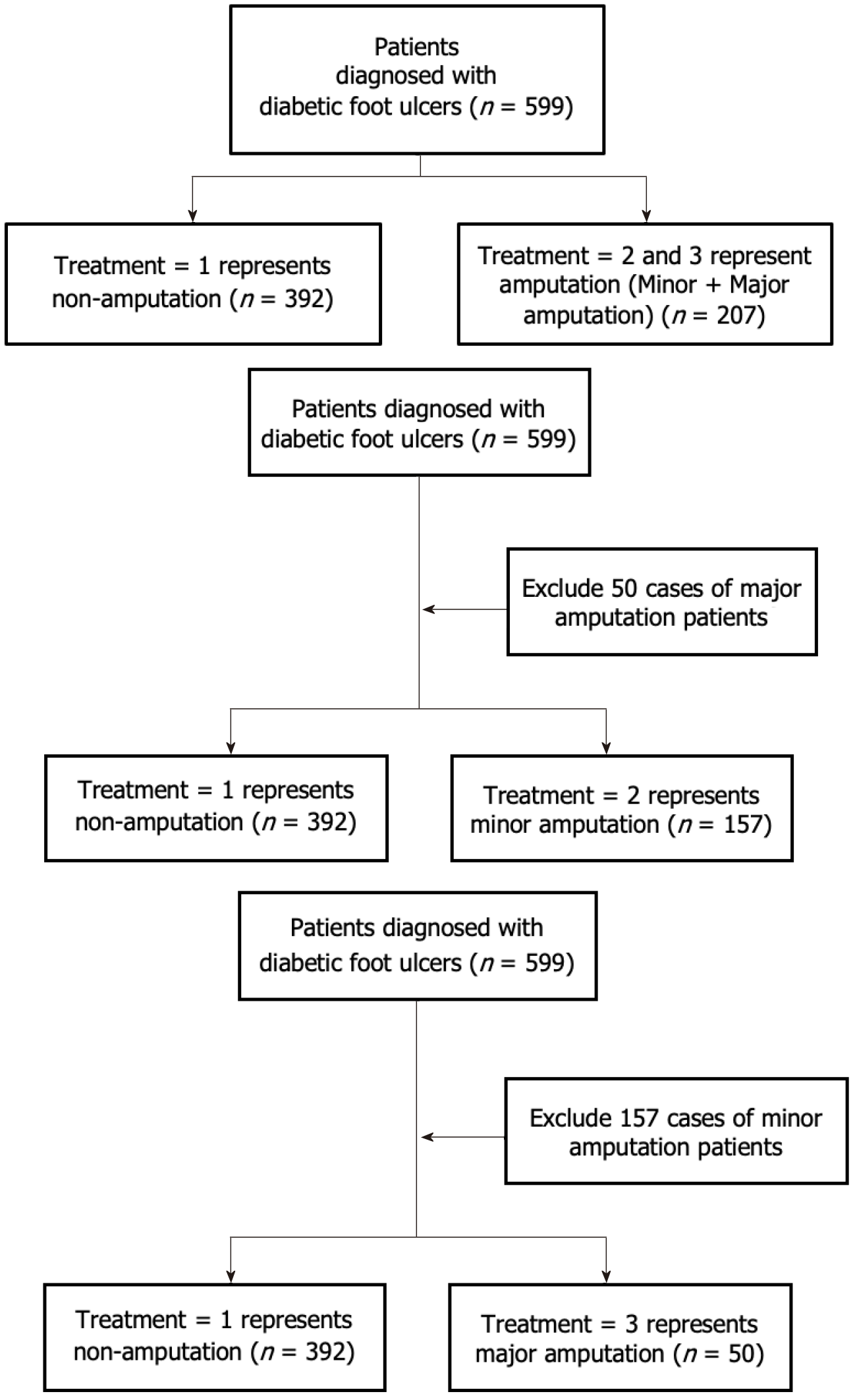
Figure 1 Multi-classification grouping flow chart of amputation prediction for diabetic foot ulcer patients.
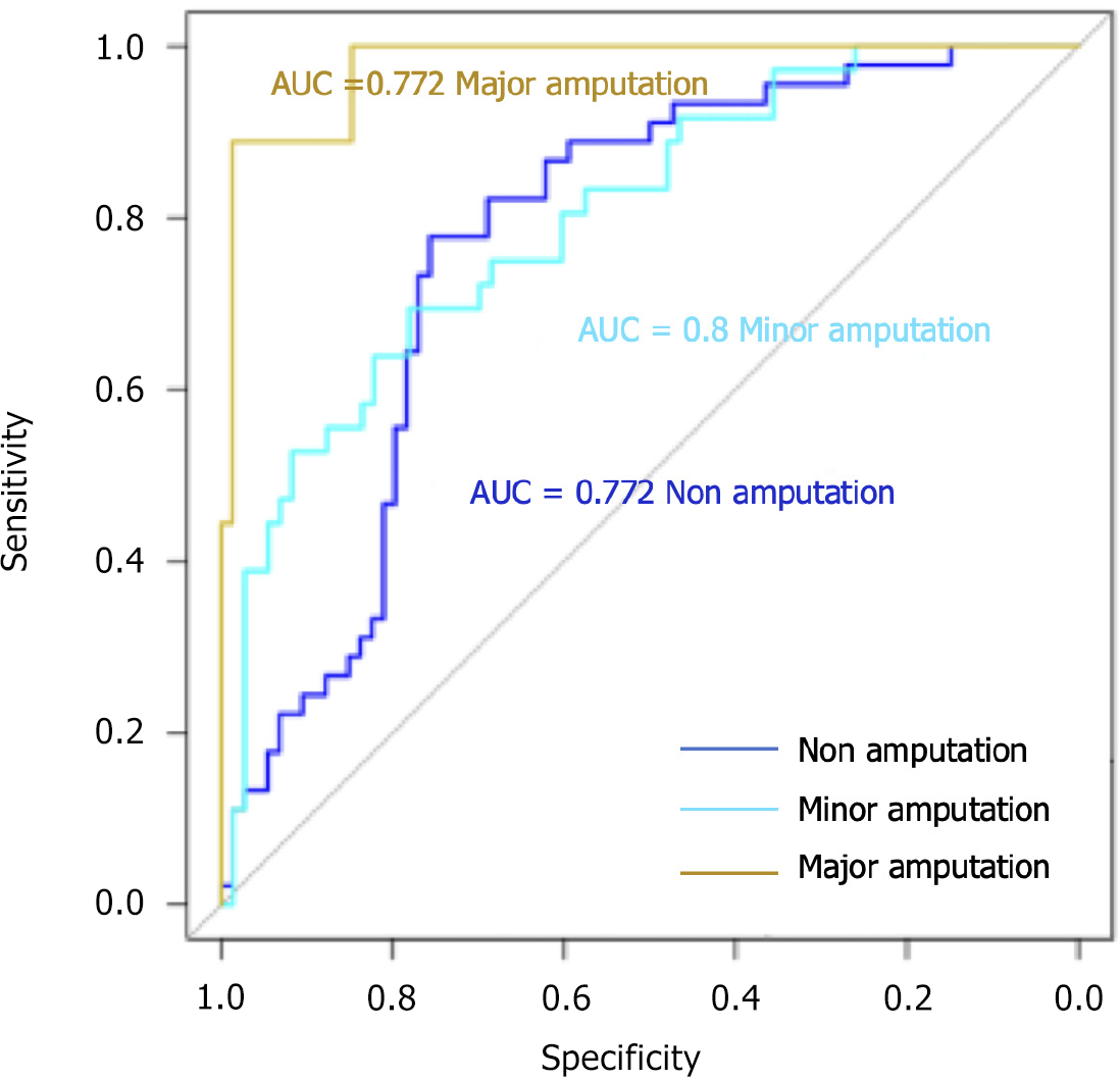
Figure 2 Receiver operating characteristic curves of the multi-category classification model.
AUC: Area under the curve.
Figure 3 Confusion matrix of three classification models based on eXtreme Gradient Boosting.
Different colors represent different frequencies, with the horizontal axis representing predicted values and the vertical axis representing actual values.
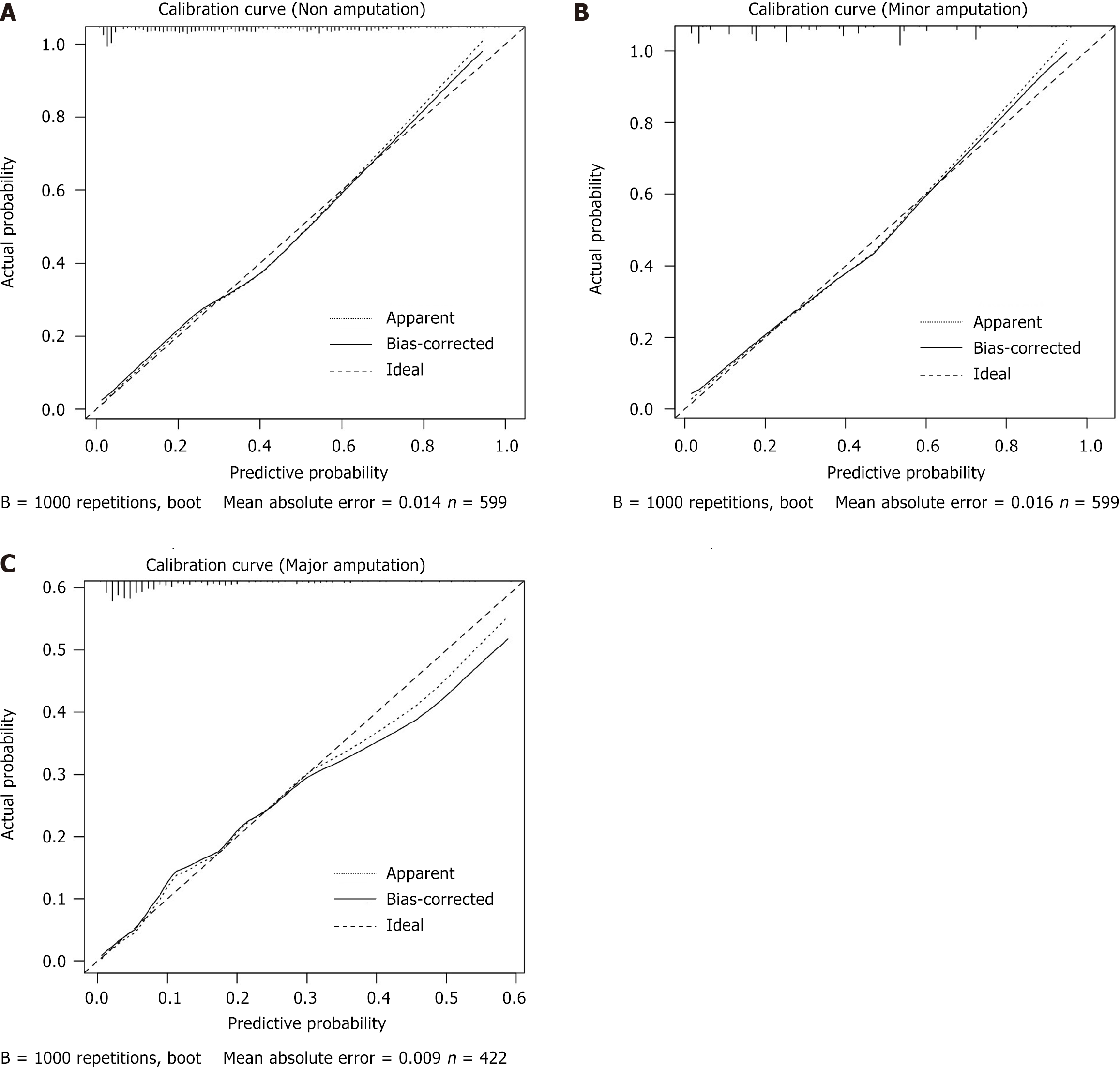
Figure 4 Calibration curves for three classification models.
A: Calibration curves for non-amputation model; B: Calibration curves for minor amputation model; C: Calibration curves for major amputation model. Apparent calibration (dotted line): This curve represents the raw, uncorrected calibration of the predicted probabilities of the model against the actual probabilities. The predictions of the model are plotted directly, and the apparent curve often deviates from the ideal (diagonal) line, indicating some level of bias in the model’s prediction. Bias-corrected calibration (solid line): This curve corrects for the bias observed in the apparent calibration curve. It adjusts the predictions to improve alignment with the observed outcomes, reducing the systematic under- or overestimation of probabilities. Ideal calibration (dashed line): This represents perfect calibration, where the predicted probabilities perfectly match the actual probabilities. In an ideally calibrated model, the curve would coincide with the dashed line, indicating perfect agreement between predicted and observed probabilities. Mean absolute error (0.009): The calculated error value indicates the average discrepancy between the predicted probabilities and the actual outcomes. A lower value (such as 0.009 in this case) suggests good calibration, with minor deviations between predicted and actual probabilities. B = 1000 repetitions, boot: This suggests that bootstrapping was used to calculate confidence intervals and improve the stability of the calibration curve, based on 1000 resampling iterations.
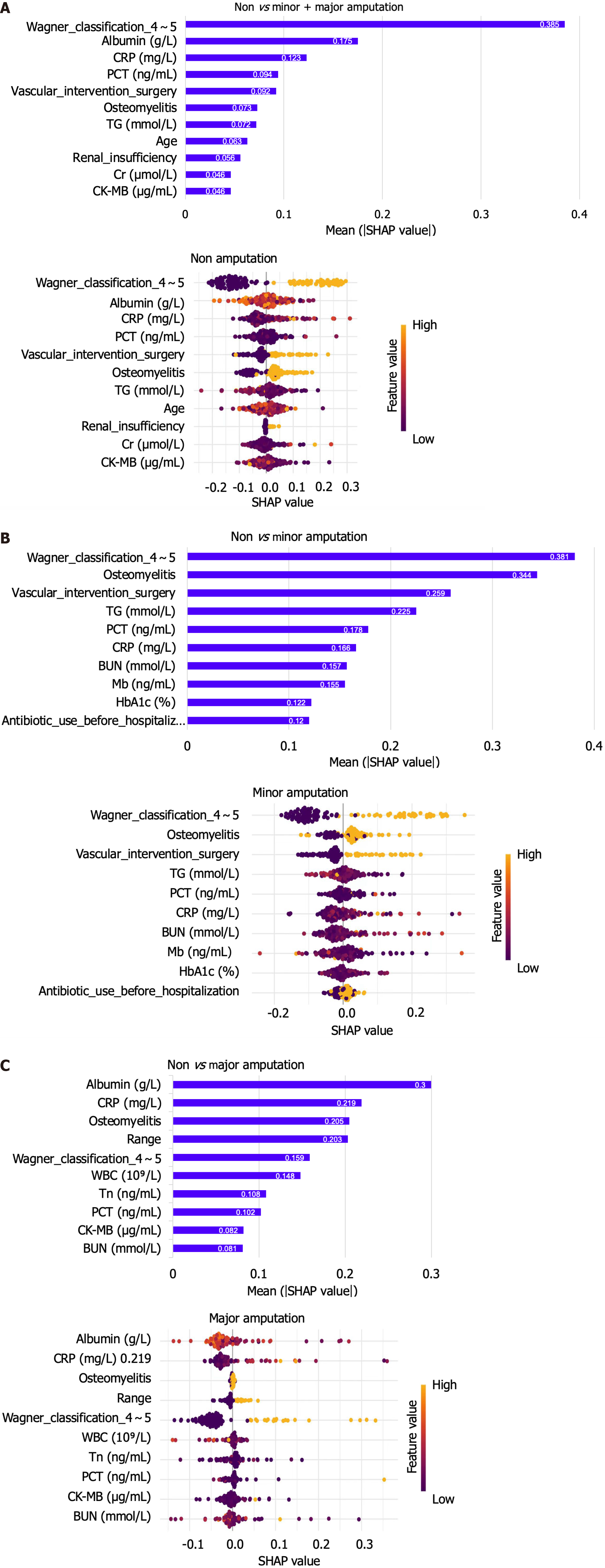
Figure 5 The weights of variable importance and the Beeswarm diagram drawn by SHapley Additive exPlanation to explain the three classification models.
A: The weights of variable importance and the Beeswarm diagram drawn by SHapley Additive explanation (SHAP) to explain the non-amputation model; B: The weights of variable importance and the Beeswarm diagram drawn by SHAP to explain the Minor amputation model; C: The weights of variables importance and the Beeswarm diagram drawn by SHAP to explain the Major amputation model. The values in the bar chart represent the contribution value of each feature, the colors in SHAP value represent the level of correlation, and the left side of 0 represents negative correlation, while the right side represents positive correlation. SHAP: SHapley Additive exPlanation.
- Citation: Gao L, Liu ZX, Wang JN. Predictive model and risk analysis for outcomes in diabetic foot ulcer using eXtreme Gradient Boosting algorithm and SHapley Additive exPlanation. World J Diabetes 2025; 16(7): 104789
- URL: https://www.wjgnet.com/1948-9358/full/v16/i7/104789.htm
- DOI: https://dx.doi.org/10.4239/wjd.v16.i7.104789


