
















Copyright: ©Author(s) 2026.
World J Gastroenterol. Nov 7, 2026; 32(41): 121893
Published online Nov 7, 2026. doi: 10.3748/wjg.121893
Published online Nov 7, 2026. doi: 10.3748/wjg.121893
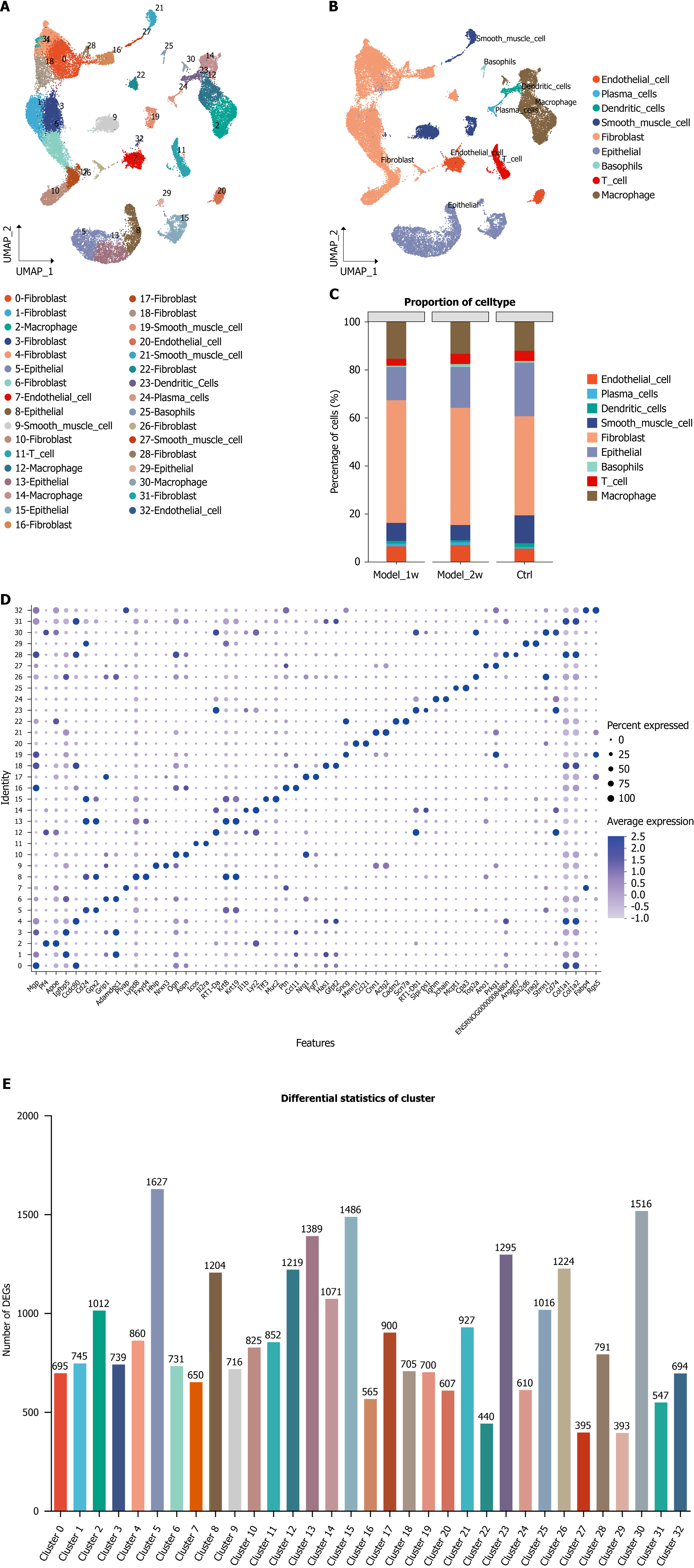
Figure 1 Single-cell transcriptomic landscape of internal hemorrhoidal.
A and B: The X-axis and Y-axis denote dimensionality-reduced components; different cell clusters are distinguished by distinct colors; C: Bar plot showing the relative proportions of 9 major cell types in the control, 1 week of modeling and 2 weeks of modeling groups (n = 5 rats per group). Differences in cell proportions among groups were analyzed using the Kruskal-Wallis H test with the Benjamini-Hochberg correction. Adjust P < 0.05 vs the control group; D: The X-axis indicates normalized gene expression; each dot indicates differential gene expression in each cell; and the Y-axis indicates clusters; E: The X-axis indicates colored clusters; the Y-axis indicates the number of differentially expressed genes per cluster.

Figure 2 Visualization of the subpopulations of internal hemorrhoid cells.
A, D, G, and J: The X-axis and Y-axis denote dimensionality-reduced components; different cell clusters are distinguished by distinct colors; B, E, H, and K: Different colors represent distinct cell type identities; C, F, I, and L: The X-axis indicates cell types; the Y-axis indicates normalized gene expression values; and each dot indicates the average expression of the differentially expressed genes in each cell type.
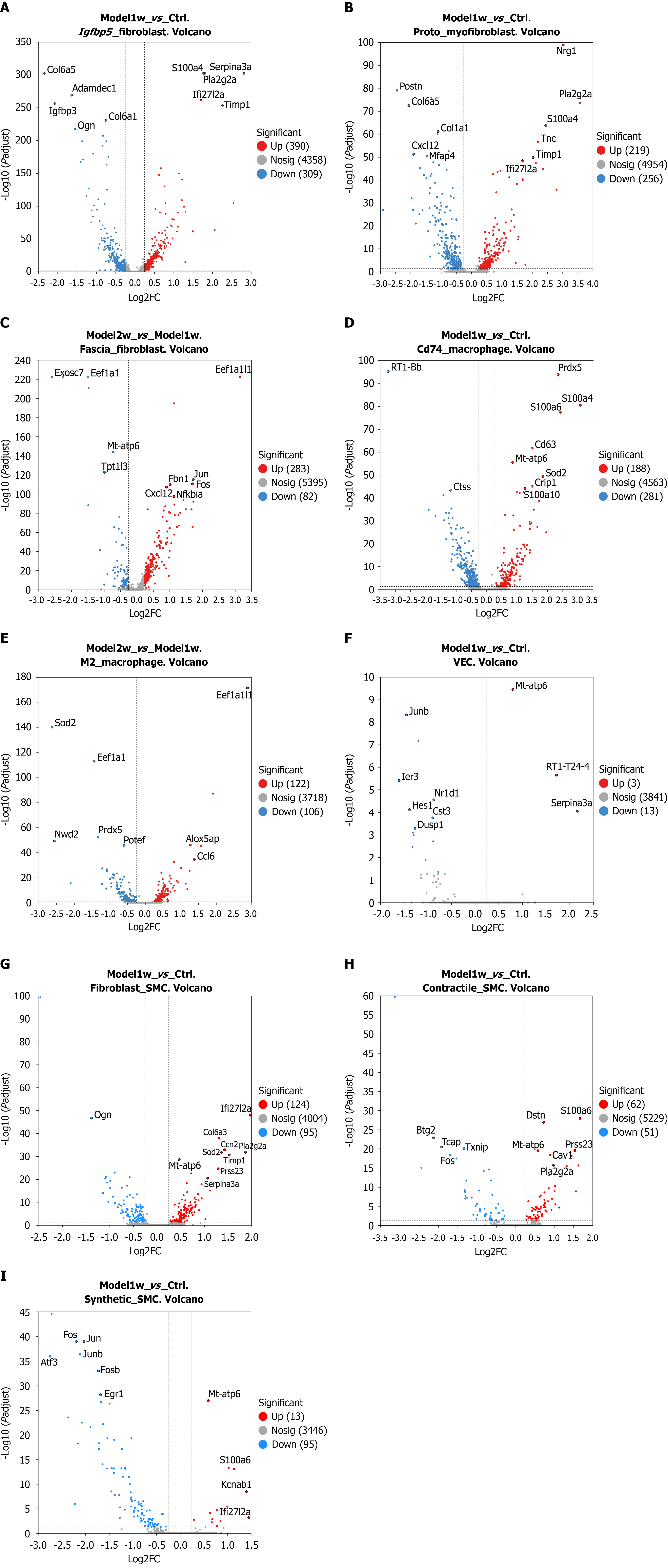
Figure 3 Volcano plots of differentially expressed genes.
The X-axes indicate the log2 fold change (log2FC) values for gene expression; the Y-axes indicate the adjusted P values (adjust P values). Adjust P < 0.05 was considered to indicate statistical significance. Each dot represents a gene: Red indicates significantly upregulated genes, blue indicates significantly downregulated genes, and gray indicates genes whose expression did not change significantly. Dots farther from the center or with larger values along the Y-axis indicate genes with more significant differences in expression. A: Igfbp5-fibroblast [1 week of modeling (Model-1w) vs control group (Ctrl)]; B: Protomyofibroblast (Model-1w vs Ctrl); C: Fascia-fibroblast [2 weeks of modeling (Model-2w) vs Model-1w]; D: Cd74-expressing macrophage (Model-1w vs Ctrl); E: M2 macrophage (Model-2w vs Model-1w); F: Vascular endothelial cell (Model-1w vs Ctrl); G: Fibroblast-smooth muscle cell (SMC) (Model-1w vs Ctrl); H: Contractile-SMC (Model-1w vs Ctrl); I: Synthetic-SMC (Model-1w vs Ctrl). Ctrl: Control group; Model-1w: 1 week of modeling; Model-2w: 2 weeks of modeling; VEC: Vascular endothelial cell; SMC: Smooth muscle cell.
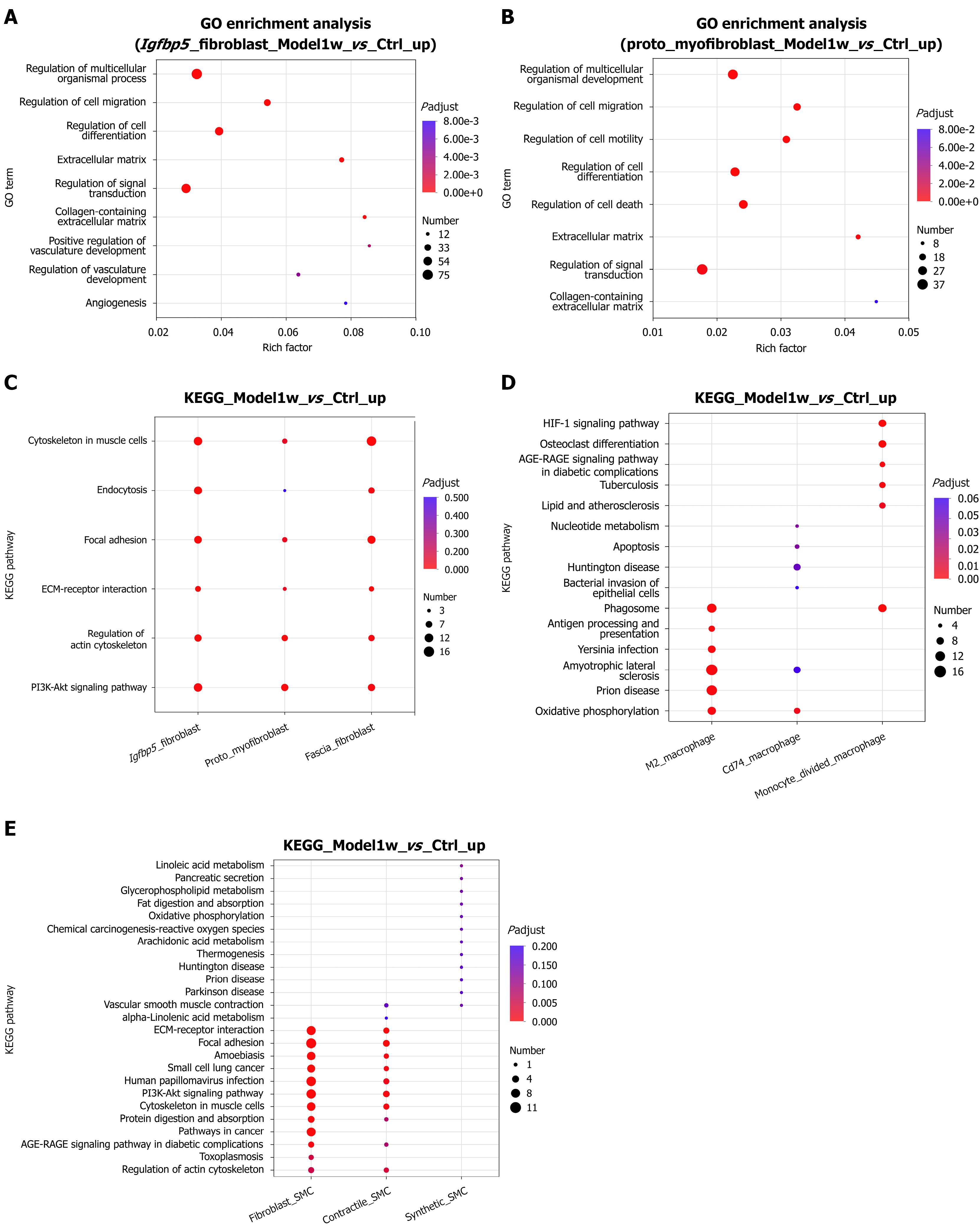
Figure 4 Plots of the results of the Gene Ontology and Kyoto Encyclopedia of Genes and Genomes enrichment analyses.
The Y-axes indicate the names of the Gene Ontology (GO) terms or Kyoto Encyclopedia of Genes and Genomes (KEGG) pathways; the X-axes indicate the Rich factors (higher values indicate stronger enrichment). The dot size represents the number of genes; the dot color corresponds to the range of adjust P values. Adjust P < 0.05 was considered to indicate statistical significance. A: GO enrichment analysis of upregulated genes in Igfbp5-fibroblast [1 week of modeling (Model-1w) vs control group (Ctrl)]; B: GO enrichment analysis of upregulated genes in Protomyofibroblast (Model-1w vs Ctrl); C: KEGG pathway enrichment analysis of upregulated genes in three fibroblast subsets (Igfbp5-fibroblast, protomyofibroblast, and fascia-fibroblast) (Model-1w vs Ctrl); D: KEGG pathway enrichment analysis of upregulated genes in three macrophage subsets (M2 macrophage, Cd74-expressing macrophage, and monocyte-derived macrophage) (Model-1w vs Ctrl); E: KEGG pathway enrichment analysis of upregulated genes in three SMC subsets (fibroblast-smooth muscle cell (SMC), contractile-SMC, and synthetic-SMC) (Model-1w vs Ctrl). GO: Gene Ontology; KEGG: Kyoto Encyclopedia of Genes and Genomes.
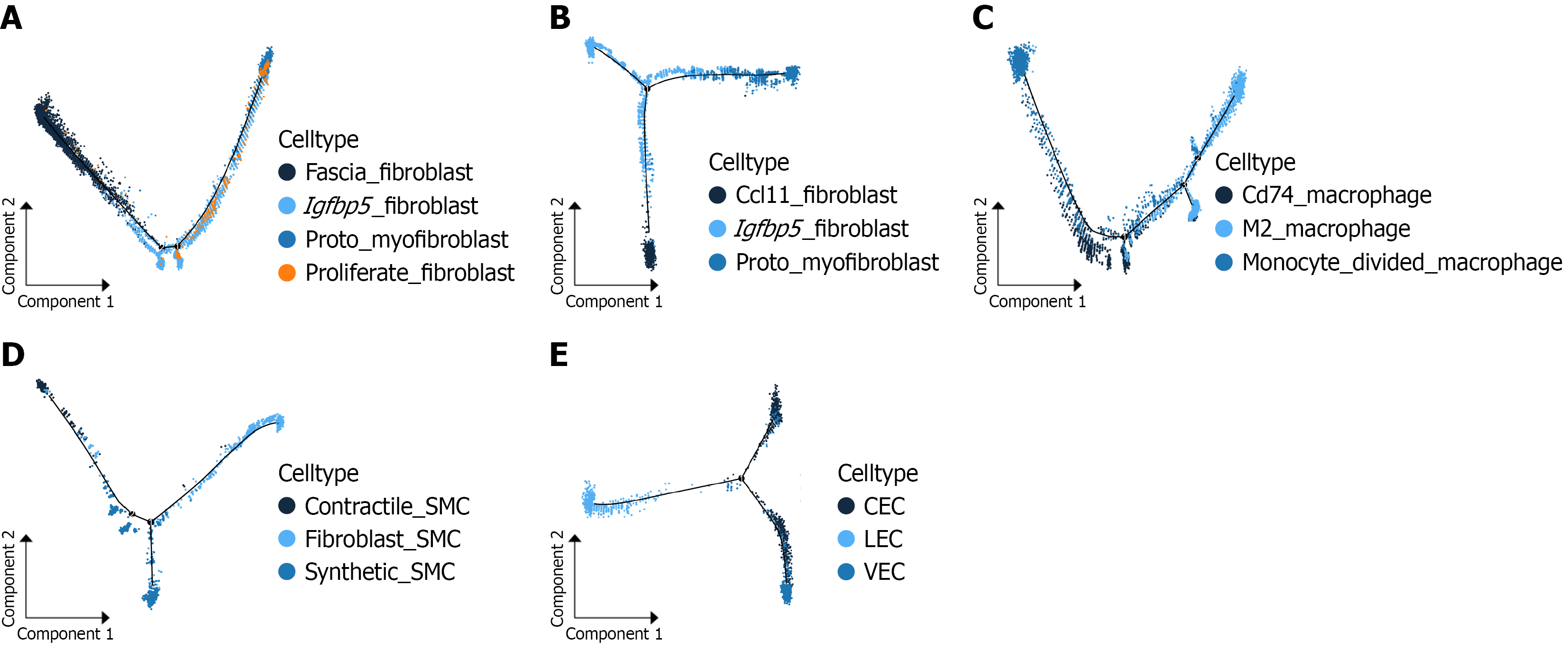
Figure 5 Pseudotime plots.
Each dot represents a cell arranged along a pseudotime trajectory. Color gradients indicate cell state transitions; numbers in black circles indicate differentiation nodes. A: Pseudotime trajectory analysis of four fibroblast subsets (fascia-fibroblast, Igfbp5-fibroblast, protomyofibroblast, and proliferate-fibroblast); B: Pseudotime trajectory analysis of three fibroblast subsets (Ccl11-fibroblast, Igfbp5-fibroblast, and protomyofibroblast); C: Pseudotime trajectory analysis of three macrophage subsets (Cd74-expressing macrophage, M2 macrophage, and monocyte-derived macrophage); D: Pseudotime trajectory analysis of three smooth muscle cell (SMC) subsets: Fibroblast-SMC, contractile-SMC, and synthetic-SMC; E: Pseudotime trajectory analysis of three endothelial cell subsets: Circulating endothelial cell, lymphatic endothelial cell, and vascular endothelial cell. SMC: Smooth muscle cell; CEC: Circulating endothelial cell; LEC: Lymphatic endothelial cell; VEC: Vascular endothelial cell.

Figure 6 Spatial transcriptome profiling of internal hemorrhoids.
A: Images of hematoxylin and eosin staining; B: Dot plots of the spatial transcriptomic results. The clustering results from Seurat are overlaid on tissue sections; each dot indicates one spot, and different colors indicate each cluster; C: Maps of cell type annotations; D: Maps of the spatial deconvolution analysis of fibroblast subsets; E: Bubble plot of the top 3 marker genes per group; F: Maps showing the results of the dimensionality reduction clustering analysis; G: Maps showing the spatial localization of highly expressed genes; darker red dots indicate genes with higher expression in the spots; H: Violin plots. Ctrl: Control group; Model-1w: 1 week of modeling; Model-2w: 2 weeks of modeling.
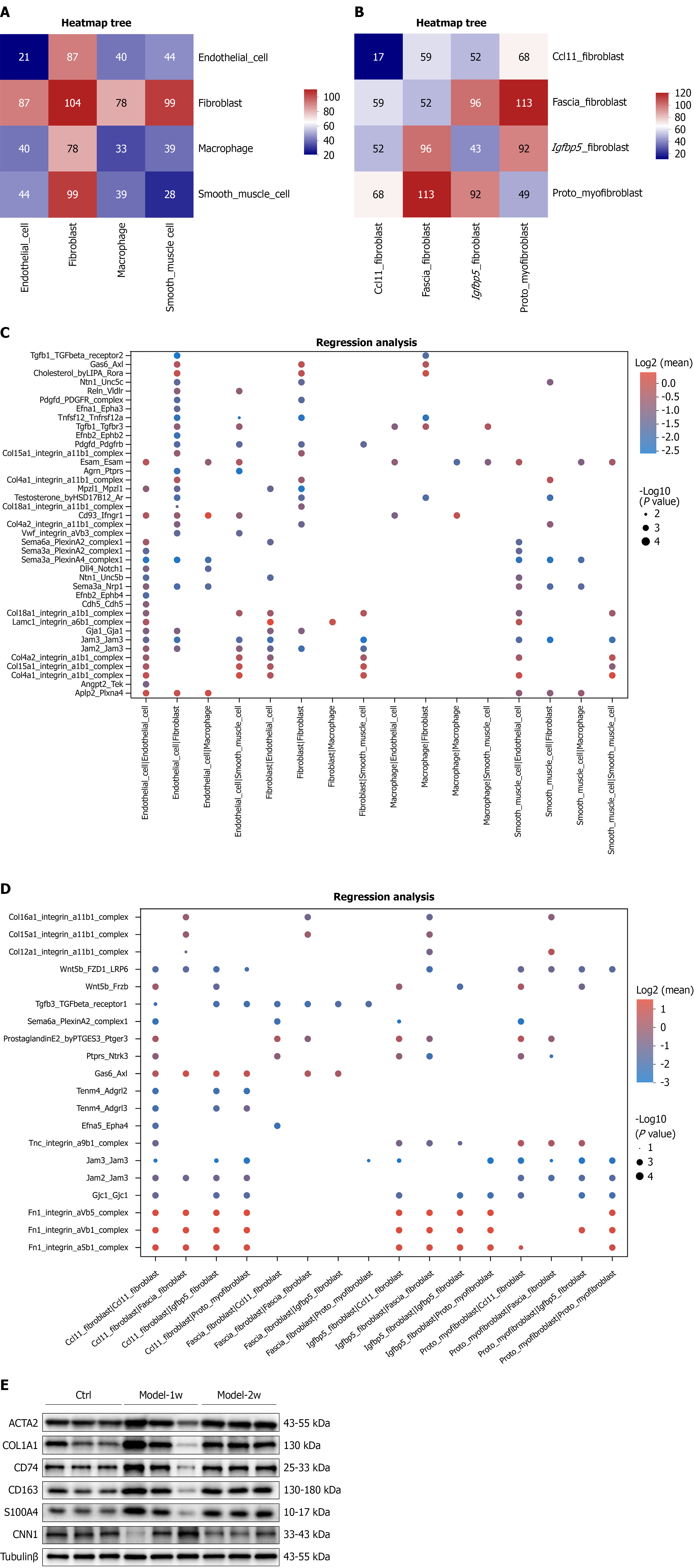
Figure 7 Intercellular communication networks and protein expression.
A and B: The X-axis and Y-axis indicate cell types; the color gradient from dark blue to dark red indicates an increasing number of interactions; C and D: The X-axis indicates cell type interactions, and the Y-axis indicates ligand-receptor pairs. Larger dots indicate smaller P values (greater significance); the color represents the average expression level (indicating interaction strength); E: Western blots showing protein expression. Ctrl: Control group; Model-1w: 1 week of modeling; Model-2w: 2 weeks of modeling.
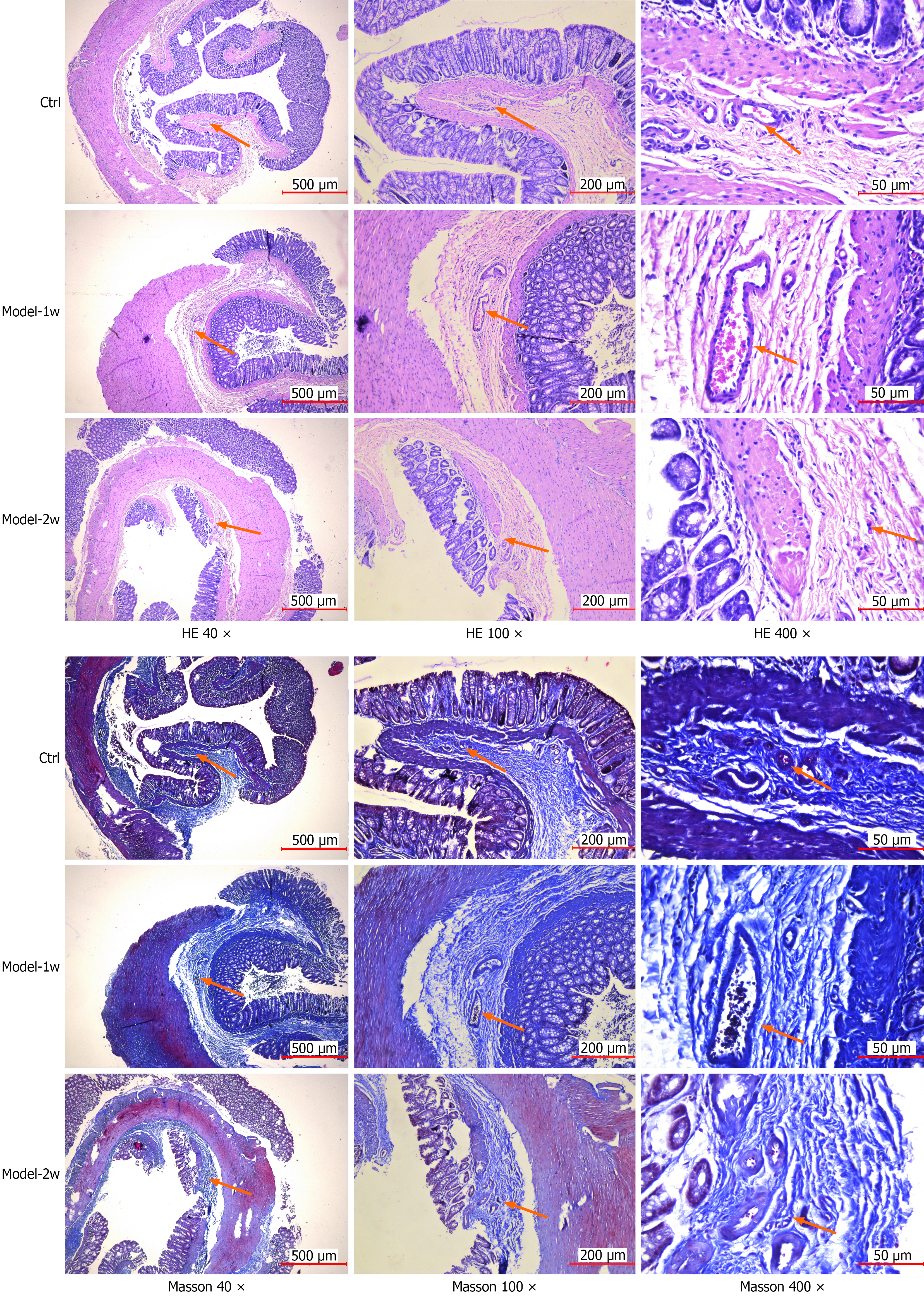
Figure 8 Images of histopathological staining (hematoxylin and eosin and Masson’s trichrome staining).
Ctrl: Control group; Model-1w: 1 week of modeling; Model-2w: 2 weeks of modeling; HE: Hematoxylin and eosin.
- Citation: Lin WG, Huang SY, Lan H, Zheng XX, Liu XB, Xu ZG, Ke MH. Spatiotemporal atlas of internal hemorrhoids in rats elucidated using integrated single-cell RNA sequencing and spatial transcriptomics. World J Gastroenterol 2026; 32(41): 121893
- URL: https://www.wjgnet.com/1007-9327/full/v32/i41/121893.htm
- DOI: https://dx.doi.org/10.3748/wjg.121893