
















Copyright: ©Author(s) 2026.
World J Gastroenterol. Aug 14, 2026; 32(30): 119360
Published online Aug 14, 2026. doi: 10.3748/wjg.119360
Published online Aug 14, 2026. doi: 10.3748/wjg.119360
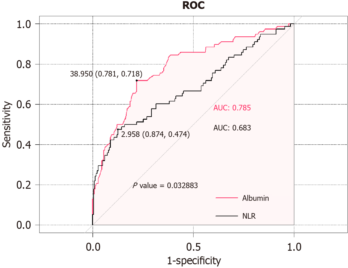
Figure 1 Receiver operating characteristic curves of serum albumin and neutrophil-to-lymphocyte ratio in the training cohort.
Receiver operating characteristic (ROC) analysis was performed to evaluate the discriminatory ability of serum albumin (red curve) and neutrophil-to-lymphocyte ratio (NLR) (black curve) for the study endpoint. The area under the curve (AUC) was 0.785 for albumin and 0.683 for NLR. The optimal cut-off values determined by ROC analysis were 38950 for albumin (sensitivity = 0.781, specificity = 0.718) and 2.958 for NLR (sensitivity = 0.874, specificity = 0.474). The difference between the AUCs was statistically significant (P = 0.032883). ROC: Receiver operating characteristic; AUC: Area under the curve; NLR: Neutrophil-to-lymphocyte ratio.
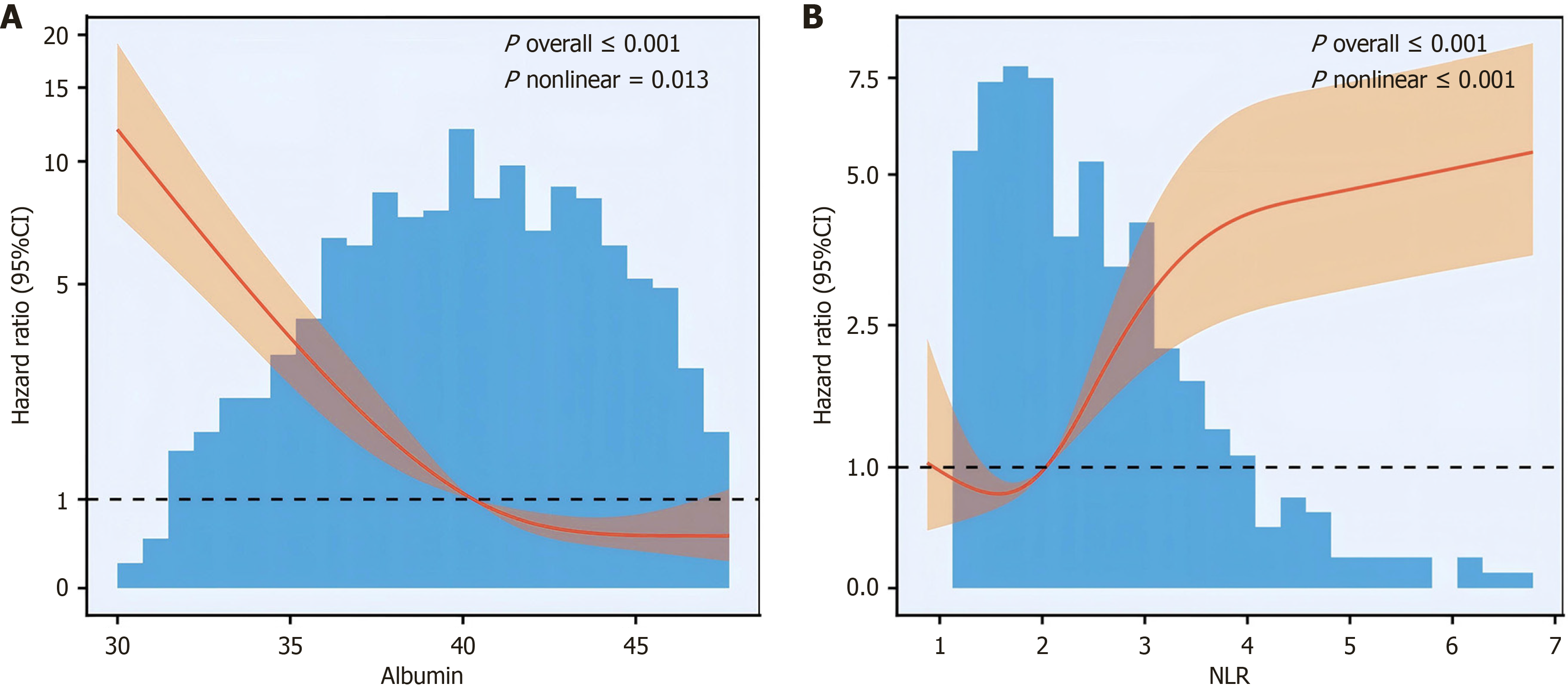
Figure 2 Restricted cubic spline analysis of the associations of serum albumin and neutrophil-to-lymphocyte ratio with the study endpoint.
A: Restricted cubic spline (RCS) curve showing the dose-response relationship between serum albumin level and hazard ratio (HR); B: RCS curve showing the dose-response relationship between neutrophil-to-lymphocyte ratio (NLR) and HR. The solid red line represents the estimated HR, and the shaded area indicates the 95% confidence interval. The black dashed line indicates the reference (HR = 1.0). The distribution of albumin/NLR is shown by the histogram. P values for overall association and nonlinearity are presented in each panel (albumin: P overall < 0.001, P nonlinear = 0.013; NLR: P overall < 0.001, P nonlinear < 0.001). CI: Confidence interval; NLR: Neutrophil-to-lymphocyte ratio.
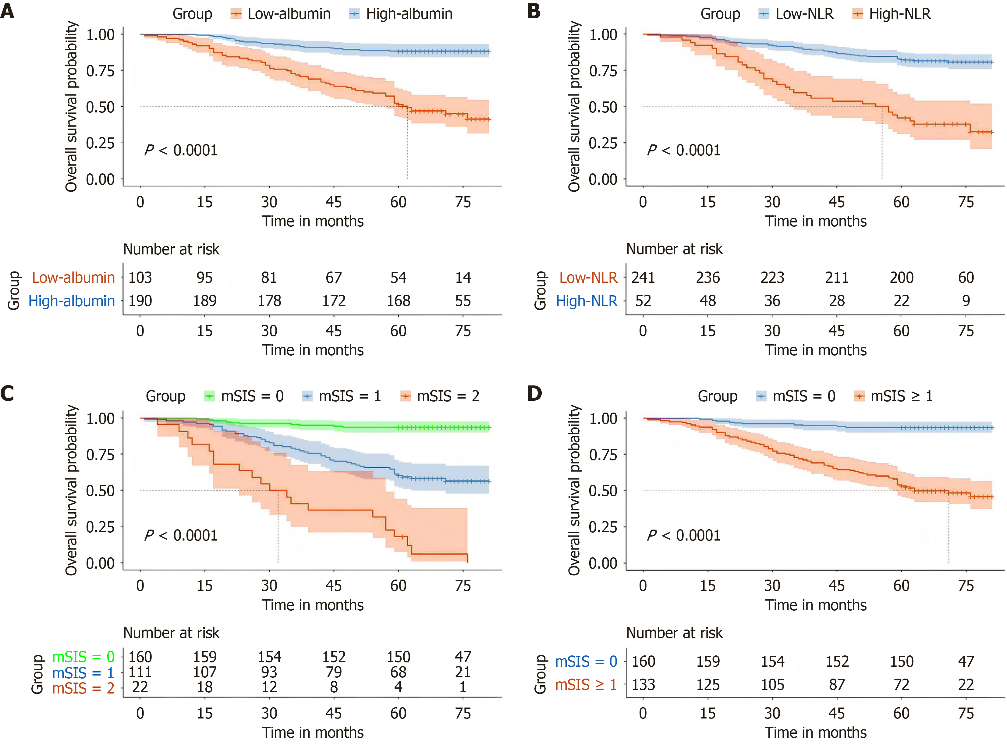
Figure 3 Kaplan-Meier overall survival curves.
A and B: Curves stratified by serum albumin and neutrophil-to-lymphocyte ratio (NLR) in colorectal cancer; A: Overall survival curves for patients in the low-albumin and high-albumin groups; B: Overall survival curves for patients in the low-NLR and high-NLR groups. Shaded areas represent 95% confidence intervals. The numbers of patients at risk at each time point are shown below the plots. P values were calculated using the log-rank test (both P < 0.0001); C and D: Curves stratified by the modified systemic inflammation score; C: Overall survival curves for patients with modified systemic inflammation score (mSIS) scores of 0, 1, and 2; D: Overall survival curves for patients with mSIS = 0 and mSIS ≥ 1. Shaded areas represent 95% confidence interval. The numbers of patients at risk at each time point are shown below the plots. P values were calculated using the log-rank test (both P < 0.0001). mSIS: Modified systemic inflammation score; NLR: Neutrophil-to-lymphocyte ratio.
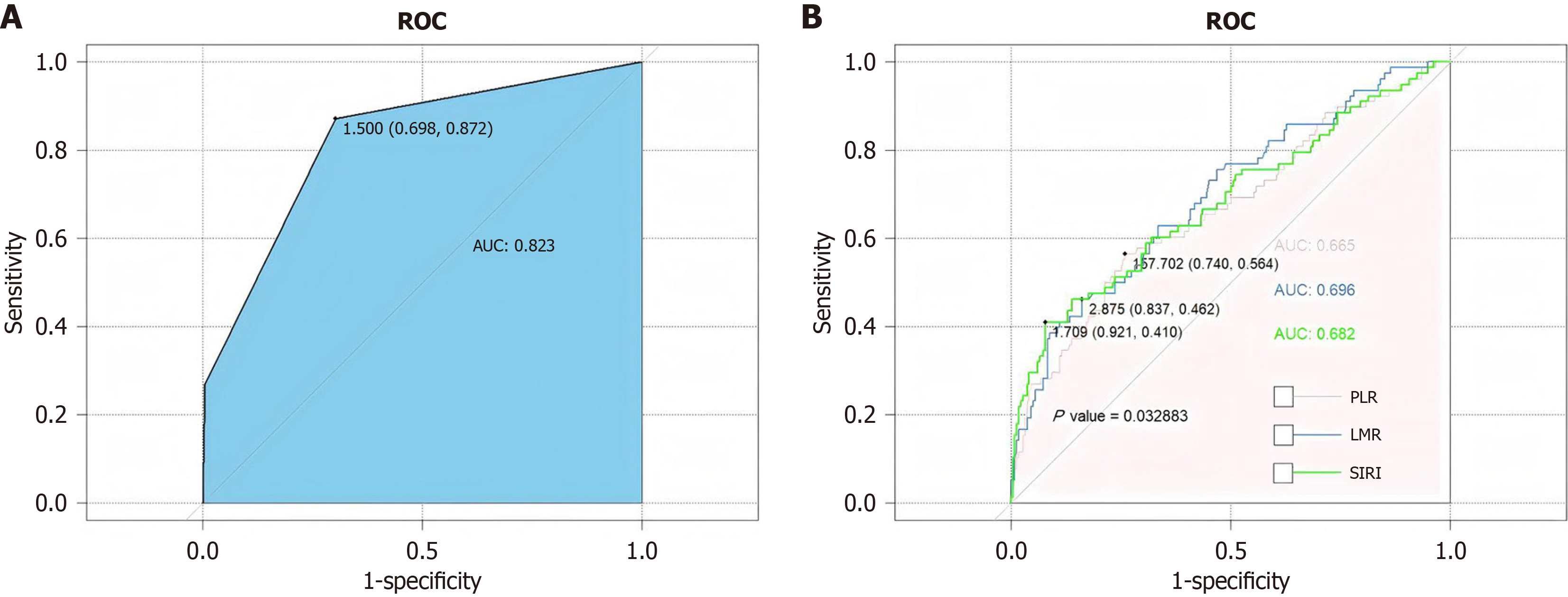
Figure 4 Receiver operating characteristic curve analysis of inflammation-related indicators in the training cohort.
A: Receiver operating characteristic (ROC) curve of the modified systemic inflammation score, with an area under the curve (AUC) of 0.823. The optimal cut-off value was 1.500 (sensitivity = 0.698, specificity = 0.872), as indicated in the figure; B: Comparison of ROC curves for platelet-to-lymphocyte ratio (PLR), lymphocyte-to-monocyte ratio (LMR), and systemic inflammation response index (SIRI). The AUCs were 0665 for PLR, 0.696 for LMR, and 0.682 for SIRI. The optimal cut-off values were 157.702 for PLR (sensitivity = 0.740, specificity = 0.564), 2.875 for LMR (sensitivity = 0.837, specificity = 0.462), and 1.709 for SIRI (sensitivity = 0.921, specificity = 0.410). The difference among the ROC curves was statistically significant (P = 0.032883). ROC: Receiver operating characteristic; AUC: Area under the curve; PLR: Platelet-to-lymphocyte ratio; LMR: Lymphocyte-to-monocyte ratio; SIRI: Systemic inflammation response index.
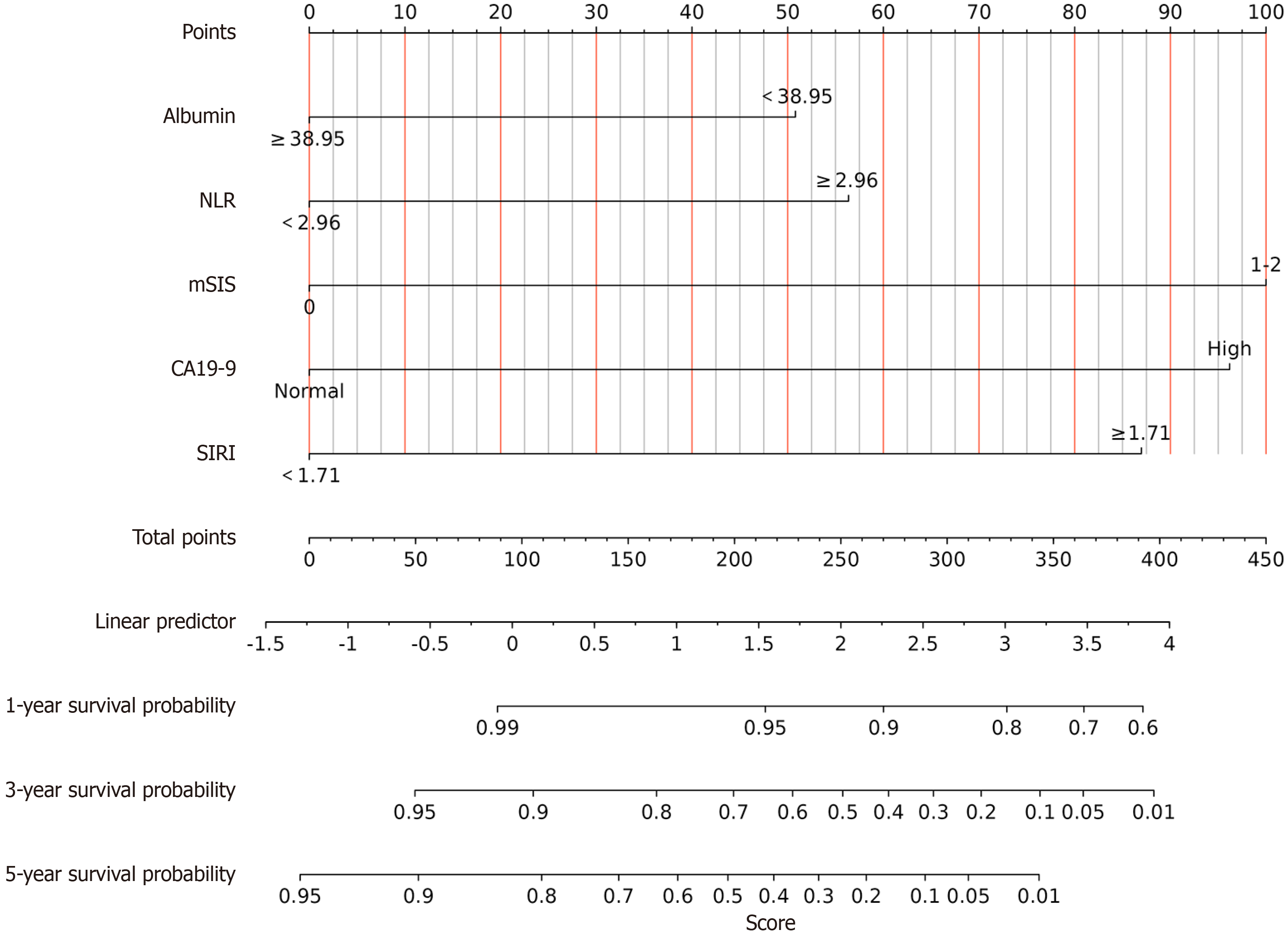
Figure 5 Nomogram for predicting 1-, 3-, and 5-year overall survival in colorectal cancer patients.
The nomogram was developed based on serum albumin, neutrophil-to-lymphocyte ratio (NLR), modified systemic inflammation score (mSIS), carbohydrate antigen 19-9 (CA19-9), and systemic inflammation response index (SIRI). For each variable, points were assigned according to the patient’s status (albumin: ≥ 38.95 vs < 38.95; NLR: < 2.96 vs ≥ 2.96; mSIS: 0 vs 1-2; CA19-9: Normal vs high; SIRI: < 1.71 vs ≥ 1.71). The total points were calculated by summing the points for all variables and were then used to estimate the probabilities of 1-, 3-, and 5-year overall survival. CA19-9: Carbohydrate antigen 19-9; SIRI: Systemic inflammation response index; mSIS: Modified systemic inflammation score; NLR: Neutrophil-to-lymphocyte ratio.
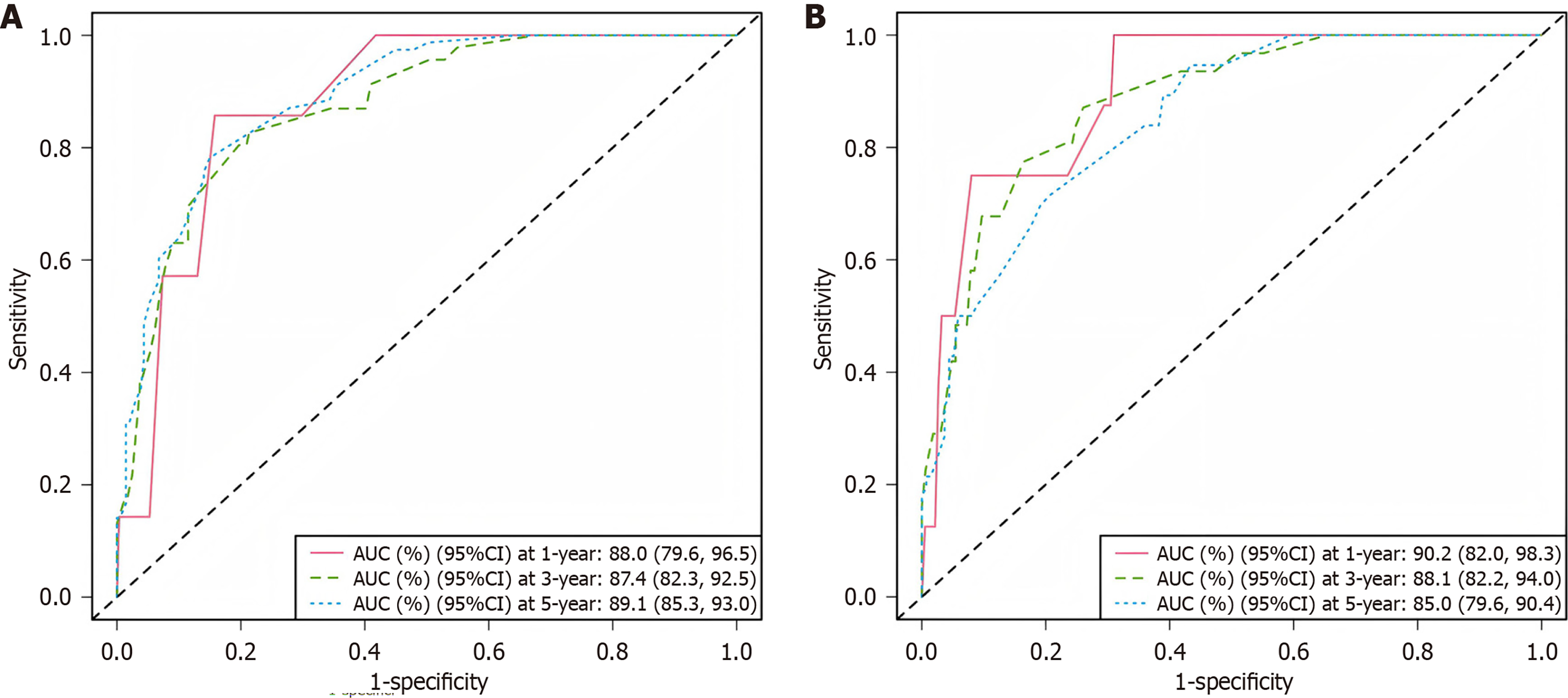
Figure 6 Time-dependent receiver operating characteristic curves of the nomogram for predicting 1-, 3-, and 5-year overall survival in the training and validation cohorts.
A: Receiver operating characteristic (ROC) curves of the nomogram in the training cohort. The area under the curve (AUC) [95% confidence interval (CI)] were 880% (79.6%-96.5%) at 1 year, 87.4% (82.3%-92.5%) at 3 years, and 89.1% (85.3%-93.0%) at 5 years; B: ROC curves of the nomogram in the validation cohort. The AUCs (95%CI) were 902% (82.0%-98.3%) at 1 year, 88.1% (82.2%-94.0%) at 3 years, and 85.0% (79.6%-90.4%) at 5 years. The diagonal dashed line indicates the reference line. AUC: Area under the curve; CI: Confidence interval.
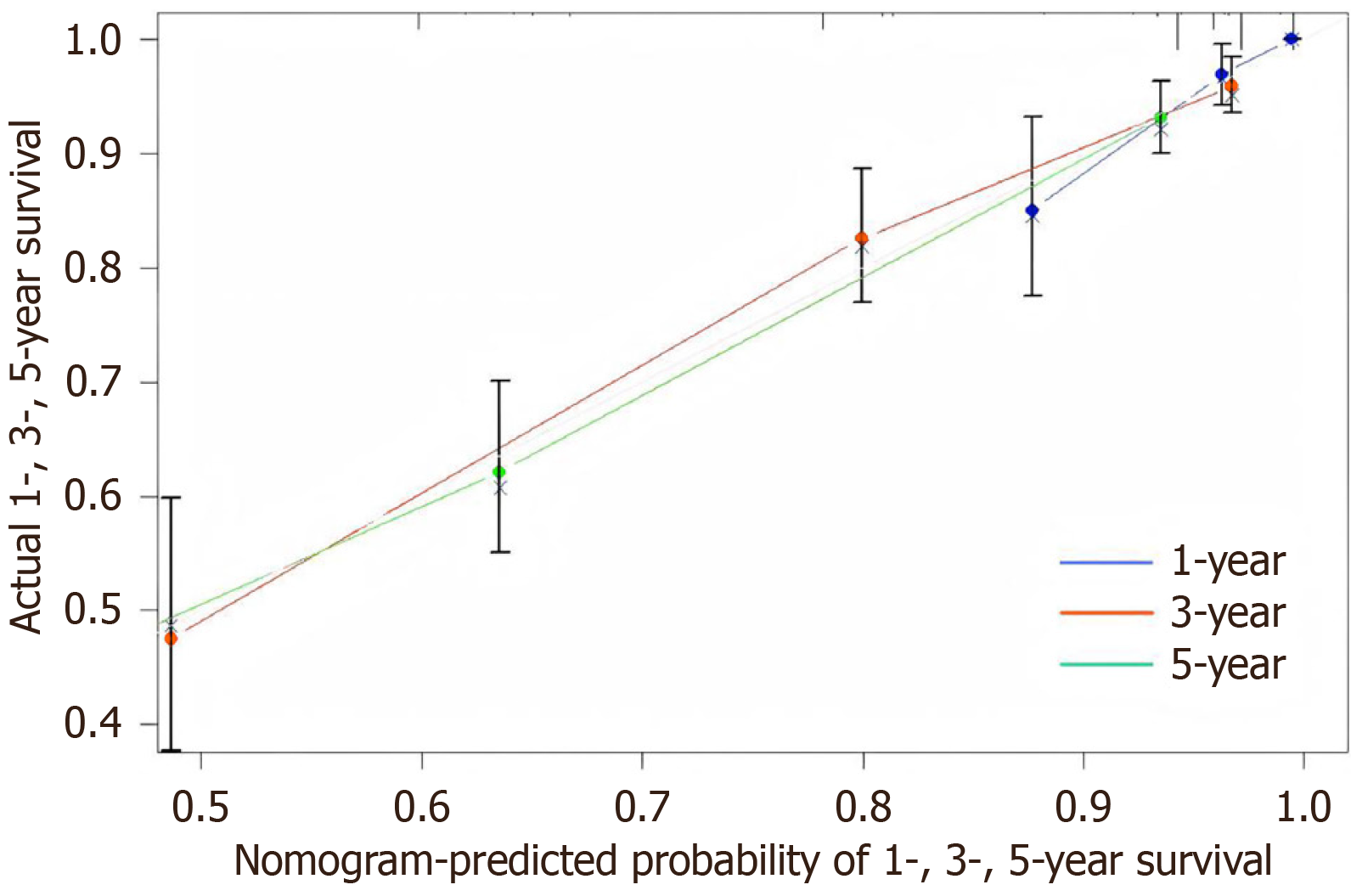
Figure 7 Calibration plots of the nomogram for predicting 1-, 3-, and 5-year overall survival.
Calibration curves were used to assess the agreement between nomogram-predicted and observed overall survival probabilities. The X-axis represents the nomogram-predicted probability of survival, and the Y-axis represents the actual survival probability. The blue, red, and green curves correspond to 1-year, 3-year, and 5-year overall survival, respectively.
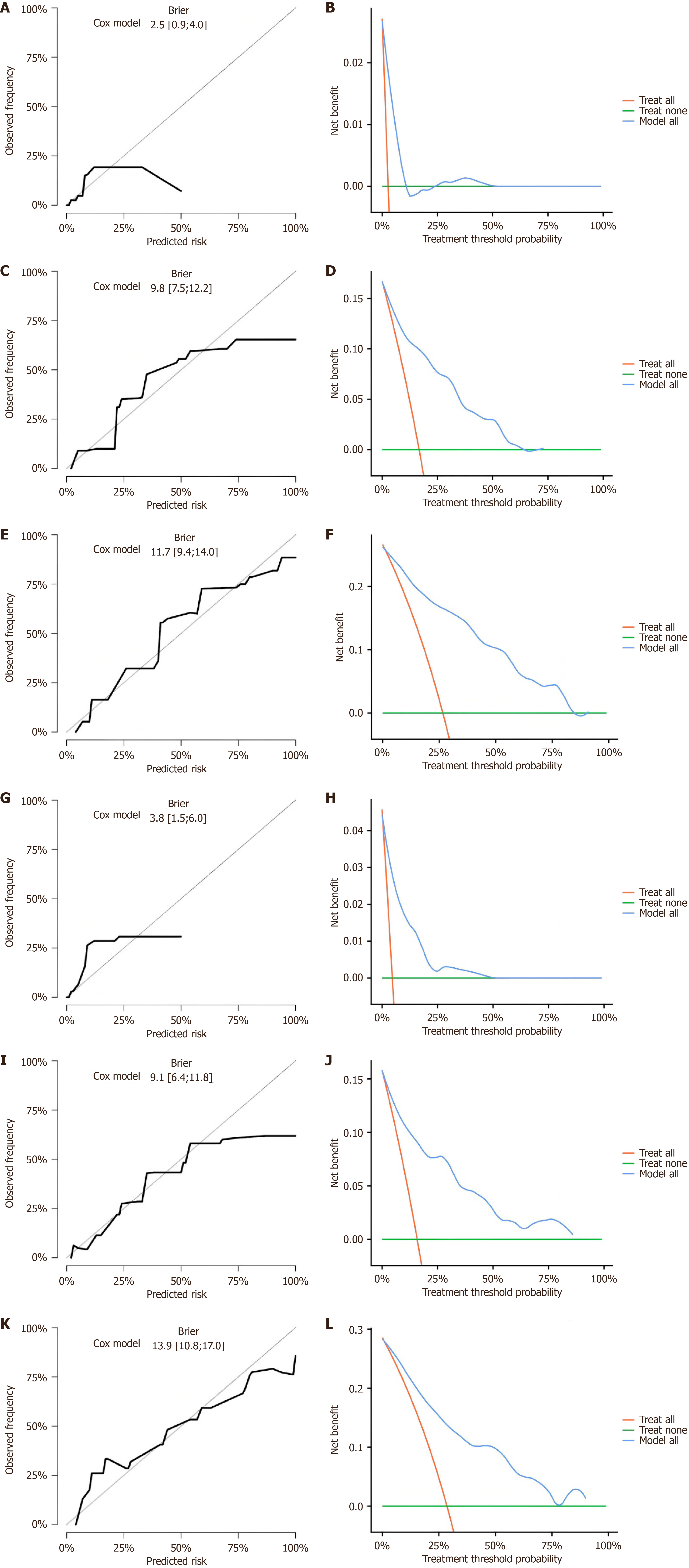
Figure 8 Calibration curves and decision curve analysis of the nomogram for predicting 1-, 3-, and 5-year overall survival in the training cohort and validation cohort.
A-F: In the training cohort: Calibration curve at 1 year (A); Decision curve analysis (DCA) curve at 1 year (B); Calibration curve at 3 years (C); DCA curve at 3 years (D); Calibration curve at 5 years (E); DCA curve at 5 years (F); G-L: In the validation cohort: Calibration curve at 1 year (G); DCA curve at 1 year (H); Calibration curve at 3 years (I); DCA curve at 3 years (J); Calibration curve at 5 years (K); DCA curve at 5 years (L). For calibration, the X-axis indicates predicted risk and the Y-axis indicates observed frequency; the diagonal gray line indicates the ideal reference line and Brier scores are shown. For DCA, the X-axis indicates threshold probability and the Y-axis indicates net benefit; the nomogram (model all) is compared with treat all and treat none strategies.
- Citation: Wang K, Zhang BX, Li KJ, Guan JM, Li BY, Hong ZH, Zeng XY, Zhao ZL, Chen Y. Preoperative immunonutrition status predicts survival after colorectal cancer resection: Nomogram based on modified systemic inflammation score. World J Gastroenterol 2026; 32(30): 119360
- URL: https://www.wjgnet.com/1007-9327/full/v32/i30/119360.htm
- DOI: https://dx.doi.org/10.3748/wjg.119360