©The Author(s) 2021.
World J Transplant. Oct 18, 2021; 11(10): 432-442
Published online Oct 18, 2021. doi: 10.5500/wjt.v11.i10.432
Published online Oct 18, 2021. doi: 10.5500/wjt.v11.i10.432
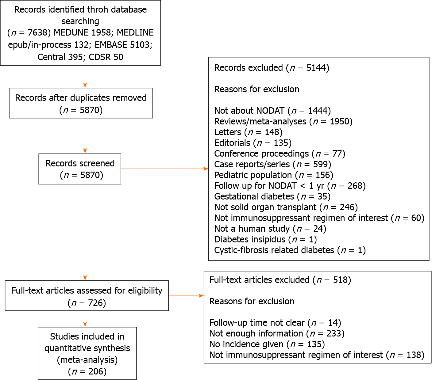
Figure 1 PRISMA flow diagram illustrating the results of search strategy and study selection.
NODAT: New onset diabetes after transplantation.
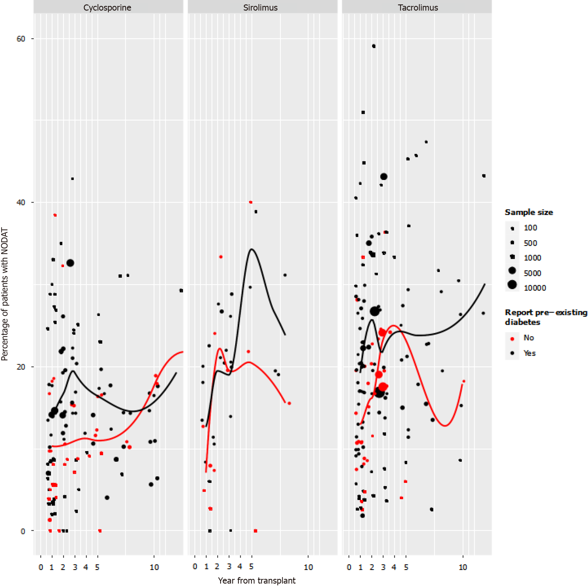
Figure 2 First-reported Incidence of post-transplant diabetes mellitus in each study plotted against the timing of the assessment, grouped according to mainstay of immunosuppression, with separate estimates of average incidence for studies excluding and not-excluding patients with pre-existing diabetes mellitus.
Plotting symbols indicate the number of patients contributing to the estimate. The red data points denotes the studies which did not report the percentage of diabetes pre-existing before transplant. The black data points denote the studies, which report the percentage of pre-transplant diabetes in the patients. NODAT: New onset diabetes after transplantation.
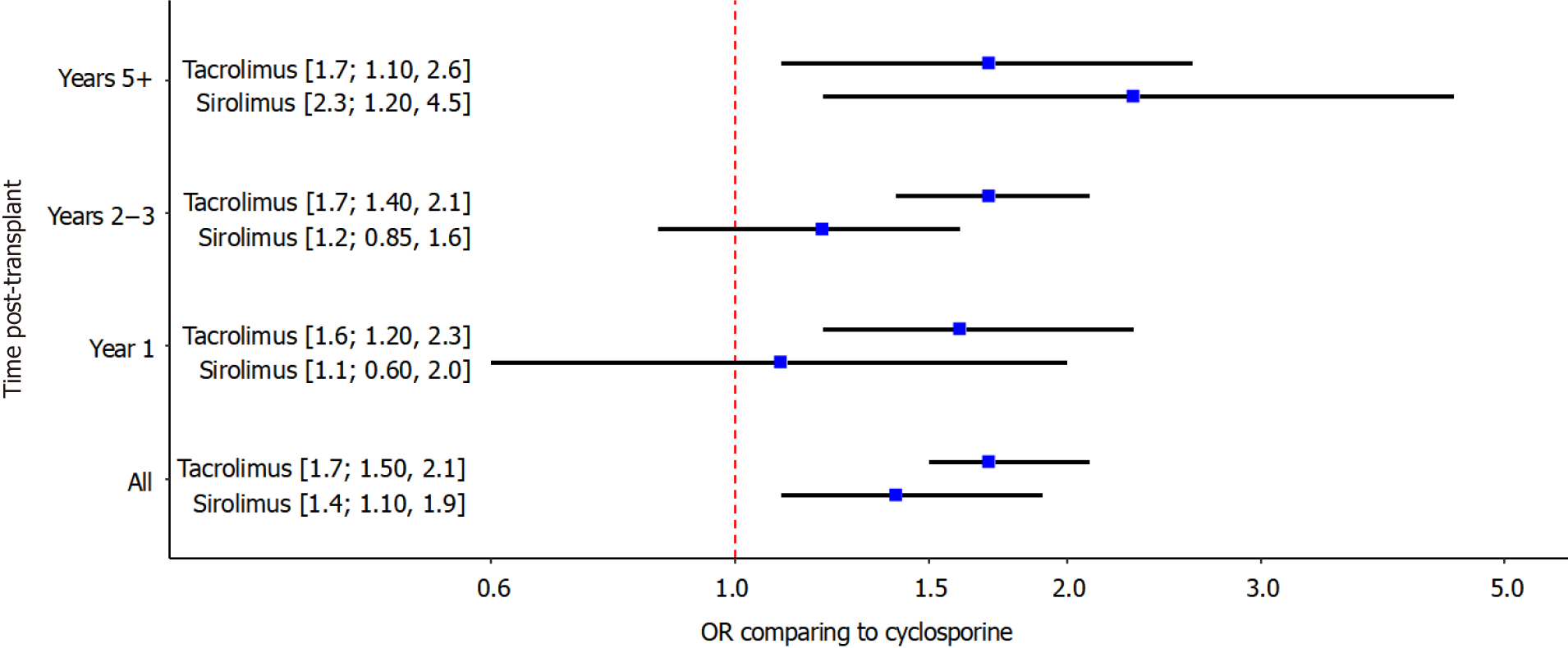
Figure 3 Estimates and 95% confidence intervals from the network meta-analysis comparing the odds of developing post-transplant diabetes mellitus in patients receiving tacrolimus or sirolimus compared to the odds with cyclosporine as the mainstay of treatment.
The “All” estimate uses the first time-point from each study. The other estimates are presented according to the timing of that post-transplant diabetes mellitus assessment.
- Citation: Kotha S, Lawendy B, Asim S, Gomes C, Yu J, Orchanian-Cheff A, Tomlinson G, Bhat M. Impact of immunosuppression on incidence of post-transplant diabetes mellitus in solid organ transplant recipients: Systematic review and meta-analysis. World J Transplant 2021; 11(10): 432-442
- URL: https://www.wjgnet.com/2220-3230/full/v11/i10/432.htm
- DOI: https://dx.doi.org/10.5500/wjt.v11.i10.432


