
















Copyright: ©Author(s) 2026.
World J Gastrointest Surg. Sep 27, 2026; 18(9): 120780
Published online Sep 27, 2026. doi: 10.4240/wjgs.120780
Published online Sep 27, 2026. doi: 10.4240/wjgs.120780
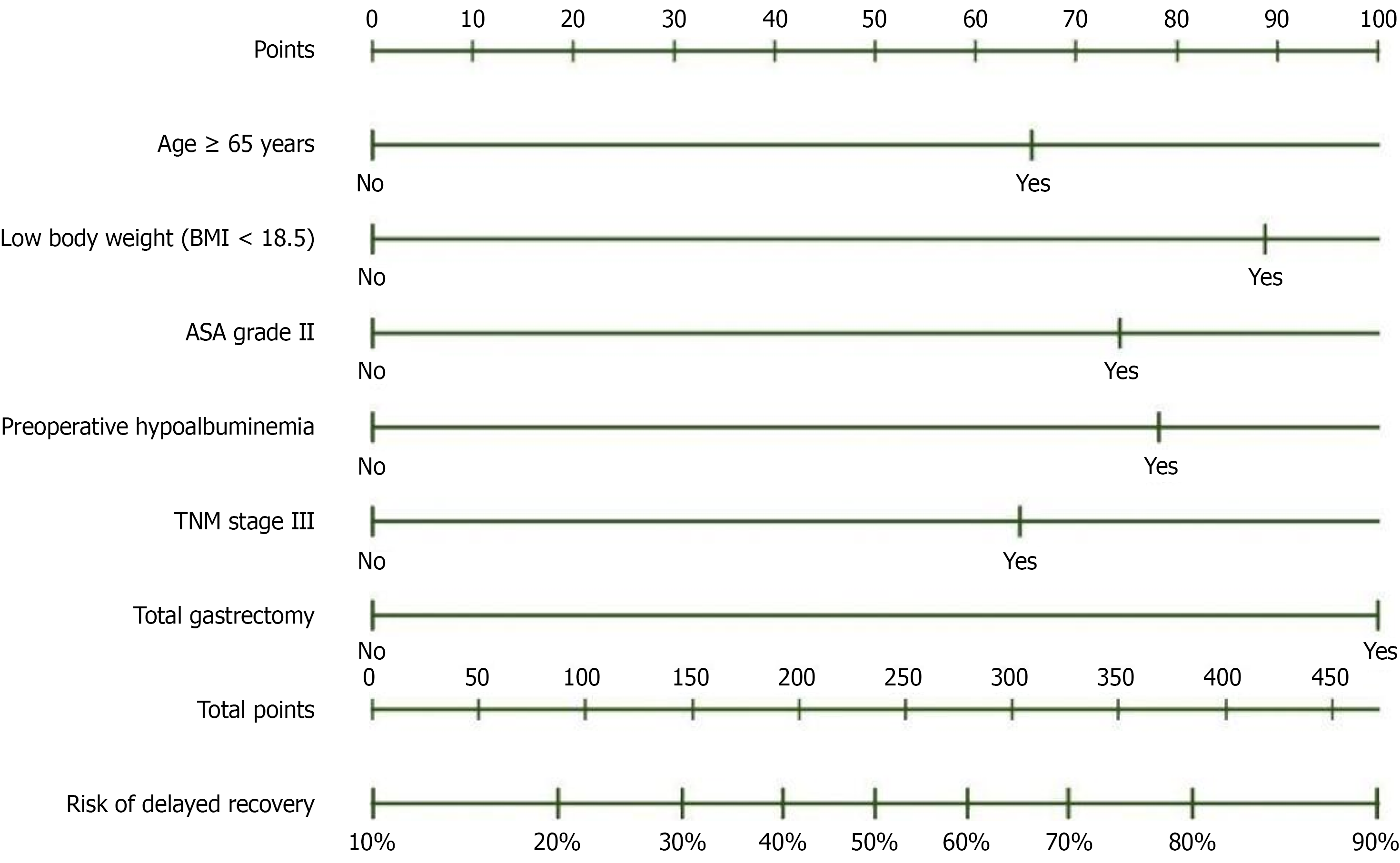
Figure 1 Nomogram for predicting the risk of delayed gastrointestinal recovery after radical gastrectomy.
The nomogram incorporates six independent risk factors: Age ≥ 65 years, low body weight (body mass index < 18.5), American Society of Anesthesiologists grade III, preoperative hypoalbuminemia, tumour, node, and metastasis stage III, and total gastrectomy. For each patient, a score is assigned to each variable by drawing a vertical line to the Points axis. The sum of all individual scores yields the total points, which corresponds to the predicted probability of delayed gastrointestinal recovery along the bottom axis (ranging from 10% to 90%). ASA: American Society of Anesthesiologists; TNM: Tumour, node, and metastasis.
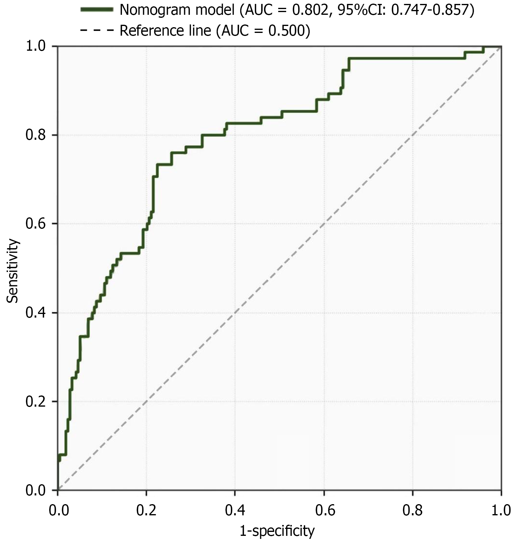
Figure 2 Receiver operating characteristic curve of the nomogram prediction model.
The receiver operating characteristic curve demonstrates the discriminative performance of the nomogram in predicting delayed gastrointestinal recovery after radical gastrectomy. The model achieved an area under the curve (AUC) of 0.802 (95%CI: 0.747-0.857), indicating good discriminative ability. The dashed diagonal line represents the reference line (AUC = 0.500), corresponding to random chance. AUC: Area under the curve.
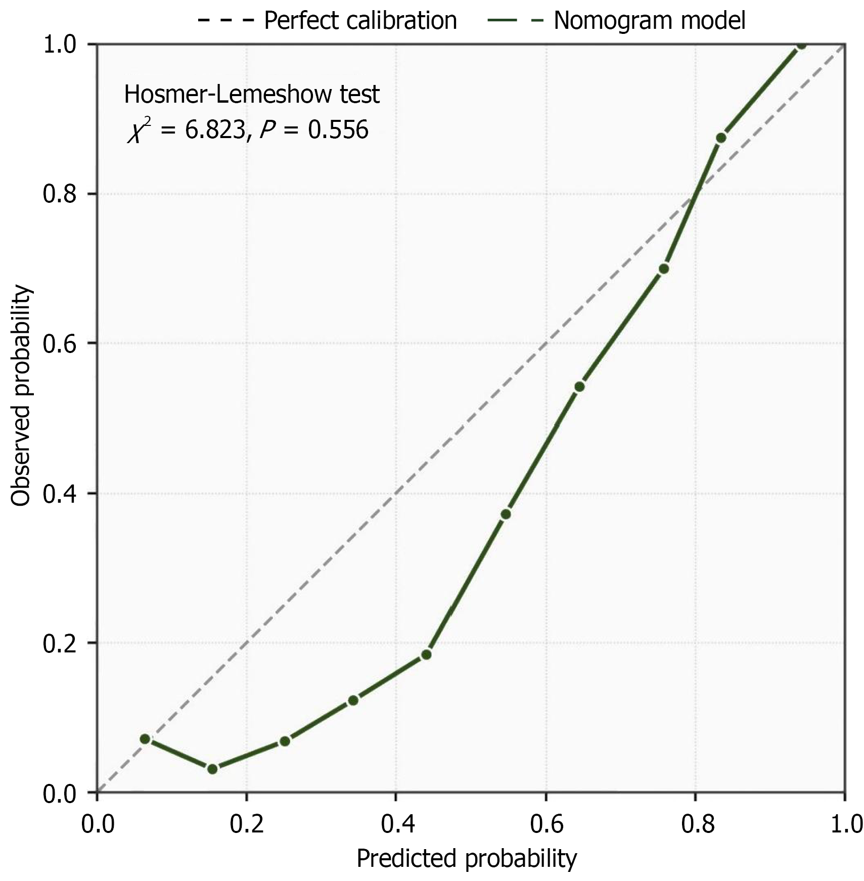
Figure 3 Calibration curve of the nomogram prediction model.
The calibration curve illustrates the agreement between predicted probabilities and observed outcomes of delayed gastrointestinal recovery after radical gastrectomy. The dashed diagonal line represents perfect calibration, while the solid line with dots represents the nomogram model. The Hosmer-Lemeshow test yielded χ2 = 6.823 (P = 0.556), indicating no significant deviation from perfect calibration and confirming satisfactory goodness-of-fit of the model.
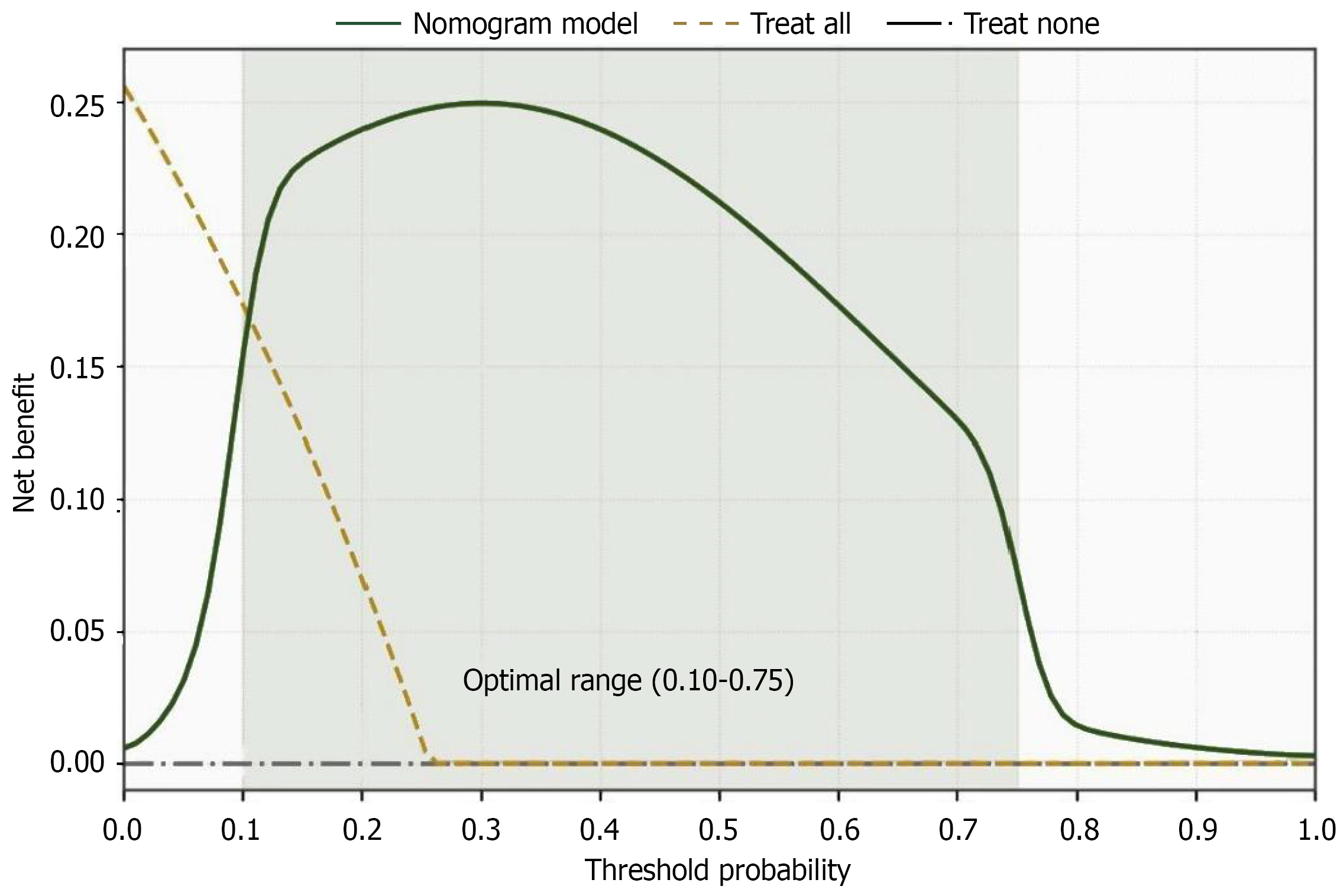
Figure 4 Decision curve analysis of the nomogram prediction model.
The decision curve analysis evaluates the clinical net benefit of the nomogram across a range of threshold probabilities. The solid line represents the nomogram model, the dashed line represents the “Treat All” strategy, and the dash-dotted horizontal line represents the “Treat None” strategy. The nomogram demonstrated superior net benefit over both extreme strategies across a threshold probability range of 0.10 to 0.75 (shaded area), indicating favorable clinical utility and supporting its application in guiding individualized perioperative decision-making.
- Citation: Wang CY, He HY, Li SS, Zhu QQ. Risk factors and nomogram for predicting delayed gastrointestinal recovery after radical gastrectomy. World J Gastrointest Surg 2026; 18(9): 120780
- URL: https://www.wjgnet.com/1948-9366/full/v18/i9/120780.htm
- DOI: https://dx.doi.org/10.4240/wjgs.120780