
















Copyright: ©Author(s) 2026.
World J Diabetes. Sep 15, 2026; 17(9): 122419
Published online Sep 15, 2026. doi: 10.4239/wjd.122419
Published online Sep 15, 2026. doi: 10.4239/wjd.122419
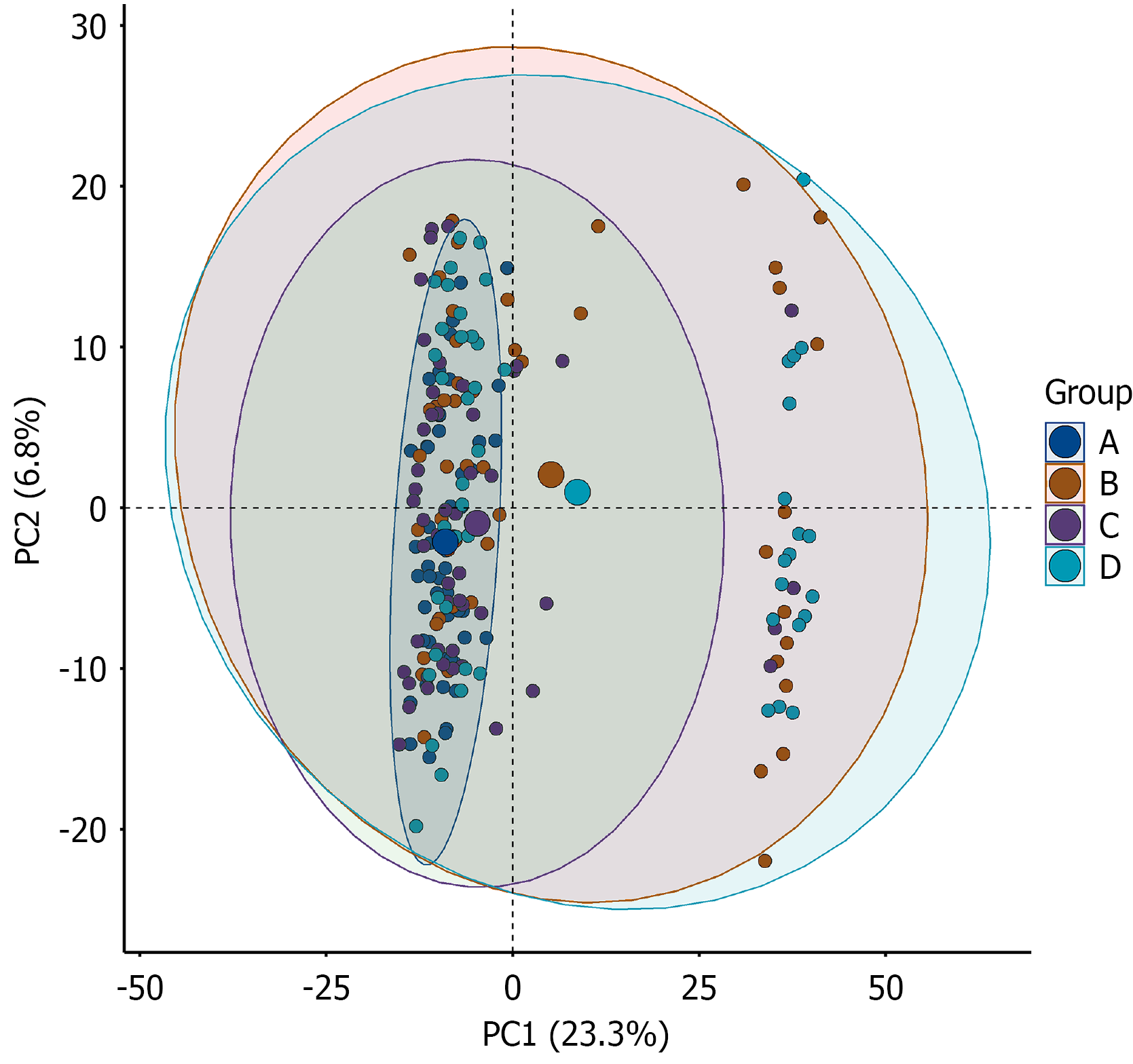
Figure 1 Principal component analysis score plot of the four study groups.
The principal component analysis score plot illustrates the overall distribution of samples across the four study groups: (1) Group A: Normal glucose tolerance; (2) Group B: Isolated impaired fasting glucose; (3) Group C: Isolated impaired glucose tolerance; and (4) Group D: Diabetes. The X-axis indicates the first principal component, explaining 23.3% of the variance, and the Y-axis indicates the second principal component, explaining 6.8% of the variance. First principal component and second principal component together explained 30.1% of the total variance; therefore, this plot was used as an exploratory visualization of overall group trends rather than a complete representation of all sample-level variation. Each point represents an individual sample, and ellipses indicate the confidence regions for each group. PC1: First principal component; PC2: Second principal component.
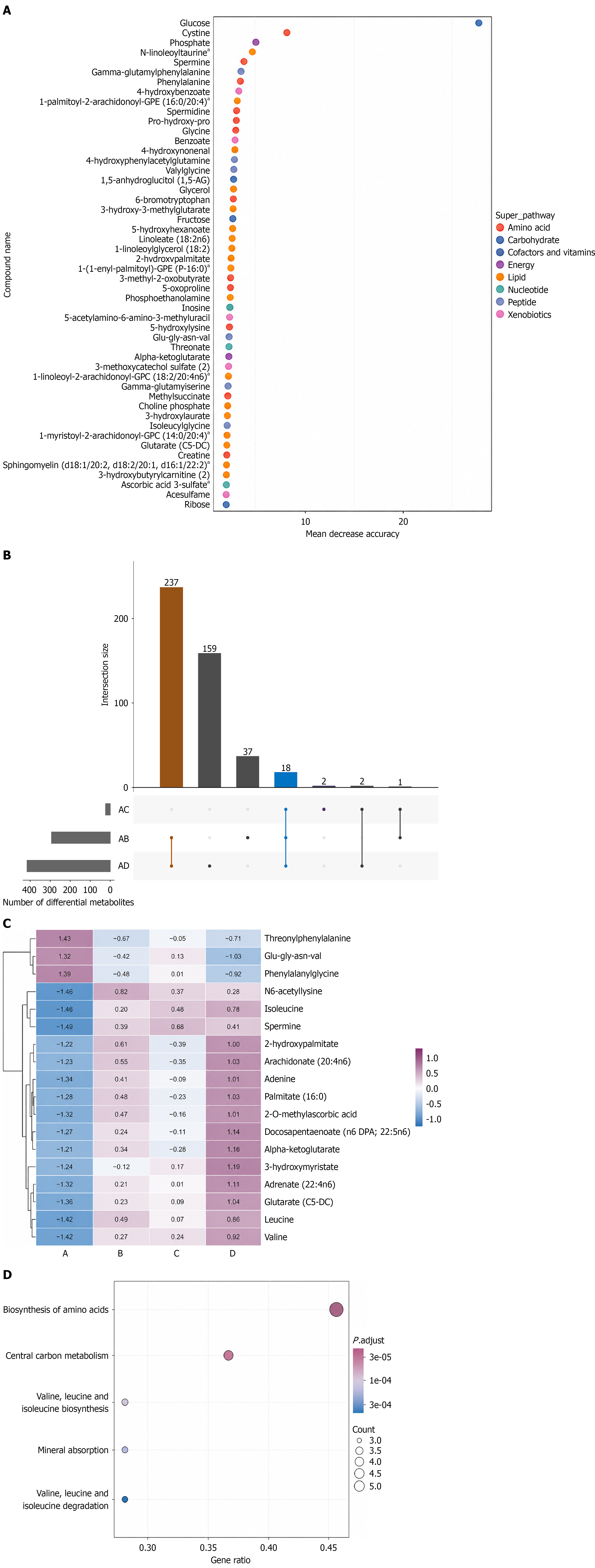
Figure 2 Differential metabolite screening and functional enrichment analysis.
A: Variable importance analysis of differential metabolites in the overall study population based on the random forest model; B: UpSet plot showing the intersections of differential metabolites identified in the comparisons between the normal glucose tolerance (NGT) and isolated impaired fasting glucose groups (A vs B), the NGT and isolated impaired glucose tolerance groups (A vs C), and the NGT and diabetes groups (A vs D); C: Heatmap showing the expression patterns of the 18 shared differential metabolites across the four groups (NGT, impaired fasting glucose, impaired glucose tolerance, and diabetes); D: Kyoto Encyclopedia of Genes and Genomes pathway enrichment analysis based on the 18 shared differential metabolites. The X-axis represents the enrichment ratio, bubble size indicates the number of metabolites enriched in each pathway, and bubble color represents the adjusted P value.
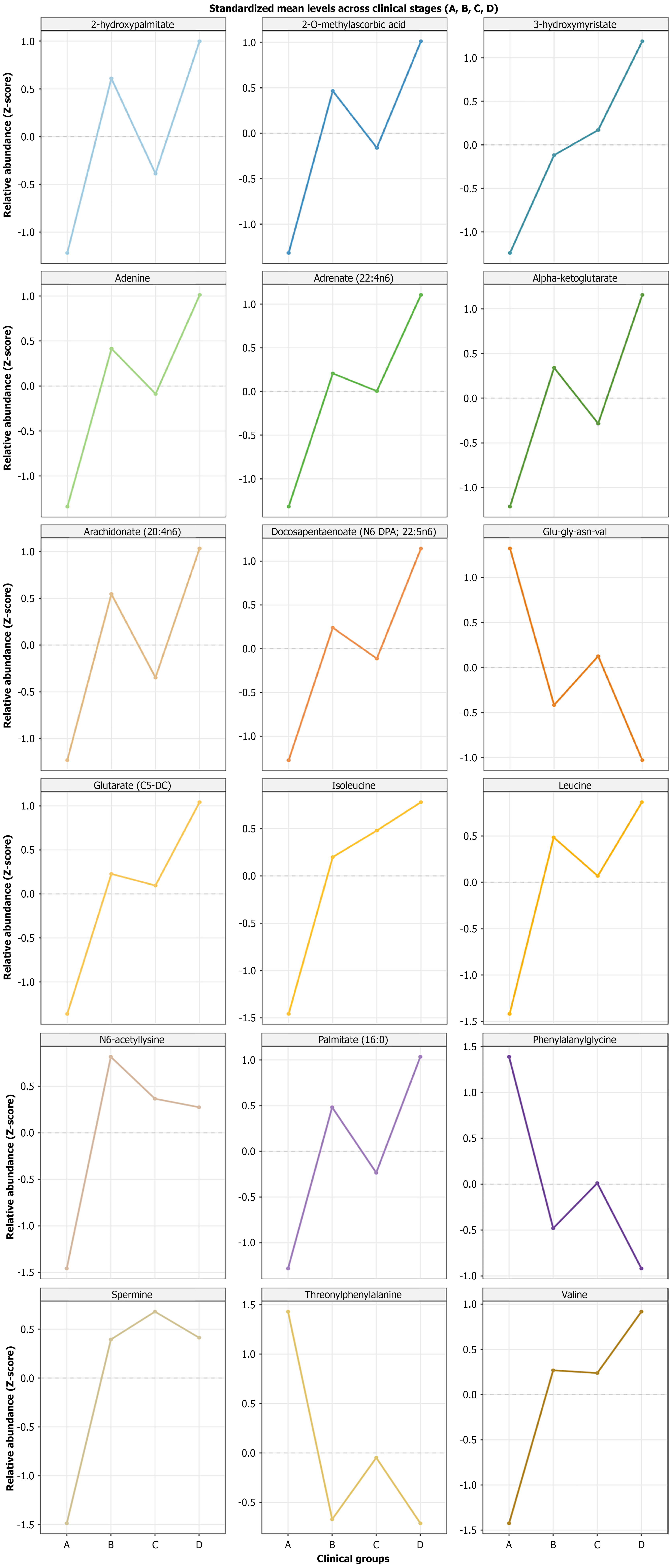
Figure 3 Trajectories of the 18 shared core metabolites across different glycemic states.
Line plots illustrate the standardized relative abundance of the 18 core metabolites across four clinical groups: (1) Normal glucose tolerance; (2) Impaired fasting glucose; (3) Impaired glucose tolerance; and (4) Diabetes. Each panel represents one metabolite, and the data were standardized using Z-score transformation. The X-axis indicates the clinical groups, and the Y-axis indicates the standardized metabolite level. Z-score: Standardized score.
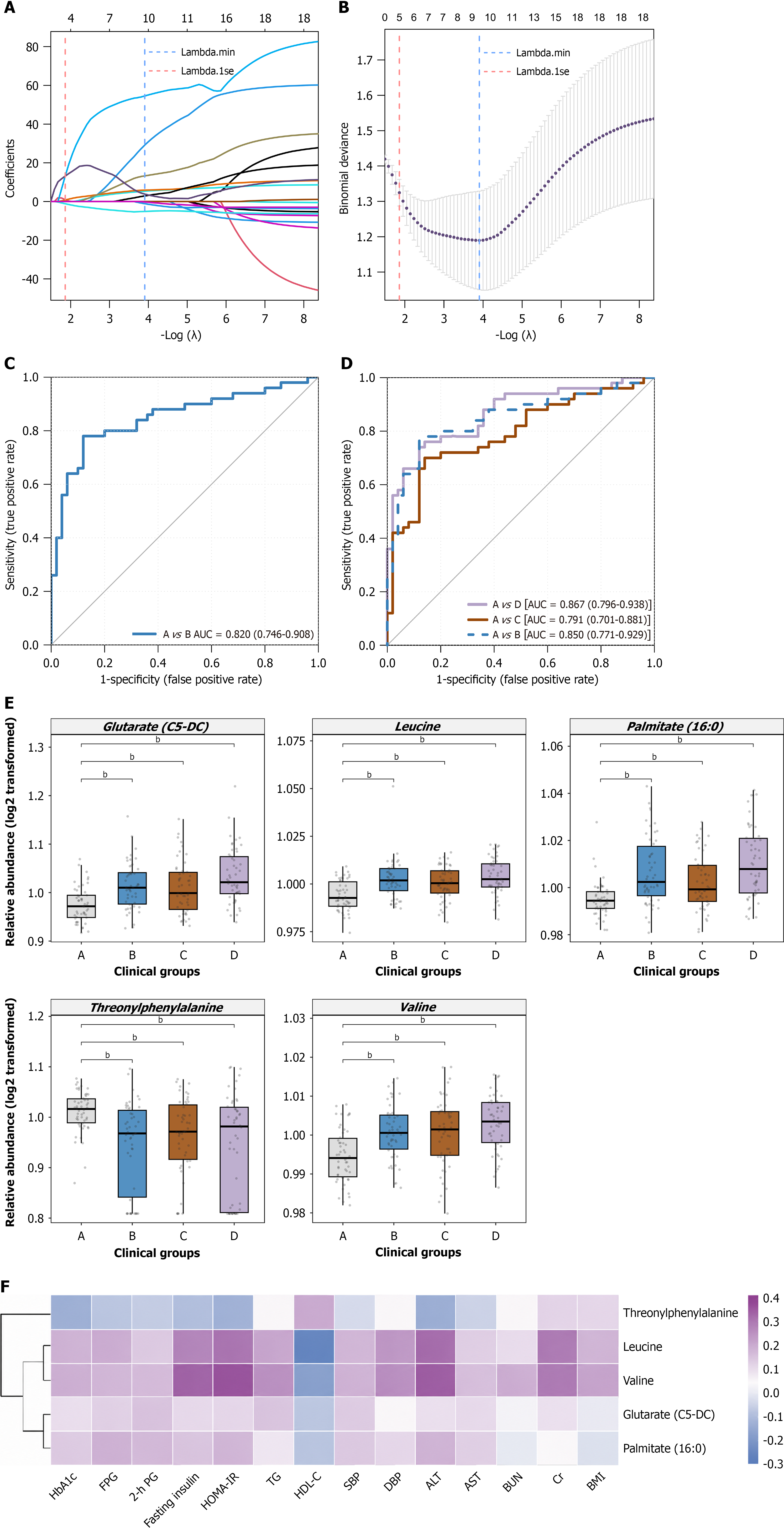
Figure 4 Least absolute shrinkage and selection operator-based selection of candidate discriminative metabolic biomarkers, dis
- Citation: Liu YT, Yu LP, Zhu DL, Li ZP, Zhang JP, Xie LD, Song LL, He YF, Jin X, Li ZQ, Deng RF, Zhang C, Zhang B. Plasma metabolomics reveals progressive alterations across glycemic states. World J Diabetes 2026; 17(9): 122419
- URL: https://www.wjgnet.com/1948-9358/full/v17/i9/122419.htm
- DOI: https://dx.doi.org/10.4239/wjd.122419