
















Copyright: ©Author(s) 2026.
World J Diabetes. Aug 15, 2026; 17(8): 121505
Published online Aug 15, 2026. doi: 10.4239/wjd.121505
Published online Aug 15, 2026. doi: 10.4239/wjd.121505
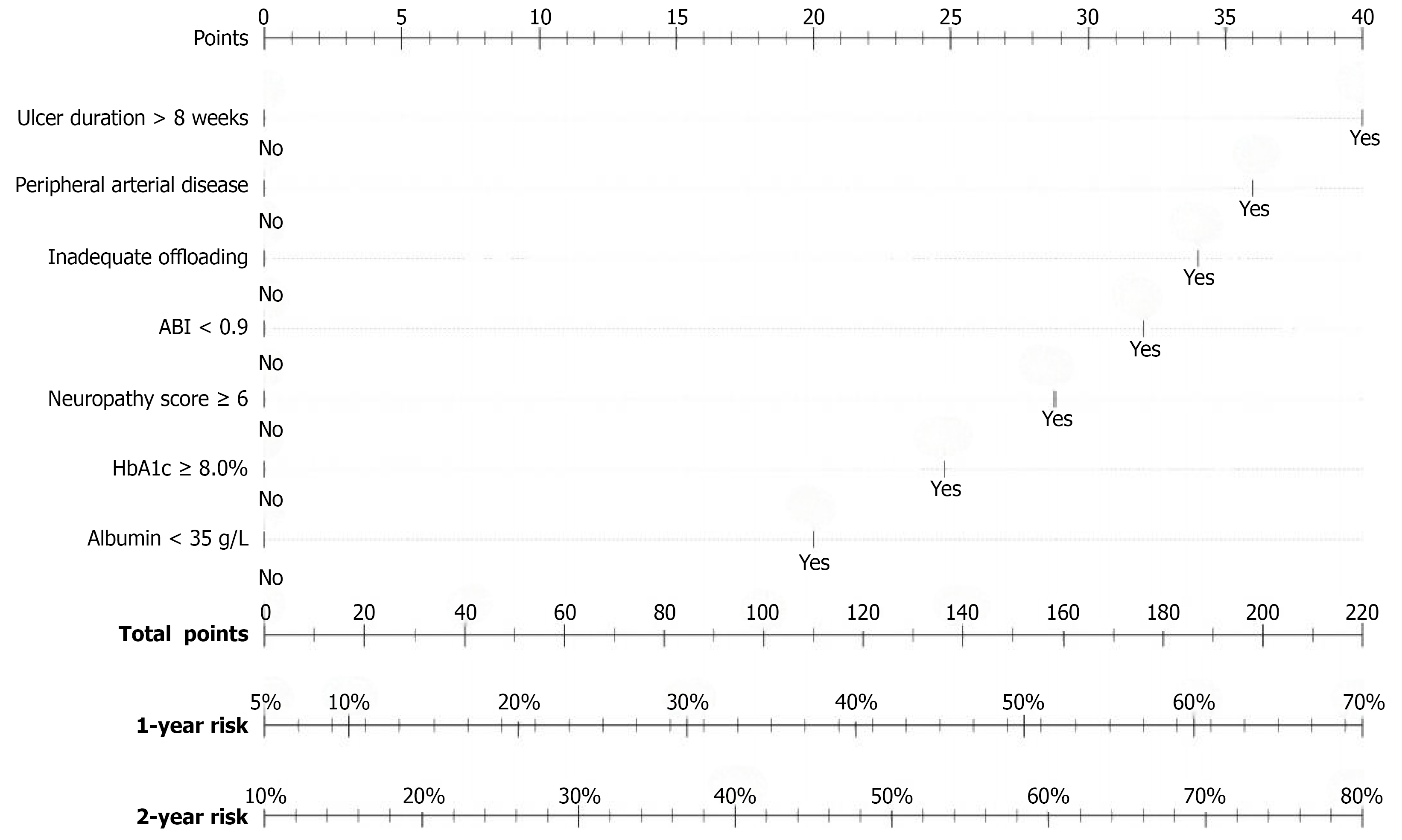
Figure 1 Nomogram for predicting 1-year and 2-year diabetic foot ulcer recurrence probability.
The nomogram consists of point scales for each of the seven predictors, a total points scale, and prediction scales for 1-year and 2-year recurrence probabilities. ABI: Ankle brachial index; HbA1c: Hemoglobin A1c.
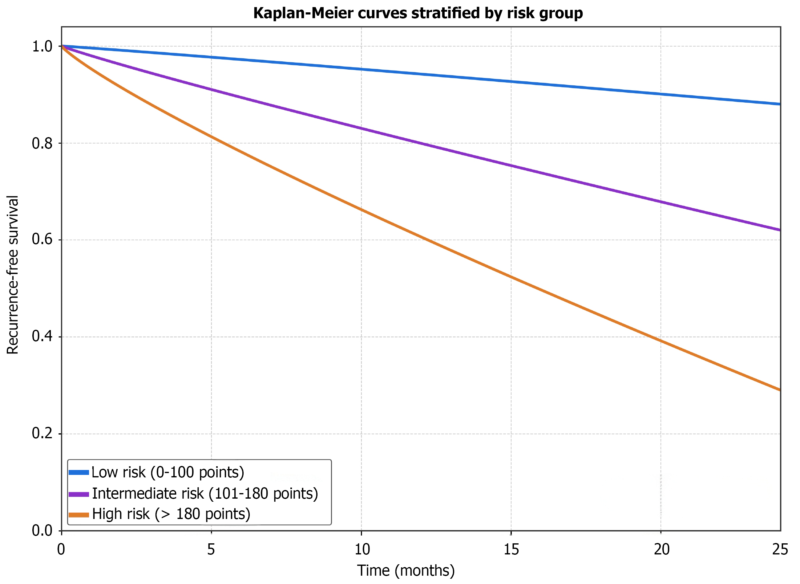
Figure 2 Kaplan-Meier curves showing recurrence-free survival stratified by risk group (low, intermediate, high).
Patients with healed diabetic foot ulcers were stratified by total nomogram points into low-risk (0-100 points; n = 89), intermediate-risk (101-180 points; n = 135), and high-risk (> 180 points; n = 88) groups. Recurrence-free survival showed clear stepwise separation across risk categories, with progressively worse outcomes in higher-risk patients. The curves diverged within the first 6 months after wound healing and remained separated through follow-up. Differences among groups were significant by log-rank test (P < 0.001). Median recurrence-free survival was not reached in the low-risk group, compared with 18.5 months in the intermediate-risk group and 9.8 months in the high-risk group.
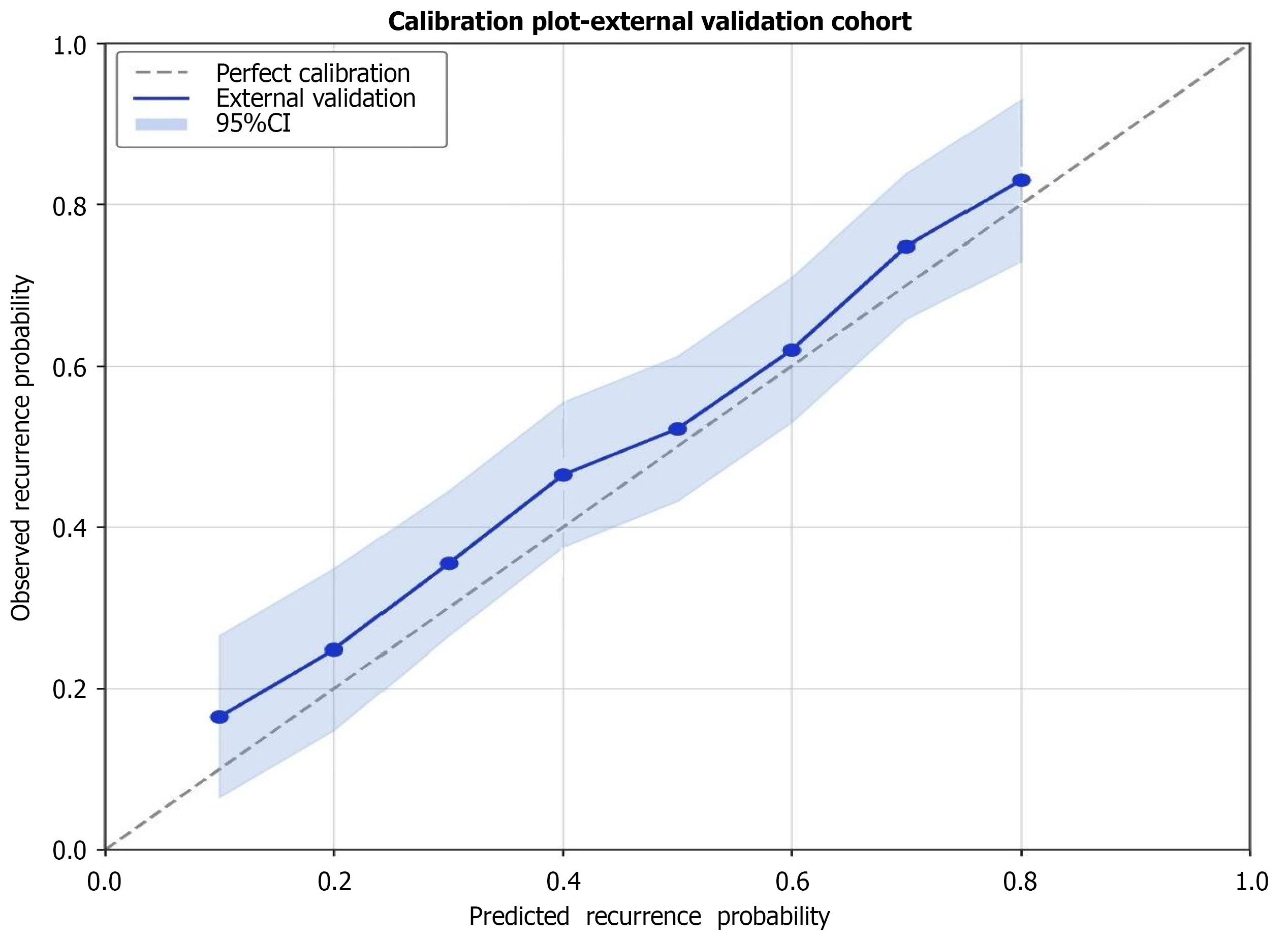
Figure 3 Temporal validation calibration plot.
The calibration plot shows close agreement between predicted and observed 2-year recurrence probabilities in the temporal validation cohort. Observed rates (blue circles) align well with the line of perfect calibration (dashed line), with calibration slope of 0.94 and intercept of 0.06, confirming excellent model calibration across the risk spectrum. CI: Confidence interval.
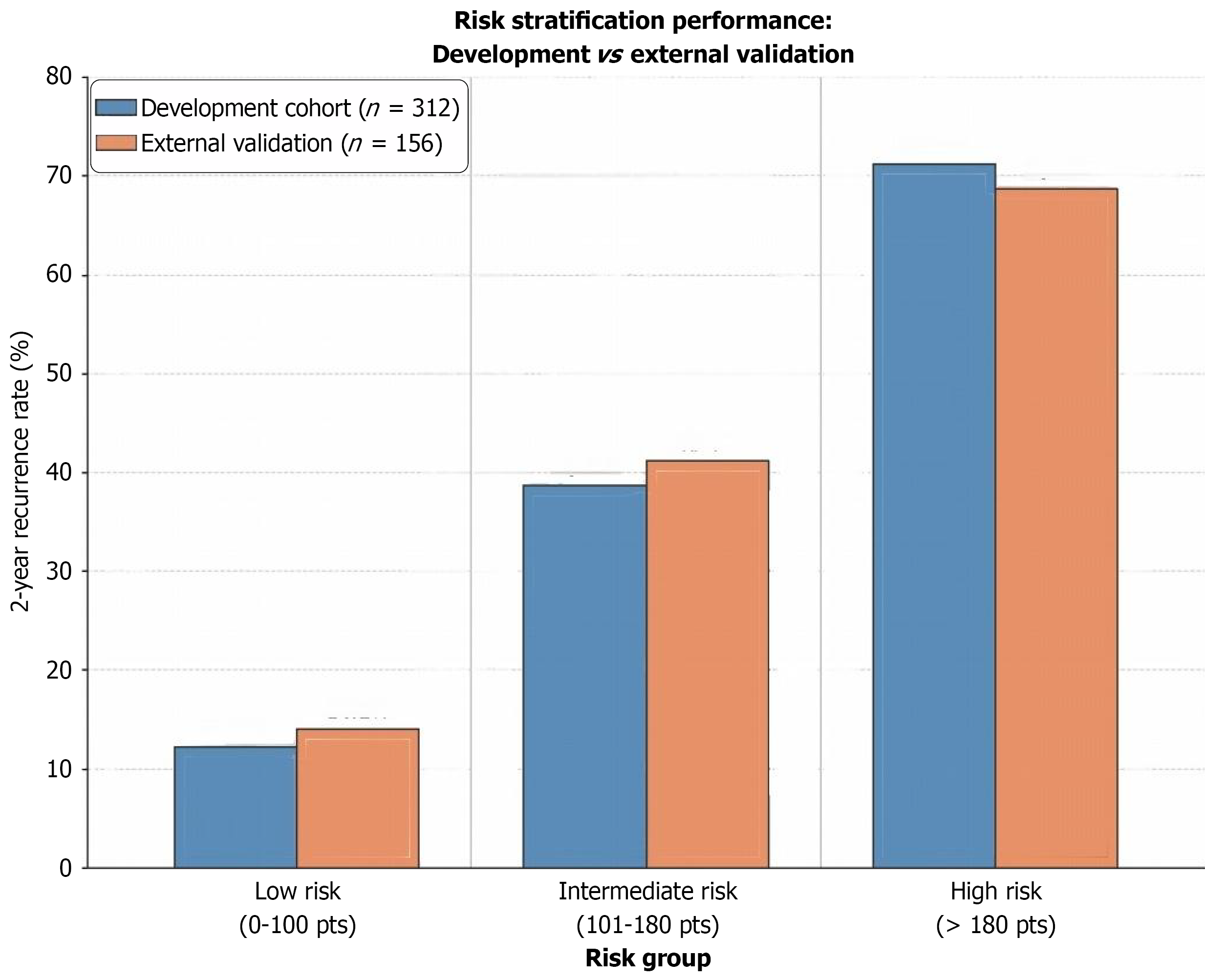
Figure 4 Risk stratification performance: Development vs temporal validation.
The three-tier risk stratification system showed consistent 2-year recurrence rates between development and validation cohorts across low-risk (12.3% vs 14.1%), intermediate-risk (38.7% vs 41.2%), and high-risk (71.2% vs 68.7%) groups, with differences under 3 percentage points confirming model transportability.
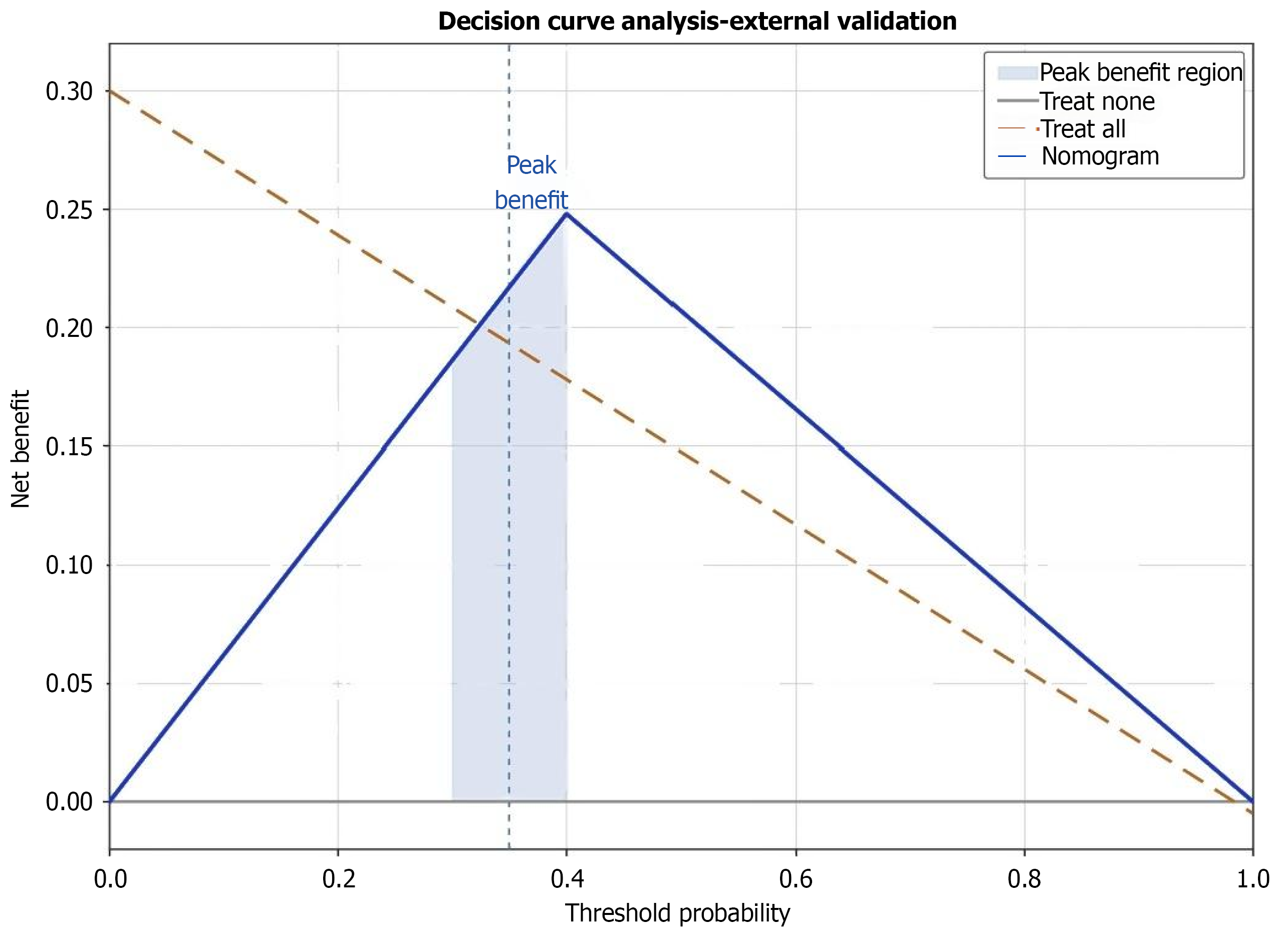
Figure 5 Decision curve analysis - clinical utility of the nomogram.
Decision curve analysis shows the nomogram (blue) provides substantial net benefit compared to uniform strategies (treat all/none) across 10%-80% threshold probabilities, with peak benefit at 30%-40% (light-blue shaded), supporting risk-stratified clinical implementation.
- Citation: Dai BW, Qi F, Xu GY, Sun W, Tao YN, Ze K. Risk stratification nomogram for diabetic foot ulcer recurrence after healing in type 2 diabetes. World J Diabetes 2026; 17(8): 121505
- URL: https://www.wjgnet.com/1948-9358/full/v17/i8/121505.htm
- DOI: https://dx.doi.org/10.4239/wjd.121505